CORKIDS
~ identity development
Corkids comes from the desire to create something that valued the Portuguese material extracted from the cork oak, innovating the concept of kids toys, by a group of young designers from Lisbon.
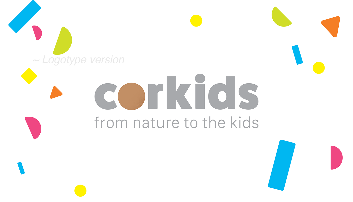
The primary goal was to reinvent the image and work with the brick letters idea from the first identity and develop it to a more kids-friendly status.
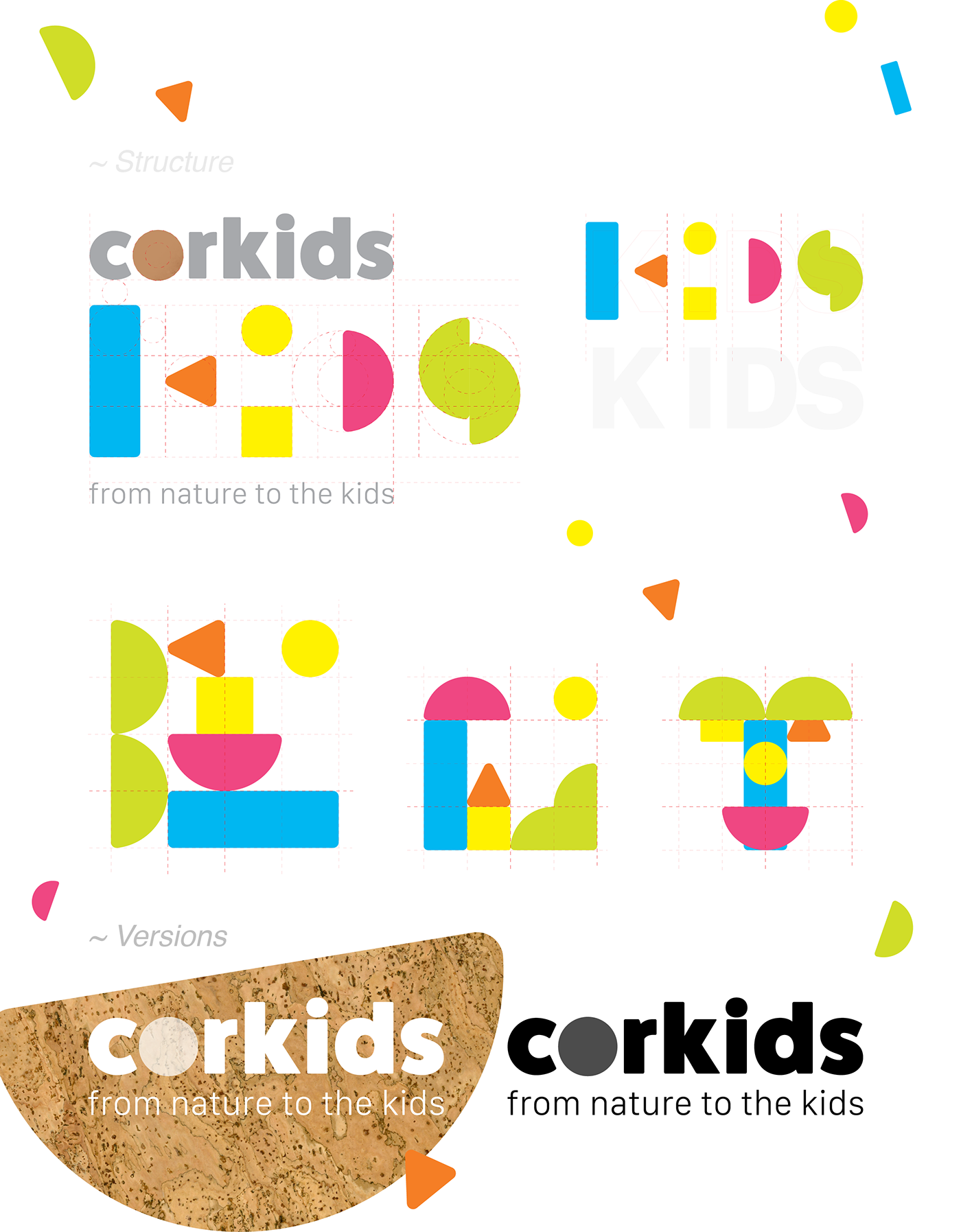
Instead of using only a monochromatic colour scheme we’ve implemented five new colours. With that in mind, the blend blocks design gave place to five versatile pieces that compose the word KIDS.
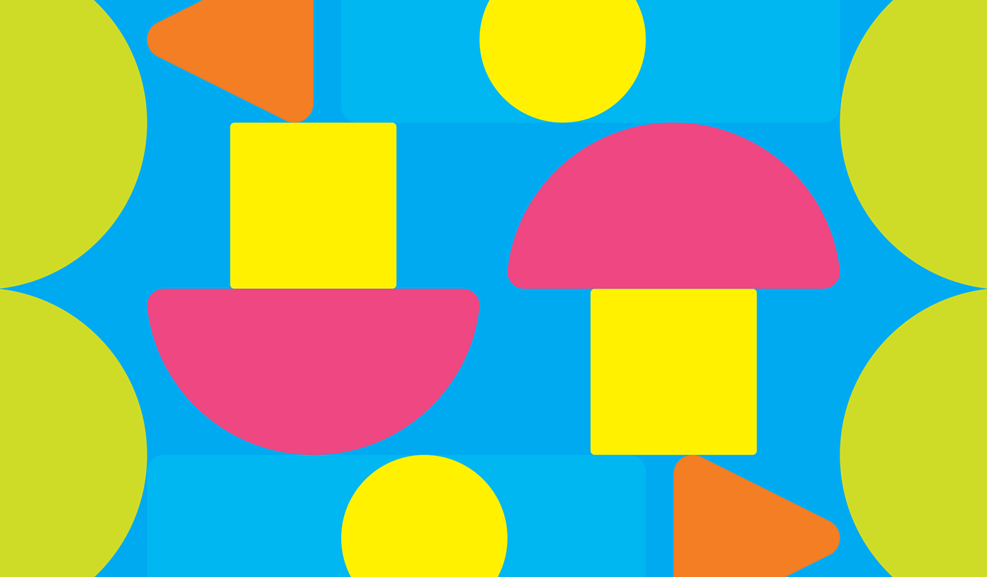
The use of geometric shapes allows space for creativity into creating an enormous amount of forms and combinations that create a brand language and are perfect to design icons,
step-by-step instructions and promotional images.
step-by-step instructions and promotional images.