Microsoft Paint Design Critique
INFO 3450 Hall of Fame and Shame 1
INFO 3450 Hall of Fame and Shame 1

The user interface of Microsoft Paint (version 6)
Microsoft Paint version 6 (included in Windows 7) is a simple but useful picture and photo editing tool. Redesigned from the classic Paint program, the version 6 interface includes the Microsoft menu ribbons across the top, with File, Home, and View tabs. The Home ribbon menu has buttons and actions grouped into like functions, such as the clipboard, shapes, or color. The bottom of the screen has a small bar with the zoom settings, as well as some information on the pixels and position of the cursor. As a program bundled with Microsoft Windows, a large percentage of computer users have access to the program. Also, with its redesign and update into a format that uses ribbon menus like other Microsoft products, it will be interesting to see how the functionality, aesthetics, and other aspects of the program works using Microsfot’s new design paradigm.
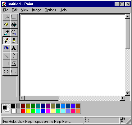
An older version of Microsoft Paint, without the ribbon menus. Image source: http://www.fayette.k12.il.us/99/paint/paint.htm
Overview: The Good
Microsoft Paint tends to be rather simplistic, unlike other programs like Photoshop, it has relatively few functions. As such, I generally use the program for more simple tasks such as cropping pictures, or making charts and images that require simple shapes and designs. The program is fun and easy to learn and use, partly from the immediate feedback, as well as from being able to see and try all the functions. As there are a limited number of functions, they can almost all be shown right away in the ribbon, without being hidden under layers of menus or found through multiple modes, conforming to Donald Norman’s ideas of visibility, being able to see what is possible, and simplifying the structure of tasks.

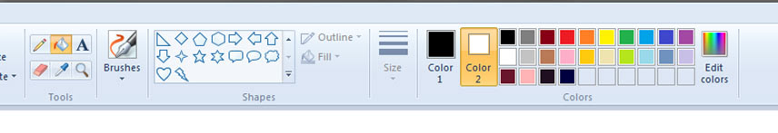
A close up look of Microsoft Paint's main ribbon menu. The alignment, groupings, and use of proximity make it aesthetically pleasing to look at, and lends itself to usually having good functionality and usability.
The placement of the clipboard on the left of the Home ribbon, and the zoom settings in the bottom right corner of the screen also agree with conventions and design paradigms set by other Microsoft programs. The information placed at the bottom of the screen showing the pixel location ofthe provides useful feedback, but it makes sense for it to be out of the way, as it is a feature not used as often.
Because the program is simple, I often use it for simple image manipulation, such as cropping and rotating. I like that the icons and buttons for those functions are very visible, and grouped together in close proximity in the "Image" section, because those are commonly used functions in such a simple program, they should be highly visible.
The color palette is a great metaphor and mapping of a real life palette, where the user can pick from preset available colors, or click on "Edit colors" to create other colors. This makes it easy to understand what its function is, and is nice to look at - the colors are the main signal that this is a drawing/painting/art-related program.
The groupings of the menu sections of the Home ribbon (Clipboard, Image, Tools, etc.) follow the general principle of proximity, asstated by Robin Williams, placing like functions together (also advocated by Norman). There is also generally good alignment between the icons along the ribbon, creating an aesthetic menu – it draws me in and makes me want to use it.
For the most part, constraints are also used, based upon theaffordances of the paint tools in real life, which are then mapped into theprogram, something also mentioned by Norman. For instance, when the paint bucket tool is selected, the outline, fill, and size options are no longer clickable, as these functions are not relevant to the paint bucket tool (norwould they be relevant factors in a “real life” situation of pouring paint ontoa canvas).
Constraints are provided, which help the program's usability. For instance, when the paint bucket tool is selected, the user cannot access the Outline, Fill, or Size menus, because they are not relevant, while the color menu is still accessible. These constraints make sure the user uses the tool correctly, increases the usability, and makes it less likely that the user will get angry or frustrated!
The Not-So-Good
There are a few things that could be improved in the interface, however. One problem is related to feedback. When an outline, fill, or size (thickness) option is chosen, there is no immediate feedback in the ribbon icons – the icons stay the same. The user has to click again to open the drop down menu in order to see what option they have chosen. Instead, immediate feedback by displaying the icon for the chosen value on the ribbon could be more useful. However, the tradeoff is that there are now several symbols that could represent Fill,Outline, and Size, further complicated by the fact that Outline and Fill share the same styling options. This would make the user more dependent on the text to read the words “Outline” and “Fill,” but the immediate feedback would mean the user wouldn’t have to do an extra click to see the options. I know that I often am not sure if I selected the correct style choice, and then I have to click on the Outline or Fill button again to double check myself. Or more often than that, I simply forget which style is currently chosen, as I use other tools and then come back to Outline and Fill. Often, I will just draw the shape and to my dismay, I have used the wrong Fill type, causing me to delete my figure and go back and redraw it with the correct Fill type, because of the lack of visibility and feedback.

If the user selects the "Crayon" style for "Fill" (as shown here), then the user has to click on the "Fill" icon again to check if he or she selected the correct Fill option. These lack of visibility of fill choice prevents immediate feedback, and means users have to click extra times to find the information. This could be improved by having the "Fill" icon change to the "Crayon" icon when it is selected, but then users would have to rely on the text that indicates the icon is for "Fill"
Another large problem has to do with how colors are presented. There are two colors, labeled “Color 1” and “Color 2,” and one is always highlighted. The user’s conceptual model is that when they draw a shape or line, the highlighted color is the color that will be used. However, in practice, Color 1 corresponds to the foreground while Color 2 corresponds to the background. When you draw a line, the line’s color is always Color 1, no matter which color is highlighted. The purpose of the highlighted color is that when a user chooses a new color from the palette, the highlighted color (Color 1 or Color 2) is the one that changes. However, the feedback mechanism of highlighting the color does not convey the foreground and background information, and causes the user to think of the wrong conceptual model. I have found this to be very frustrating. Say I want to draw a yellow line, I will select the line tool, and then click on the color yellow, but not check if I have Color 1 or Color 2 highlighted - my conceptual model is that when you click on a color, that's the color you will use right away. Then, I draw my line and it comes out a different color, because I had the wrong color highlighted. This causes me to waste time re-selecting colors and re-drawing shapes and figures. It may seem like a small thing, but I have gotten quite angry at the program several times because of it.

The conceptual model is that the highlighted color (Color 2 in this case) is the color used when I draw a line. However, when I try to do this, the line always uses Color 1 (Blue in this case). It seems the design model is that the highlighted color indicates if Color 1 or Color 2 is changed when I click on a new palette color and NOT the color I am currently using. This feedback seems to help the user create the wrong conceptual model.
There are a couple of ways to improve this. The easiest way (color suggestion #1) would be to re-label Color 1 and Color 2 to “Background” and “Foreground.” This would allow the current aesthetics to remain, which I like. While it would make the situation a little more clear, using the words would take up more space horizontally, and spread out the menu further and the feedback could still be confusing.
Another way (color suggestion #2) this could be changed is to use the style of overlapping two swatches of color, to visually indicate which color is the foreground and which is the background. This is the same convention used in older versions of Paint and in Photoshop, and it would not need text to convey its meaning, which according to Norman, is good design. However, this overlap might not fit into the current individual icon style of the new Microsoft ribbon icons, and it could look jarring and out of place when all the other tools and functions have single, separated icons, as its alignment wouldn’t match.
Another way (color suggestion #2) this could be changed is to use the style of overlapping two swatches of color, to visually indicate which color is the foreground and which is the background. This is the same convention used in older versions of Paint and in Photoshop, and it would not need text to convey its meaning, which according to Norman, is good design. However, this overlap might not fit into the current individual icon style of the new Microsoft ribbon icons, and it could look jarring and out of place when all the other tools and functions have single, separated icons, as its alignment wouldn’t match.

Displaying the Foreground and Background like this would match existing design paradigms in previous versions of Paint and in Photoshop. However, it could look out of style with the new Microsoft ribbon menu icons.
A more radical solution (color suggestion #3) would be to get rid of the color palette from the main interfacae, which would open up room to write Foreground and Background under each color. Then clicking on either color would bring up the palette as a drop down menu. However, this may seem to hide the options more and make them less visible in – in this case though, it may help as currently Color 1 or Color 2 is always highlighted, providing false feedback as shown above. If each color has a separate palette that is only seen when the color is clicked on, then neither one has to be highlighted, solving the false feedback and false conceptual model problem. This also allows the ribbon to keep its individual separated icon aesthetic. However, the disappearance of the palette is a tradeoff, as it is a signature and unique part of this program’s interface that is found in the program’s history, and not in other editing programs, like Photoshop. This move away from the existing paradigm of having a palette visible without any clicks could alienate users of previous versions of the program. (This solution is illustrated in a diagram in the next section)
Some Bigger Changes?
The conceptual model for a painting program should be the following: A tool (like a brush, line, or shape) is chosen, and associated relevant styles (outline, fill, size, foreground and background colors) are chosen. This can be done in either order, as sometimes users may want to change their style, tool, or both. The current way that the menu is split up is confusing and doesn’t fit the conceptual model. Tools, brushes, and shapes are very similar, but split into different sections. It’s a bit unclear how it should be used – can you pick multiple, or are you supposed to go from one to another? This implies that the ribbon should actually be split into different categories – Clipboard, Image, Tools (incorporating tools, brushes, shapes), and Styles (includes outline, fill, size, and colors).
Combining the above suggestions would create a new ribbon bar that is simplified, and is broken into fewer categories that better match the program’s conceptual model, seen below. Alignment and proximity are still present, and problems with feedback and visibility would be improved as well, if the other suggestions about how function icons are displayed are taken into account.
Combining the above suggestions would create a new ribbon bar that is simplified, and is broken into fewer categories that better match the program’s conceptual model, seen below. Alignment and proximity are still present, and problems with feedback and visibility would be improved as well, if the other suggestions about how function icons are displayed are taken into account.

The old ribbon, while aesthetically pleasing with its use of alignment and proximity, divides tool and style functions into many different sections. It also has problems with visibility, feedback, and provides the wrong conceptual model, as discussed earlier.

The newly designed ribbon - it retains the aesthetics of the Micorsoft ribbon menus by incorporating their style, and use of alignment and proximity of grouping. However, it simplifies the main art functions into 2 groups - "Tools" and "Styles." It also incorporates better feedback and visibility mechanisms for the "Outline," "Fill," and "Size" icons, as discussed earlier. It also uses suggestion #3 for color selection, helping to convey the correct conceptual model. The new ribbon has better visibility and feedback, and also takes up less room horizontally, which means that it will display better on smaller or lower resolution screens.
A more radical design could be to extend the metaphor and mapping of a palette in the program, to having an actual palette. This could be a circular menu that resides on top of the canvas, but is moveable (click and drag) to avoid covering up important areas. It would contain the style options (colors, outline, fill, and size), and look much like a “real” palette and artist would use.
Taking the styles options out of the ribbon would mean that there would be a lot of empty space across the top of the screen. The ribbon takes up a lot of vertical space on the screen, which is more valuable since most screens are wider than they are tall. Without the style options, the rest of the ribbon could be moved into a vertical position, flush against the side of the window. The icons, however, could still retain their aesthetic value by being aligned and grouped in proximity in a similar manner to how they are now.

The redesigned Paint interface moves the Clipboard, Image, and Tools menu from the horizontal ribbon to a vertical bar. The color and style options are placed into a palette menu (that resembles a real physical palette), which is moveable around the screen. This enhances the painting metaphor, and could increase usability, though it moves away from established design paradigms that exist both in the Paint program, and across different Microsoft programs.
This should have at least the same amount of usability as the current program, if not more, but visually separating the tools and styles in a way that works with the user’s conceptual model and plays off of the real life metaphors. However, Microsoft does lose some of its branding, as the program will not have the same ribbon style menu as other Microsoft products, and that could be an important consideration for that company. Also, it could alienate established users by changing the interface drastically, and important consideration, as there are many people who already know how to use the current interface, given how many computers the program is installed on. However, it wouldn’t be unprecedented – Microsoft changed the interfaces to many programs, including Office, Paint, and Movie Maker, when changing from the old drop-down menu to ribbon menu format.
Simple for Society
It would have been very easy to criticize Paint’s lack of functionality, and advocate for the addition of more functions – adding layers, allowing gradients, vector maps, and automatic or “magic” selection, and you may notice that I did not discuss those things. For one, extra functionality can be found in other existing programs, such as Photoshop (which I also use). Also, part of Paint’s appeal is its simplicity of functions – Paint to image editing and manipulation is like how Notepad (or Wordpad) is to document editing. I did a little work with Professor Gilly Leshed on Americans’ feelings of stress and overwork may be exacerbated by IT solutions. The extra functionalities of other image manipulating tools, like Photoshop, could exacerbate stress as well, by making the work more detailed and complicated. Paint’s lower functionality means that it has a lower learning curve, making it more fun and easy to use. Its limited options allow the user to undertake more tasks that are not structured, and have more fun creating something rather than worrying about how to use hundreds of tools to make something perfect or exact. In a world with the proliferation of new programs advertised with new features, perhaps the simplistic Paint still has a rightful place of its own on our computers.

