


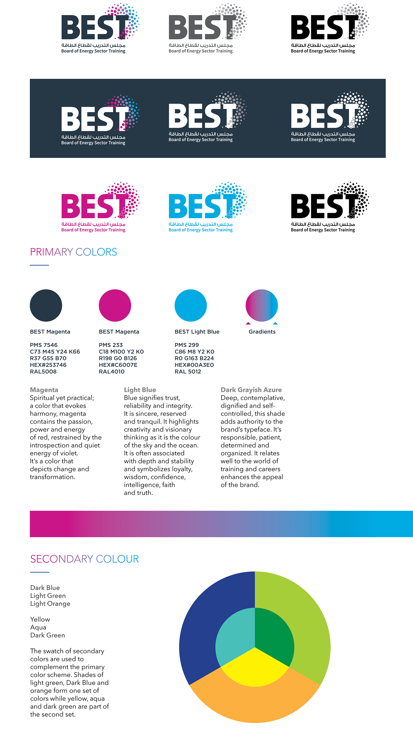
Circles are very symbolic. As an inspiration for this logo concept, the circle is symbolic of the sun in its limitless aspect. It represents totality, wholeness, perfection and implies an idea of movement. The circle expresses the cycle of value: Oil and natural resources creating opportunities for young Saudis through ESTB - and they, in turn, contributing to the businesses in the energy sector - which in turn support the mission and vision of ESTB to build national human capital... and they cycle goes on.
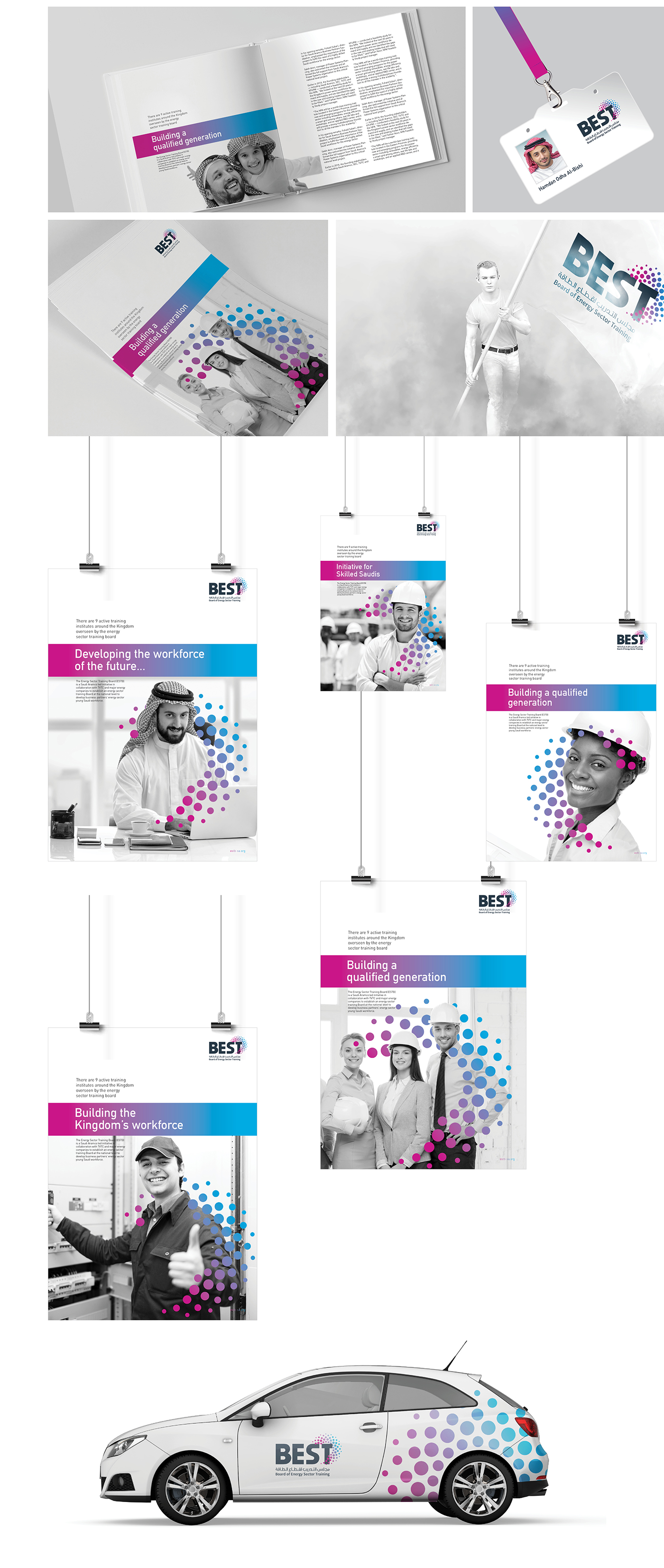
The main graphic elements for this logo design are the “Dots/Circles” that symbolize Saudi people (inspired by the “ghetra”). They also stand for diversity as represented by the many different training institutions under the Board.


The typography for the brand name has been specially created to give a bold look.
The English and Arabic fonts are upright and elegant to communicate the knowledge quotient.
The English and Arabic fonts are upright and elegant to communicate the knowledge quotient.

“Excellence in Energy Training” is emphatically conveyed through the brand name (BEST) and the logo design. In light of its role similar to that of a ‘holding initiative’ brand, the logo endeavors to portray stature and authority as a standard bearer. Each of the dots contain the energy which converge and convert into a swoosh, all of them moving around the ‘T’ that represents “Training” in the logotype.
The brand mark, together with the title, form the full identity. Positioned centrally to each other, the logo attains a refined elegance through its subtle use of color and gradation.


Client: Board of Energy Sector Training (BEST)
Credits: Jose & Ratheesh
Credits: Jose & Ratheesh
Special Credit: Charles Miraj
Agency: Miraj Graphics
Agency: Miraj Graphics
© 2017 RajeevLalith


