


R E B E C C A P O L E W S K Y | C O R P O R A T E D E S I G N
Client: Rebecca Polewsky
Studio: Bureau Mitte
Art Direction: Anna Ranches
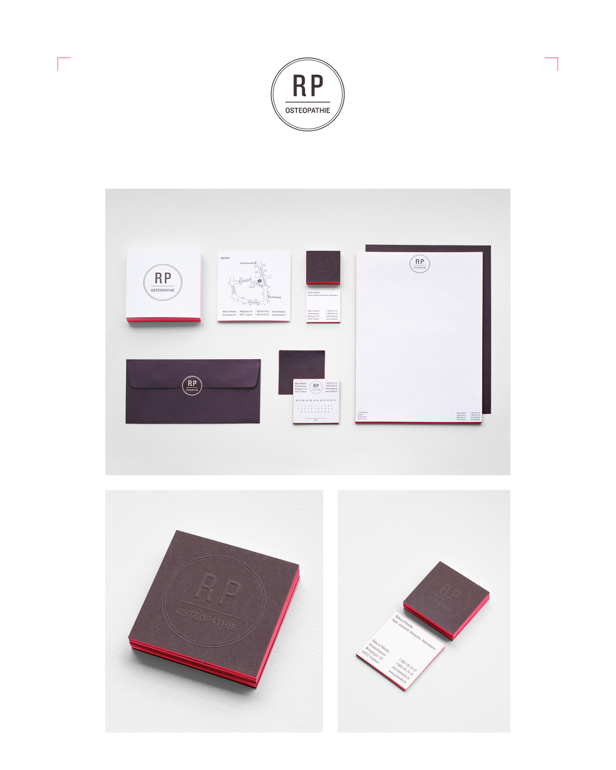
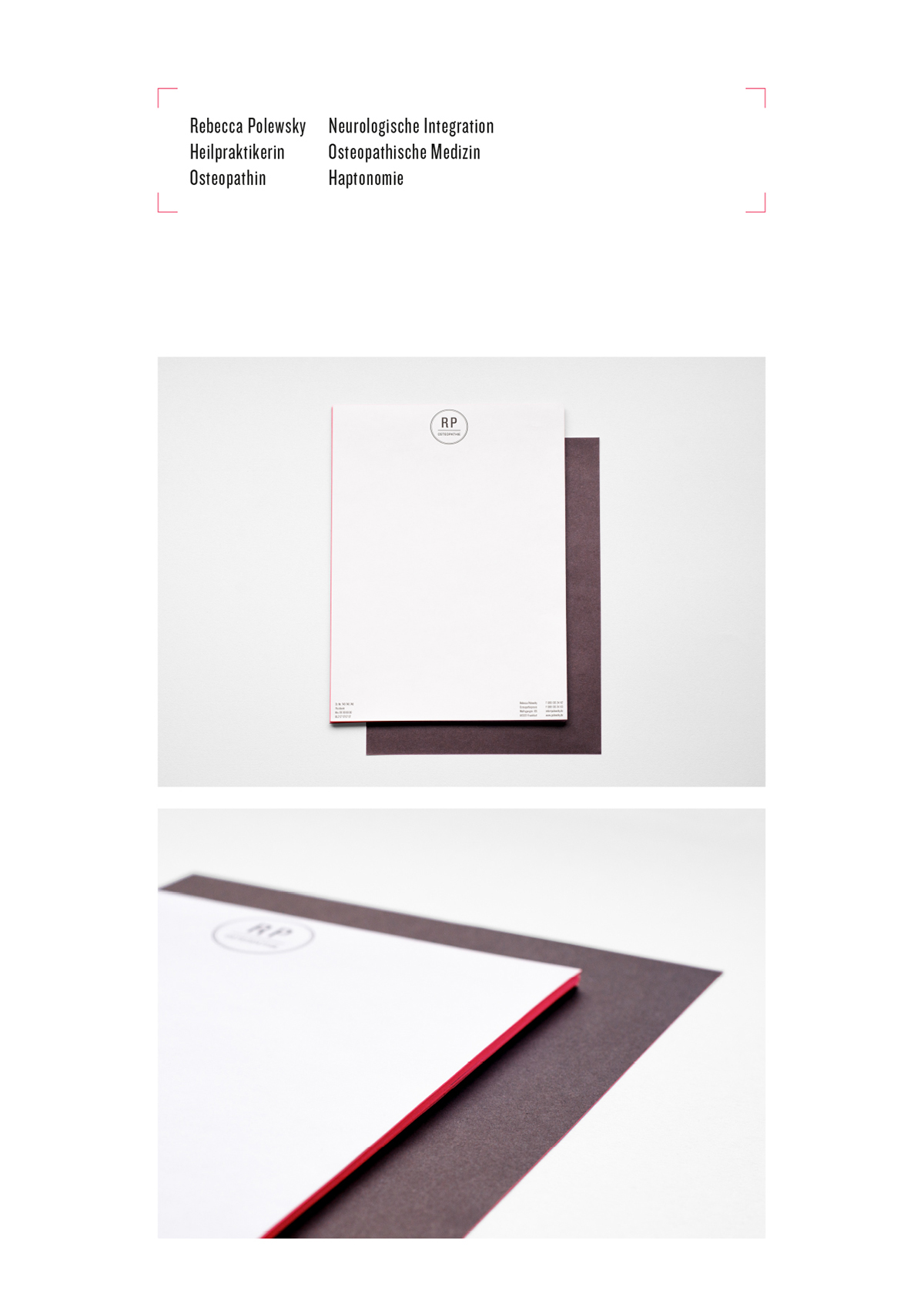
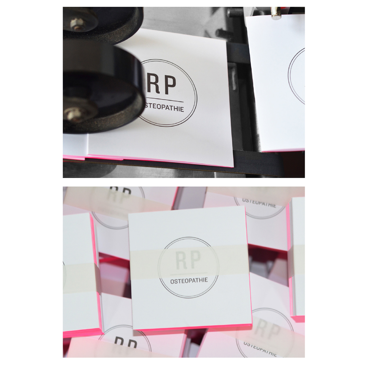
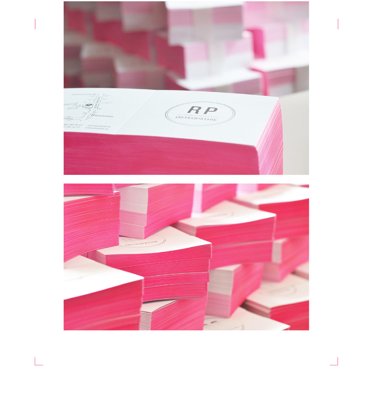
The business cards are printed on two different papers beside the different feel of the surface the special print enables an embossed logo at the frontpage. After laminating both papers the business cards as well as the whole stationery received a pink colored edge.
Client: Rebecca Polewsky
Studio: Bureau Mitte
Art Direction: Anna Ranches
The Corporate Design for Rebecca Polewsky Osteopathy comes in the unusual colours warm brown and pink combined with a bright white, printed on fine paper from Fedrigoni and refined with a print finishing. All in all an outstanding project.


