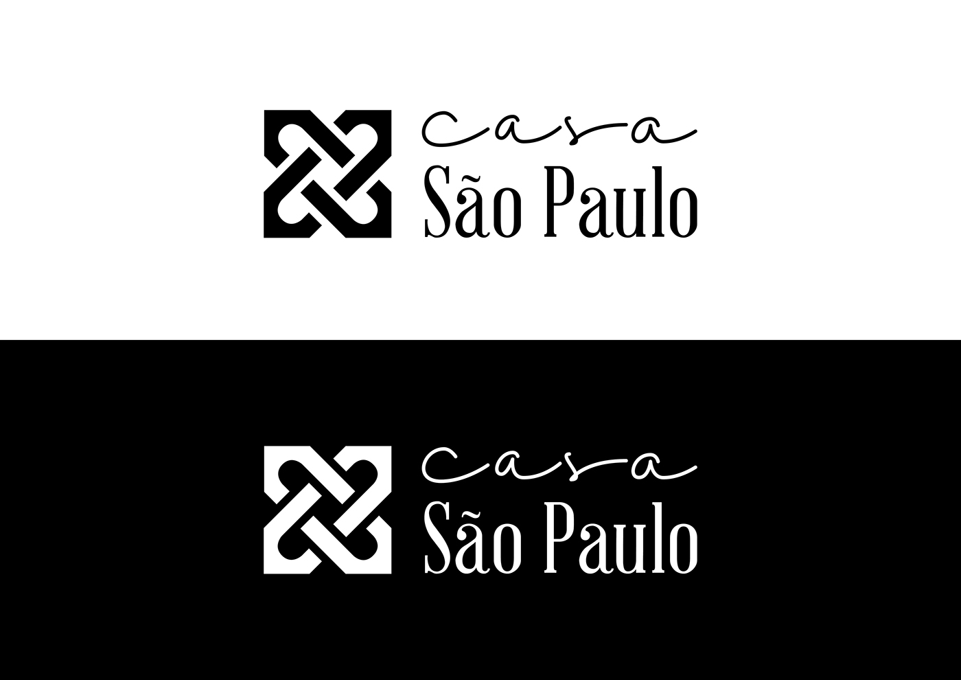
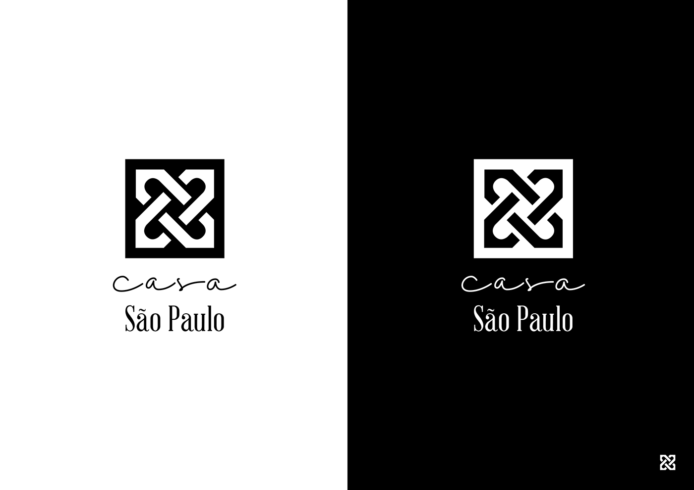
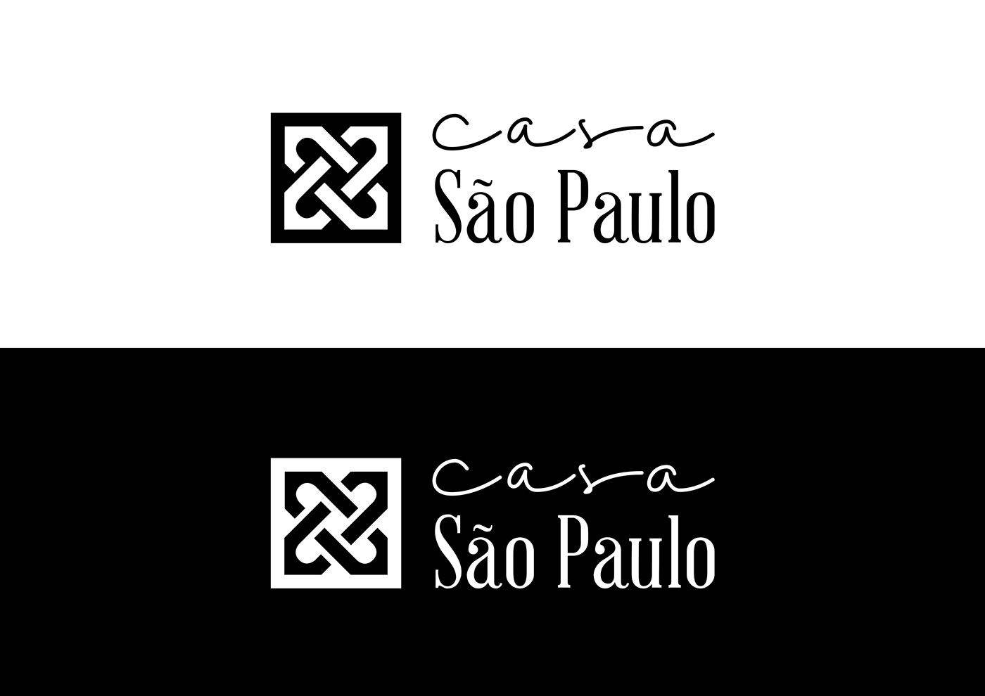
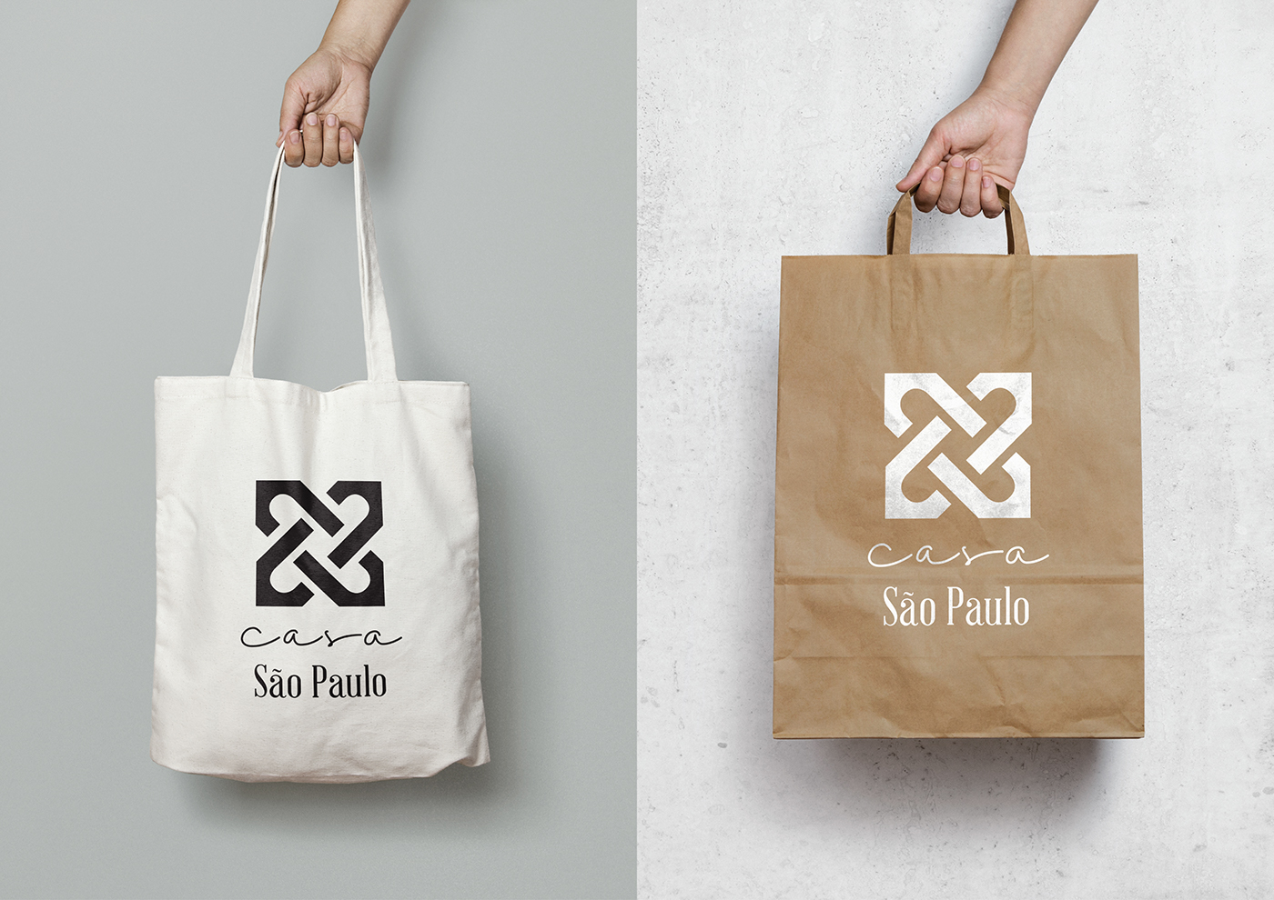
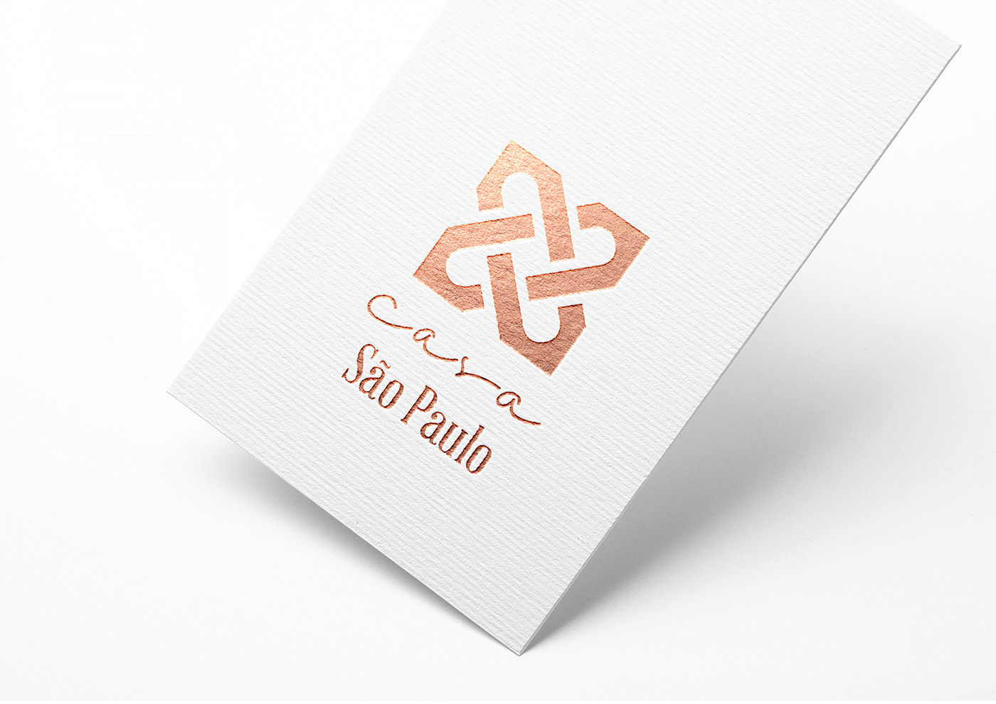
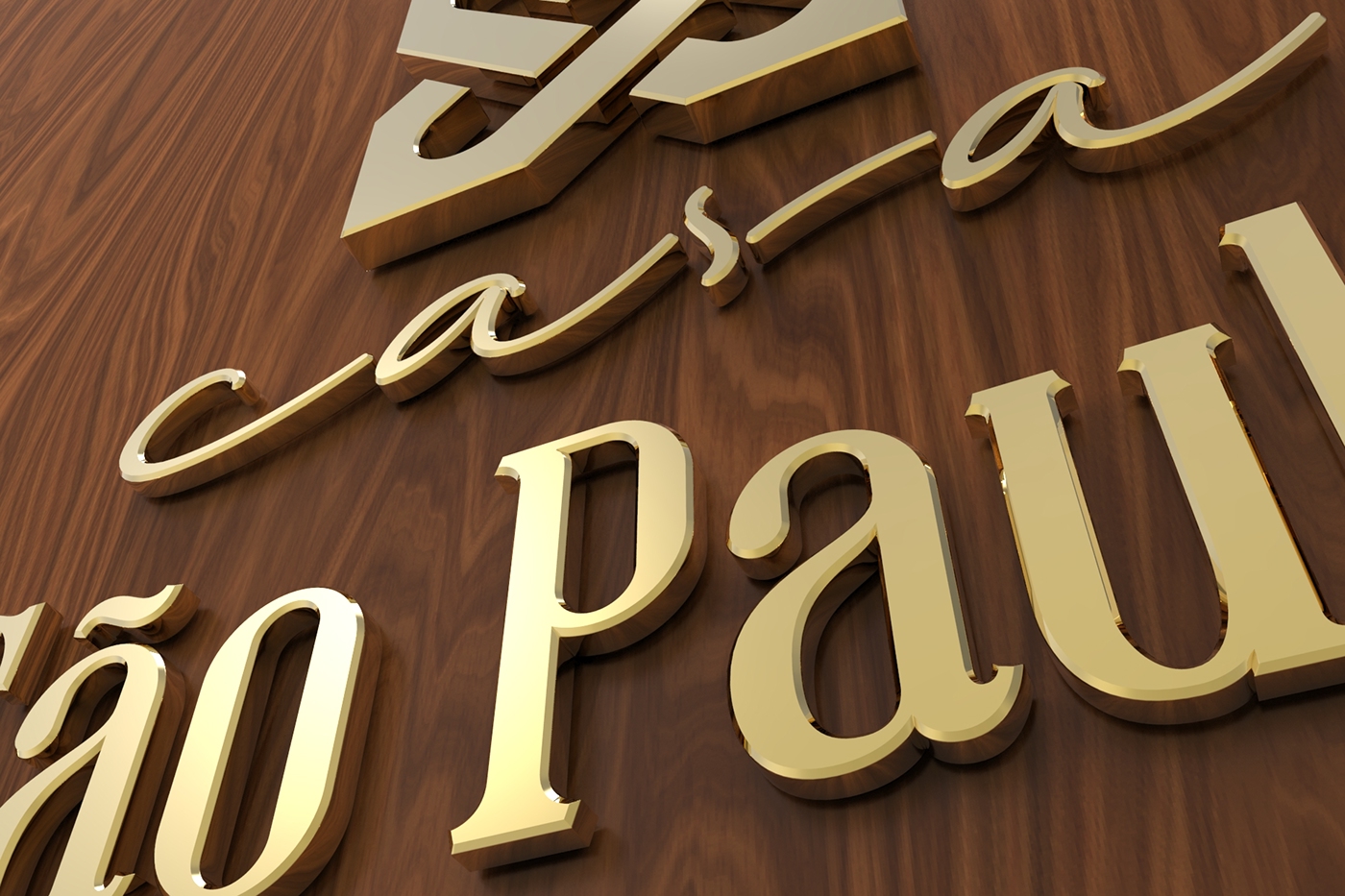
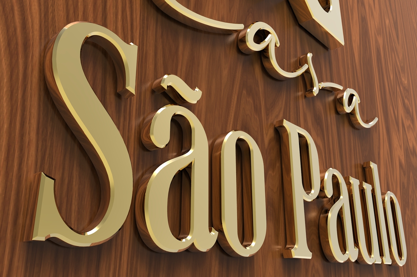
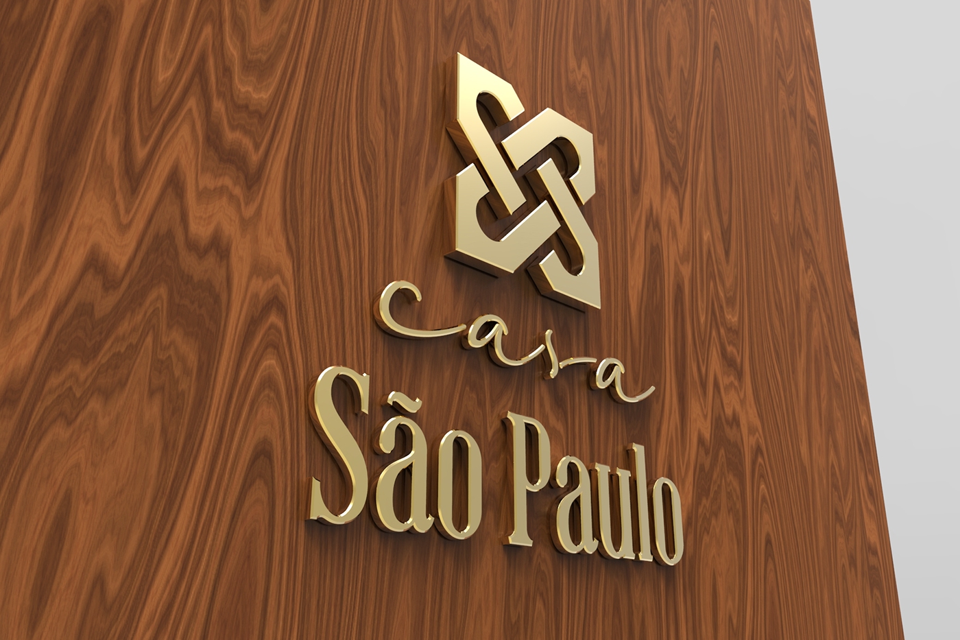
This branding project was developed for a client who was opening a new market / bakery / restaurant in Recife, Brazil, inspired by São Paulo's golden age from the 20s until the 40s.
The letters used for the name of the city on the logo were tailored-made, drawn from scratch, and and inspired by the style of the time.
The mixture between something classy and also a hand-lettering really stands out, and brings it into a more modern context.