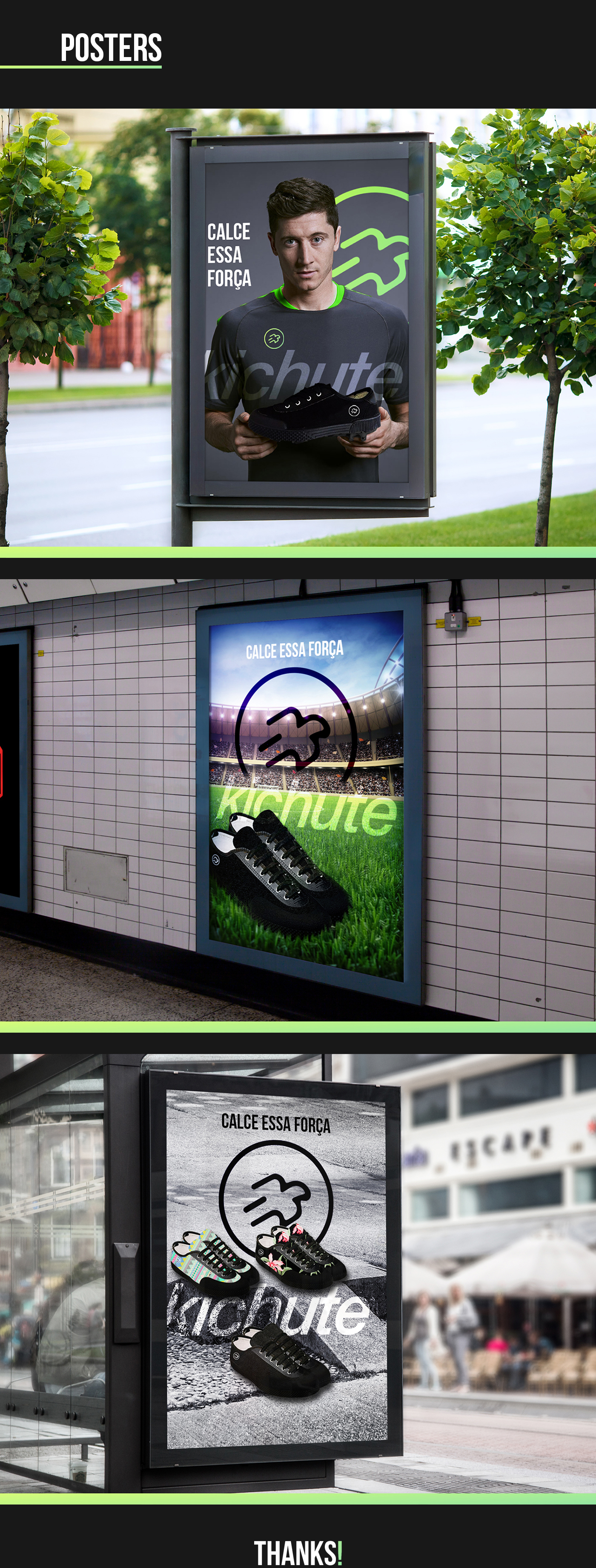
Briefing
The briefing proposed by our design business teacher was to make a brand repositioning for a nostalgic product, in our case we worked with the famous Brazilian sports brand, Kichute.
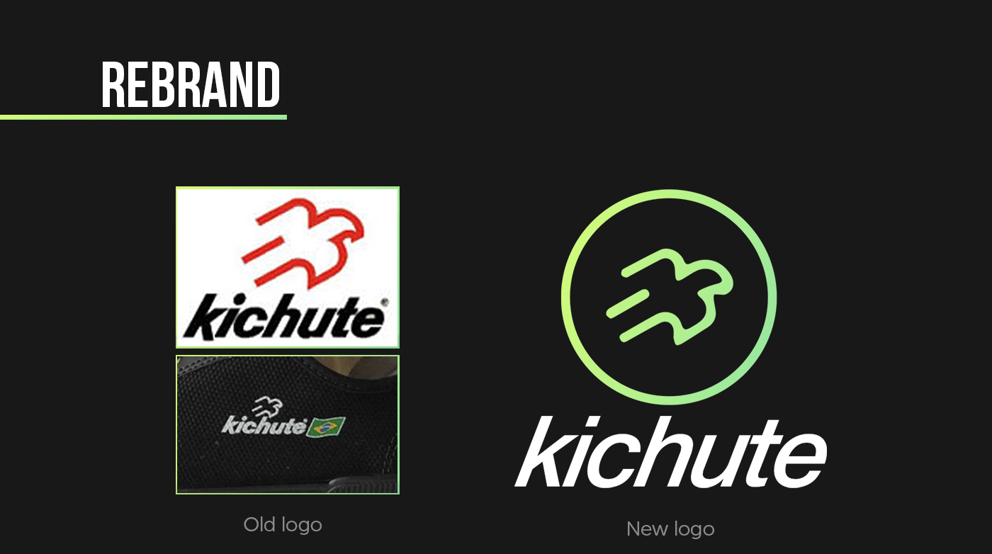
For the rebrand, we use elements of the old logo to create a new composition, according to the public and the current market. The main symbol was maintained and gained a circle, which will allow the application in sneakers without writing the entire brand "kichute", as well as application in other media. The colors represent the fact that the company started during a World Cup, making reference to Brazil.
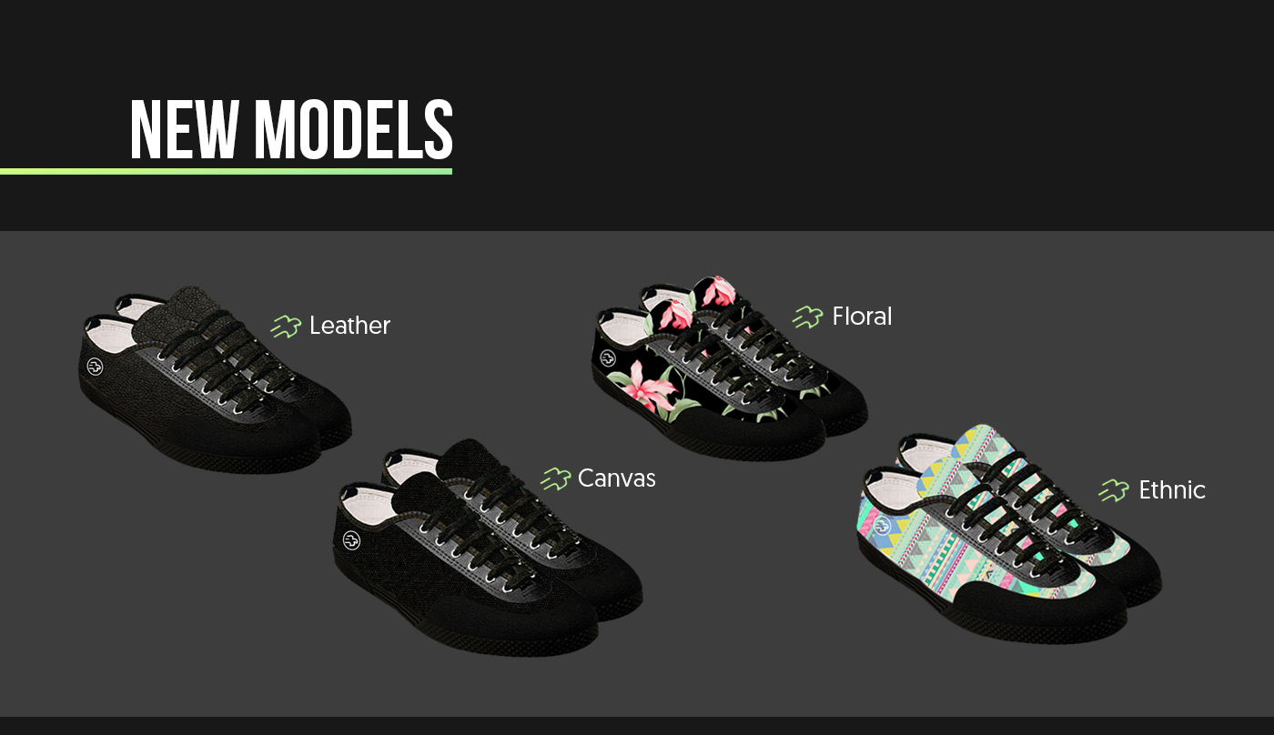
The classic "Kichute" brand shoes were sold in only one model and one color, black. As part of the repositioning of the brand, we have introduced new models of new colors, materials and patterns.