

·
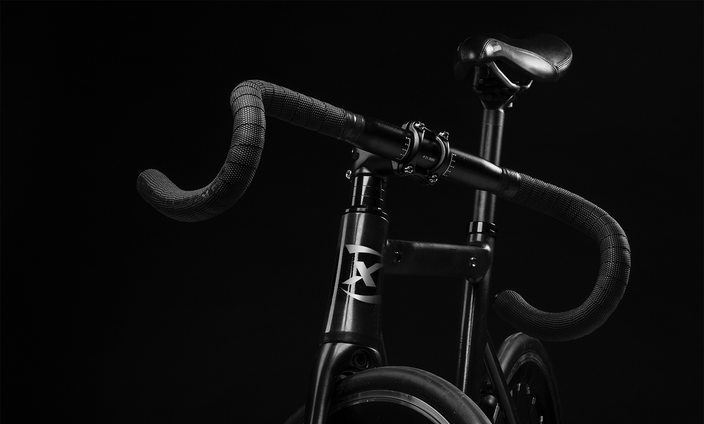
The logo maintains features of visual elements of the previous identity as the curved shapes on the letter "X" which also allows deconstruction to be used as the symbol of the brand. In terms of typography, we worked a sans serif, semi bold Italic typeface to represent movement and speed, thinning the strokes in relation to the previous version of the logo to give it features of lightness and simplicity. The result is a renewed, modern identity, adjusted to the new times and the new strategy of the company without losing its essence and history.
·


