


A literal, vivid and microscopic visual identity for nan@rts.
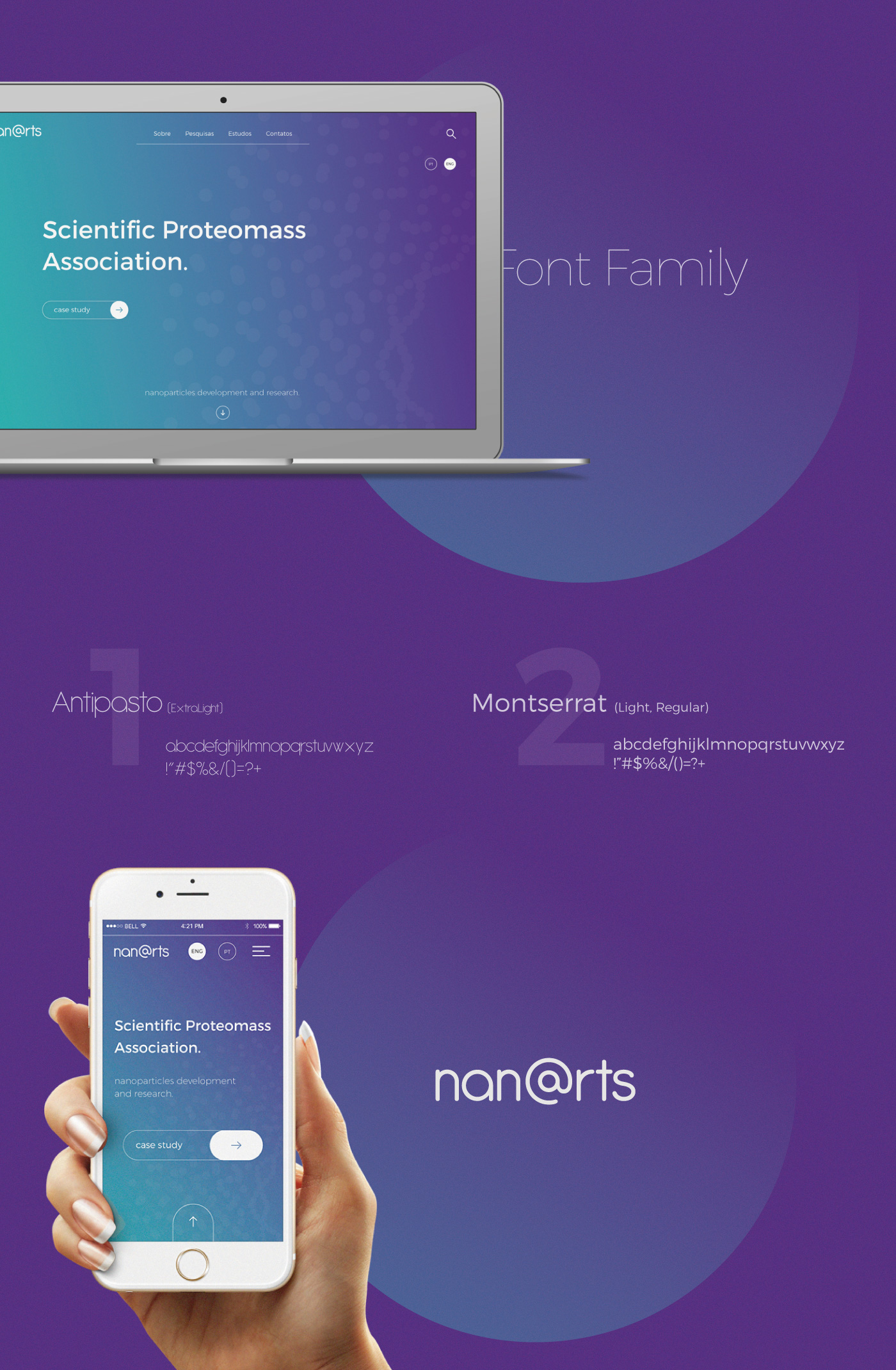
nan@rts is a group/association working on nanoparticles development and research. It is a Scientific Proteomass Association.
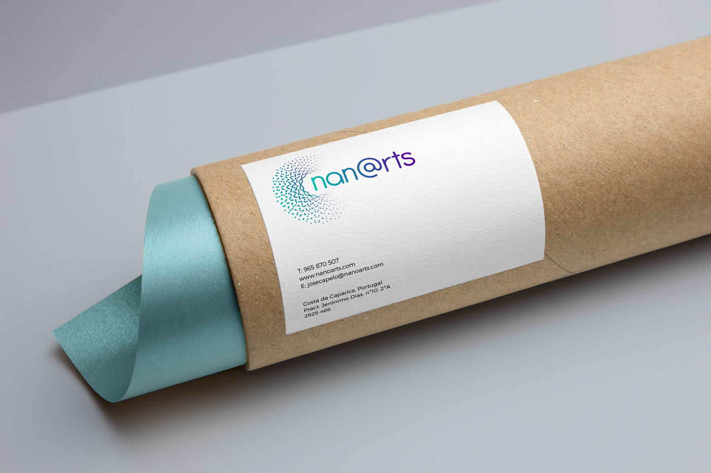
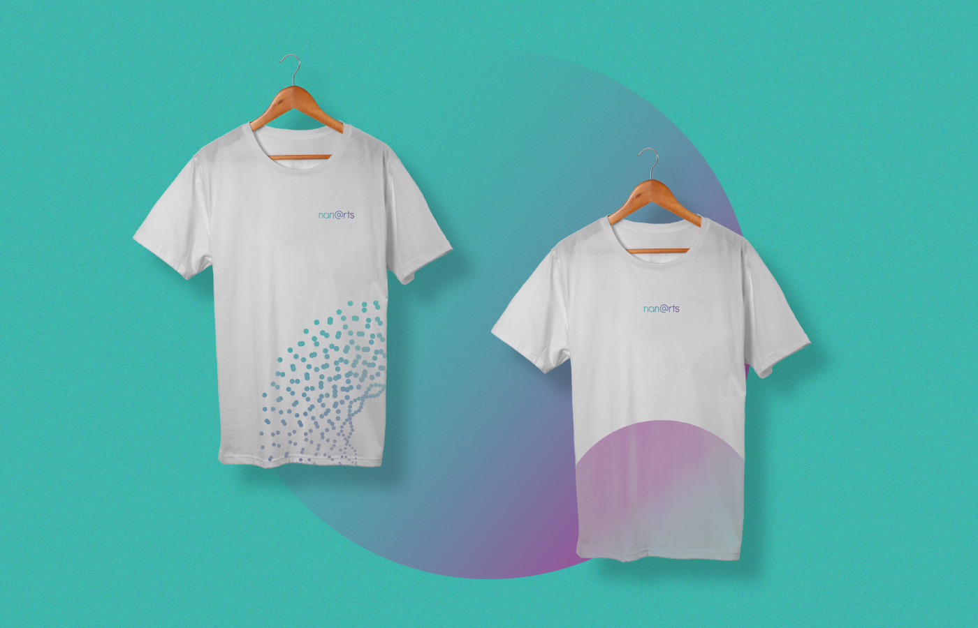
The intention of this minimalistic presentation with big dots is, to transmit the sensation that the stationary is as big or smaller than the nanoparticles. It's intended to look like you are seeing the brand collaterals through the electron microscope. You can not see these nanoparticles with an optical microscope, you need an electron microscope.
nano + art
"@" also has the denotation for letter "a" and "o".
@ = a+o.
This brand system will not be applied to machines or embroided stuff, only printed materials and digital plataforms.


Brand design developed by: Pedro Almeida
Contact: pedro.workdesign@gmail.com
Contact: pedro.workdesign@gmail.com


