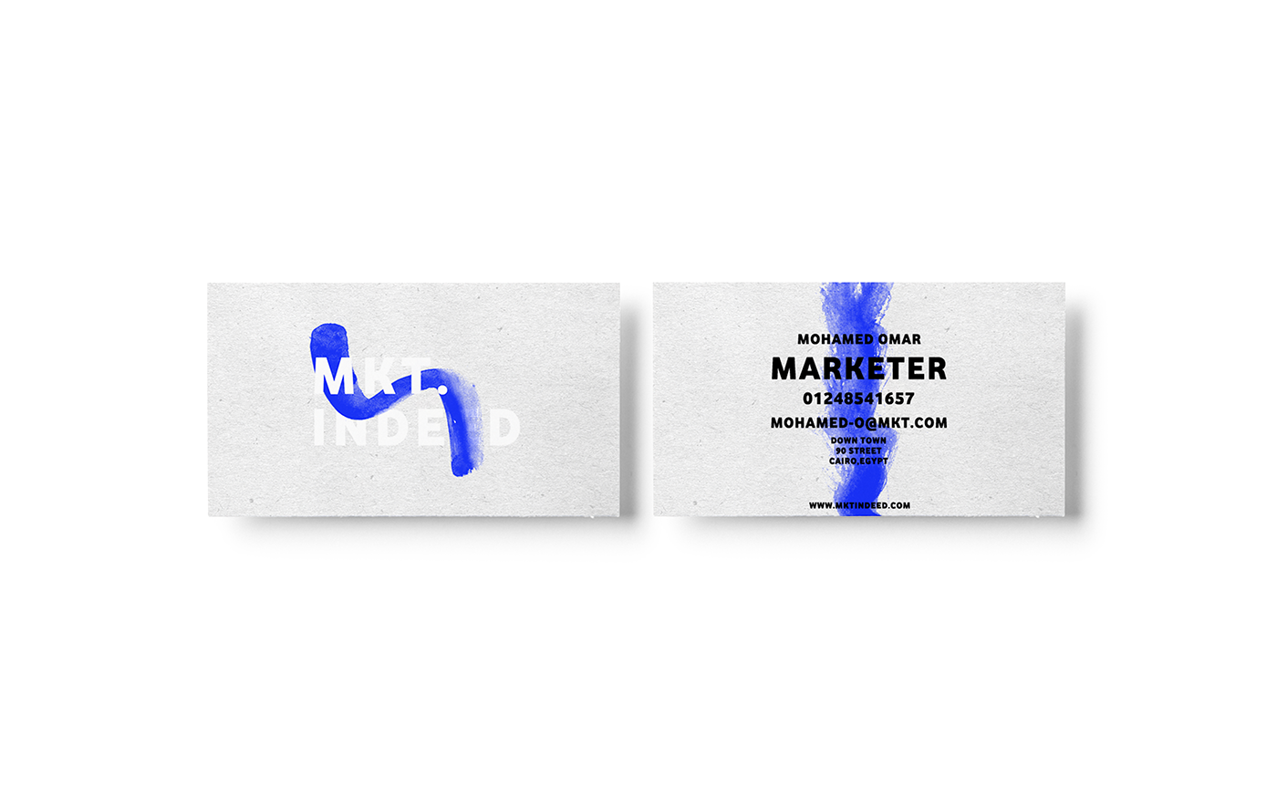
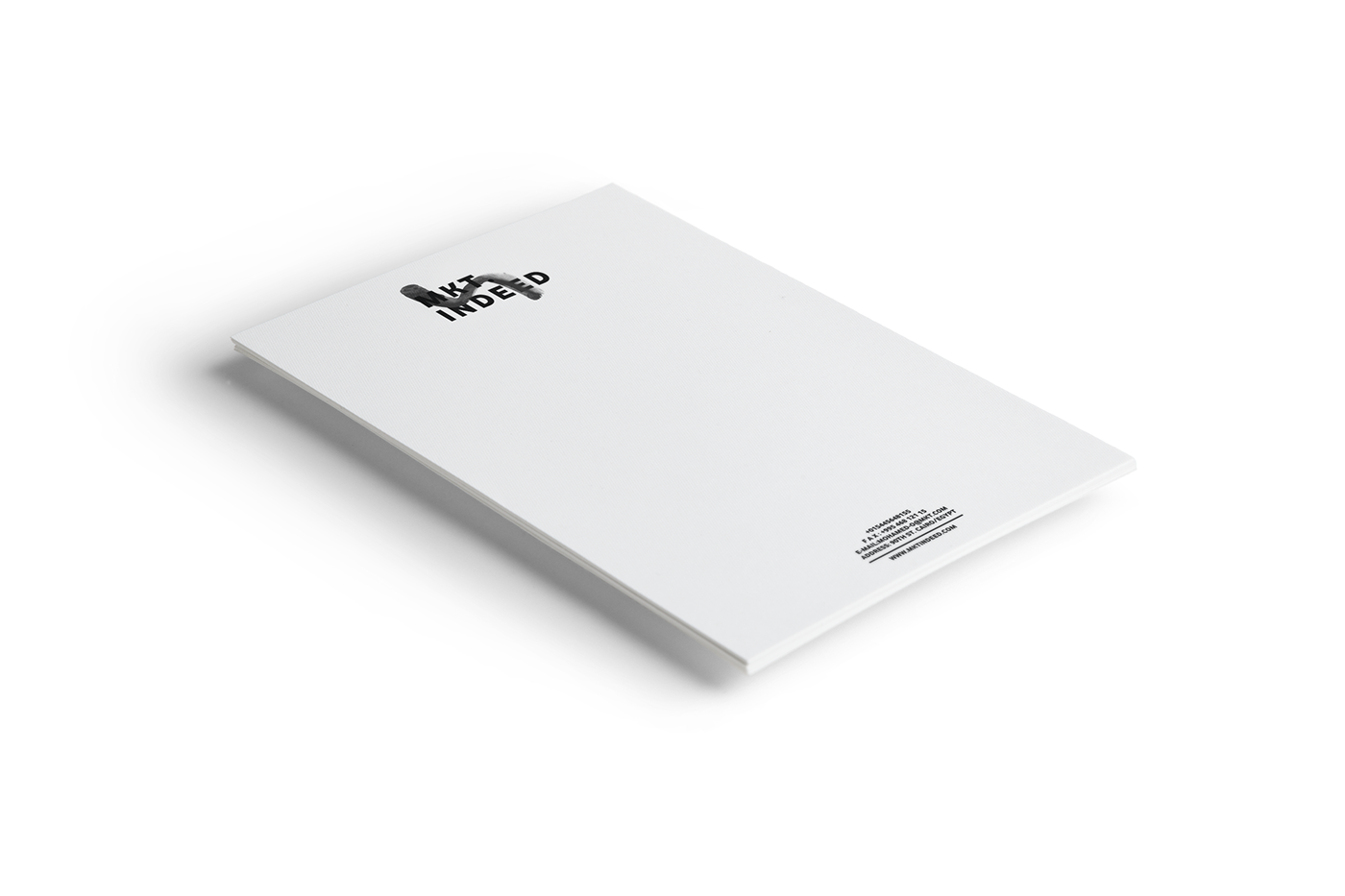
The concept of the logo stands for three main things.
Firstly the font of the logo is bold and thick with sharp edges and these tow things reveal the identity of the brand and indicate that the brand is powerful and delivering its services powerfully and nicely sharpened.
Secondly, the brush on the logo indicates that the brand is not just delivering a perfect shaped and powerful marketing but also beautiful and artistic marketing.
Thirdly the blue color is showing up trust and credibility to the brand.
We linked it with a perfect slogan that could reflect the identity of the brand and their concept.