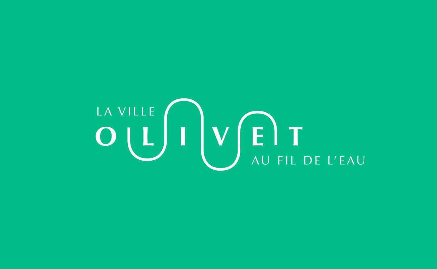
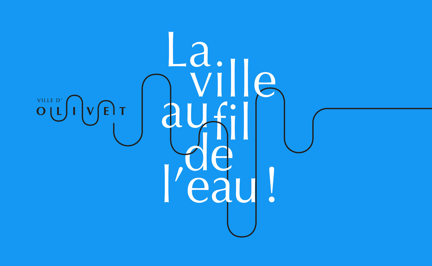
[FR] Ville d'Olivet, la ville au fil de l'eau
Olivet est une commune de 20 000 habitants située à proximité immédiate d'Orléans. Nous avons choisi de baser notre proposition d'identité visuelle (non retenue) sur sa situation géographique et sa proximité avec la rivière du Loiret, déterminante de l'identité de la ville. Notre travail s'inscrit naturellement dans la continuité de l'identité visuelle précédente.
Serpentant à travers la ville, le Loiret vient façonner l'image d'une ville reliée à la nature, offrant un cadre de vie soigné et agréable. Nous avons aussi désiré trouver un équilibre entre un traitement graphique contemporain, inscrit dans son époque, et une élégance inhérente à la ville, son histoire et au mode de vie qu'elle offre.
La simplicité enfantine de son dessin invite à la rêverie ; l'asymétrie de ses courbes apporte la vie et le mouvement, tandis que le choix typographique apporte de l'élégance.
[EN] City of Olivet, the city that follows the run of the river
Olivet is a town of 20,000 inhabitants, located near Orléans, France. We built our proposal of visual identity (that wasn't selected by the client) on the geographical situation and the proximity to the Loiret river, which draws the identity of the city.
Winding through the city, the Loiret shapes up the image of a city connected to nature, offering a neat and pleasant living environment. We also wanted to find a balance between contemporary graphic design and the elegance inherent to the city, its history and way of life.
The childish simplicity of this drawing invites to dream ; the asymmetry of the curves brings life and movement, while the typographic choice brings elegance.


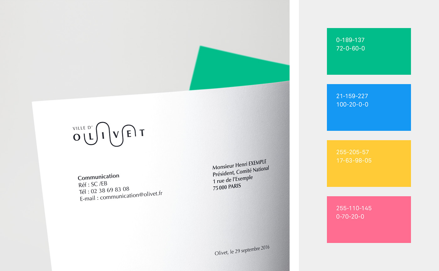
La typographie
The typography
The typography
[FR] Le caractère typographique choisi est l'Optima, qui allie élégance et lisibilité. En adoucissant la rigueur des lettres géométriques, ce caractère sans empattement s'inscrit dans la grande tradition des typographies humanistes. Complète, déclinée en de nombreuses graisses, elle permet de couvrir l'étendue des demandes de communication.
[EN] We choose the typeface Optima, that combines elegance and readability. By softening the rigor of geometric letters, this sans serif character is part of the great tradition of humanistic typography. Complete, declined in many emphasis, it can cover the various needs of communication.
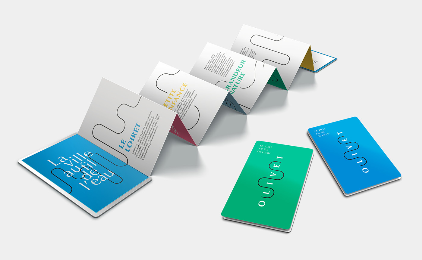
La ville au fil de l'eau
The city that follows the run of the river
[FR] En affirmant la mention "ville", cette baseline tire un trait sur la notion de "village" utilisée jusque là, au profit de notions équivalentes évoquant la douceur, le calme et la sérénité.
C'est le contraste entre l'idée de "ville" (tumulte, bruit, vitesse) et la notion de "fil de l'eau" (calme, douceur, nature) qui confère à cette baseline son charme et ses promesses.
[EN ] In affirming the mention "city", this baseline draws a line under the notion of "village" used until then, to the benefit of equivalent notions evoking gentleness, calmness and serenity.
It is the contrast between the idea of "city" (tumult, noise, speed) and the notion of "above the water" (calm, softness, nature) that gives the baseline its charm and promises.
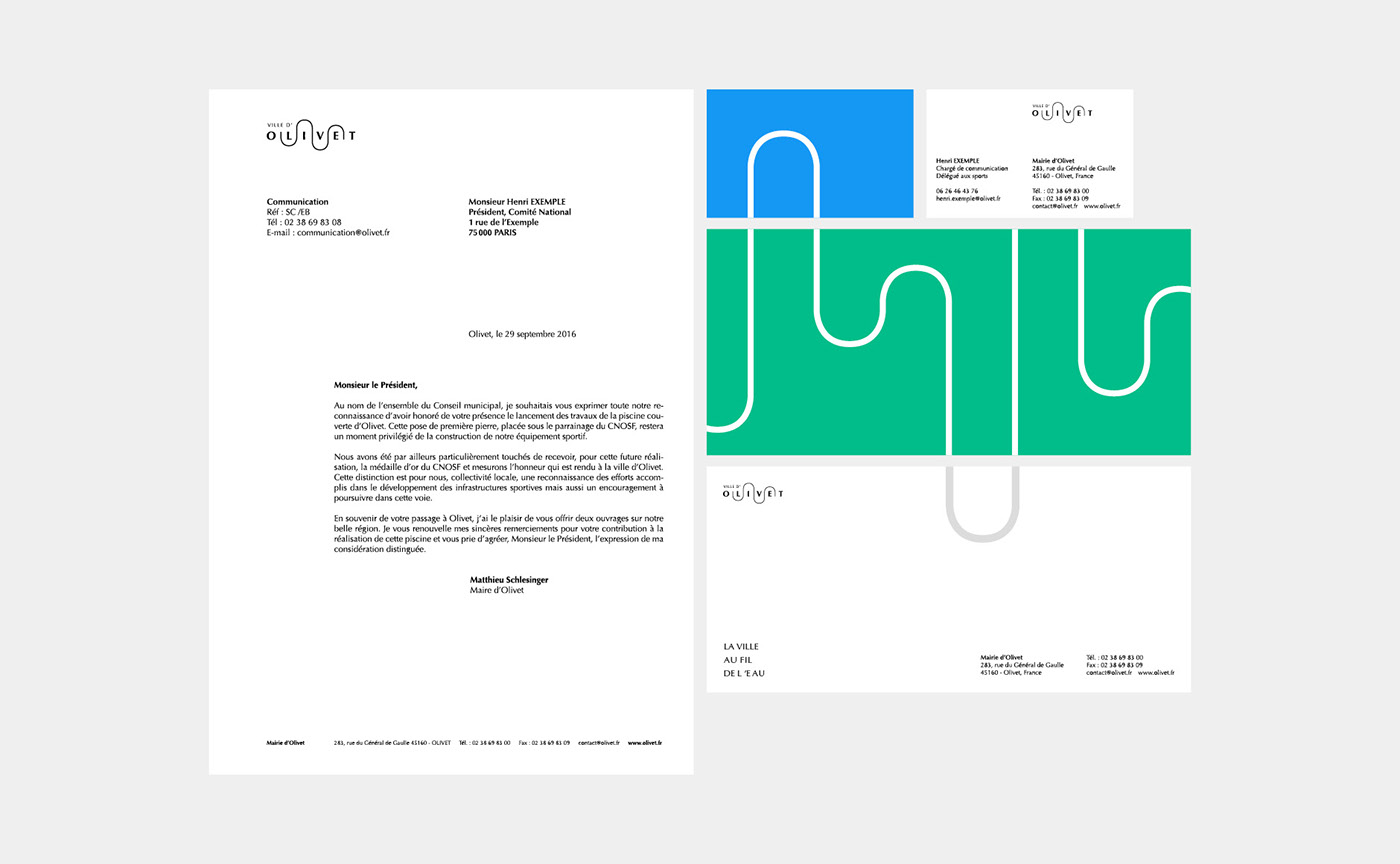
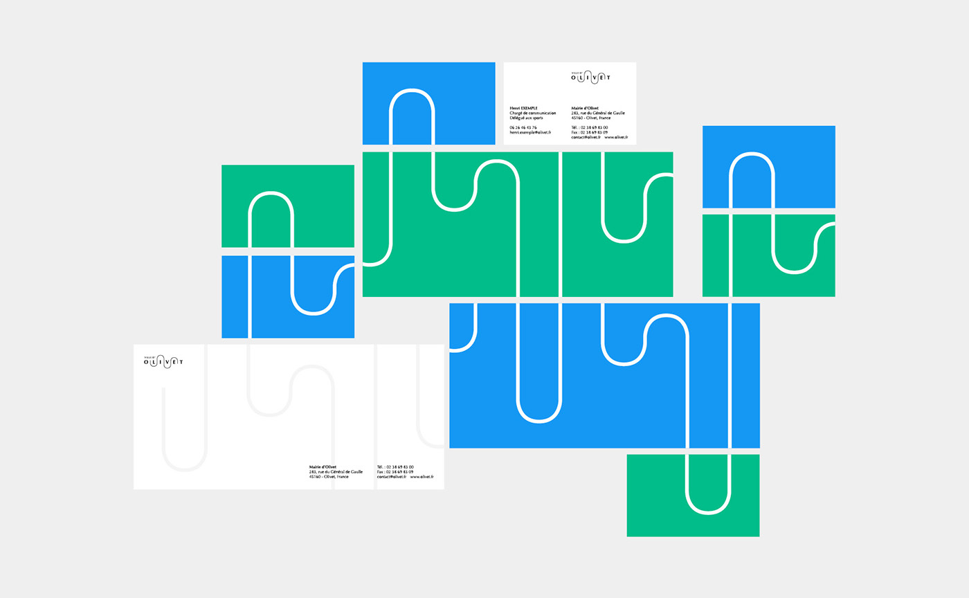
Jouons !
La charte graphique permet de poursuivre l'histoire du logo.
Le fil se déplie pour serpenter au grès des supports de communications, et inspirer de multiples déclinaisons.