
Process: Starting with the photo of a brown bear in a forest, I duplicated the image, made a selection of the bear, and masked the background of the photo. Then I went back to the original layer and "converted" it to black and white using a Gradient Map, and adjusted the Levels.
On the bear-only layer, I copied both the green and red channels. Then on the original layer, I loaded those channels as selections and copied them to new layers. The "red channel" layer I set to Screen at 70% opacity, to bring out the highlights on the bear. The "green channel" was also set to Screen at 100%, to bring out the medium tones. Then I added a Gradient Map over everything to "convert" to B/W.
To create the perforated metal look on the bear, I followed the tutorial in Ch 3 of "Down and Dirty Tricks," but I created a flower-shaped pattern for the perforation and set blend modes, beveling, and colors differently. I also duplicated the effects on a new layer, then applied a mask to that layer to reveal the bear underneath, and changed some of the effects to apply a slightly different look to the background.
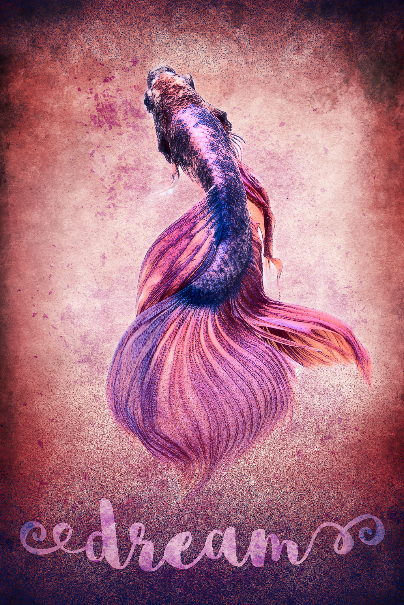
This was created from a photo of a Siamese fighting fish and texture photos of old burnt paper and smoke. I more or less followed the "Designing with Texture" tutorial in Ch 3, with several tweaks.
The background burnt paper layer was colorized to a reddish pink, then duplicated and the dup set to Overlay. Then I copied the paper's red channel, loaded it as a selection, and copied that to a new layer set to Screen to really pump up the lighter part of the paper. I did a little masking with gradients on that layer to bring the dark edges back in. Then I opened the smoke image, selected only the black (using Ctrl+Alt+2 and then Delete to get rid of any white in the layer), and brought that over to the paper. I made a few copies of it to make kind of a frame, set those to Overlay at 52%, then did more masking with gradients to soften them.
In the fish image, I duplicated the layer and masked the background on one layer, and applied the Grain texture effect on the other. I brought both of these stacked layers onto the paper and set the Grain layer to Multiply at 70%. Then I colorized the Grain layer so it would be a rich blue, to emphasize the blue splotches on the original fish. Then I copied the red channel of the original fish layer and made that into a new layer set to Vivid Light over both other fish layers, to emphasize the fish's highlights.
I made a new type layer and typed "dream." I really tried to think of something better, but it wasn't happening. But I made a path from that type layer, copied it onto a new layer, and filled it with a deep blue set to Screen. I copied the same path onto a new layer, inversed the selection, and used a linear gradient in the same blue, set to Dissolve at 75%, to partially fill in the negative space around the word.
Then I went back to the background layers and made a new layer on top of them, and used the gradient dissolve to add some corresponding blue grain to the top of the image. Finally, I made a new layer behind the fish layers, set it to Overlay, and used my favorite particle brush in the same deep blue color to add some splashes around/under the fish and in the word "dream."