This was a huge project I worked on while I was the Design Manager/Creative Director at National Semiconductor. The company shifted its corporate focus to power-efficiency. They needed a brand identity for this campaign. The name chosen was PowerWise. I directed the visual development of the PowerWise brand, from strategic positioning to identity, through marketing collateral with print and web campaigns. We hired the award-winning San Francisco design firm of Gee+Chung to design the logo. On the mark, the oval form suggest a wafer and compliments National's logo, the upward arrows conveys high performance, and the downward arrows symbolizes lower power.


This brochure had three purposes; to promote excitement from customers, adoption from employees and confidence from shareholders on the PowerWise brand.
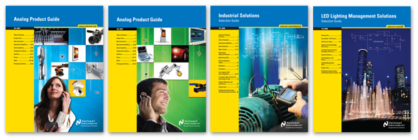
Previous Solution Guide examples before PowerWise:
National's Solution Guides were updated to reflect the new PowerWise brand. We emphasized the white space to convey the idea that National offers energy-efficient, simple solutions.

Before PowerWise, National's ads focused on an individual product or a family of products.

After PowerWise, we focused on promoting system-based solutions in key markets such as Portable Handheld Devices, LED Lighting, Communication Infrastructure and Automotive.

PowerWise Phase 1 Ads: Introduction of the PowerWise Standard

PowerWise Phase 2 Ads: System Ads

Concept for the employee communication posters celebrating National's 50 years of innovation. 24' x 36"


