I was asked to develop a stylistic language for the game's icons. Since the UI was very reduced and flat in a dark, desaturated tone, and the 3D-art of the game-world was designed in a rather lowpoly, rarely textured manner, I decided to render the icons in a cell-shaded look. A visual link between core- and meta-game. Also this style should be used for the consumable items in the shop. So it made sense to let the colors pop. Hopefully this will motivate our players to purchase our ressource- and booster-bundles.

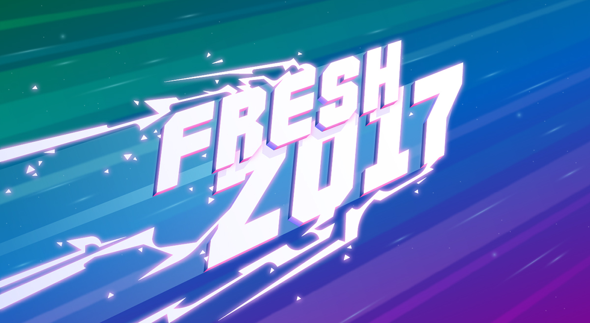
Another task was to design a few banners for our shop-offers. Usually these banners come along very noisy and full of glitter and fireworks. I was trying to find a balance between the catchy, loud typography that was expected by the stake-holders and the game's flat and reduced style. I made these three drafts playing with sci-fi-fonts, bold colors, decorative graphics and dynamic compositions - all staying within the cell-shading-range of the games 3D-assets.