Chromatic Ornate
Making a Chromatic Font for Virgin Wood Type
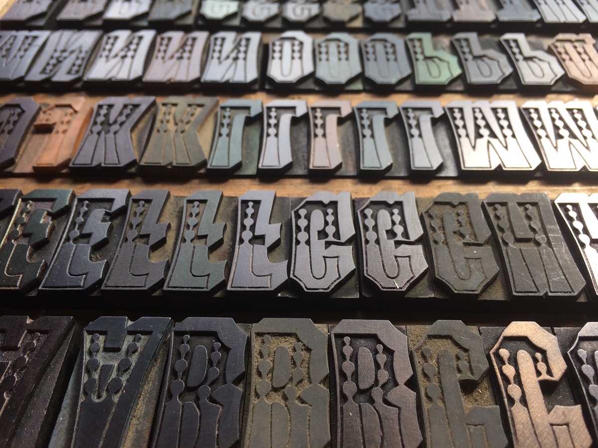
Virgin Wood Type has revived the art of producing Wood Type for printers, by purchasing the holdings of the American Wood Type Company, which traces it’s roots back to 1900. We now make Wood Type using the same font patterns and pantograph equipment used to make type for nearly a century. There was no instruction manual, no human knowledge passed down, so a good deal of relearning had to take place to get up and running. Now that Virgin is able to create excellent wood type, we decided to challenge ourselves by putting into production the first Chromatic type since the days of William H. Page & Co.


William H. Page & Company published Specimens of Chromatic Wood Type, Borders, &c. in 1874. Type made to print in two or more colors were first produced as wood type by Edwin Allen, and shown by George Nesbitt in his 1841 Fourth Specimen of Machinery Cut Wood Type. It is Page’s book, however, that used two-part type to it’s full “chromatic” potential.


Most dictionaries define Chromatic as “pertaining to color or colors”. So, as defined by the Page example, Virgin WT would define Chromatic Type to be a tw0-part font that when printed together creates the illusion of 3 or more colors.
We decided to revive Chromatic Ornate No. 1, because it had the right combination of difficulty and spectacular chromatic effect. We happen to have a copy of the one-part version of this font at our local Book Arts Center, the Flower City Arts Center, that we could proof to use as a jumping off point.
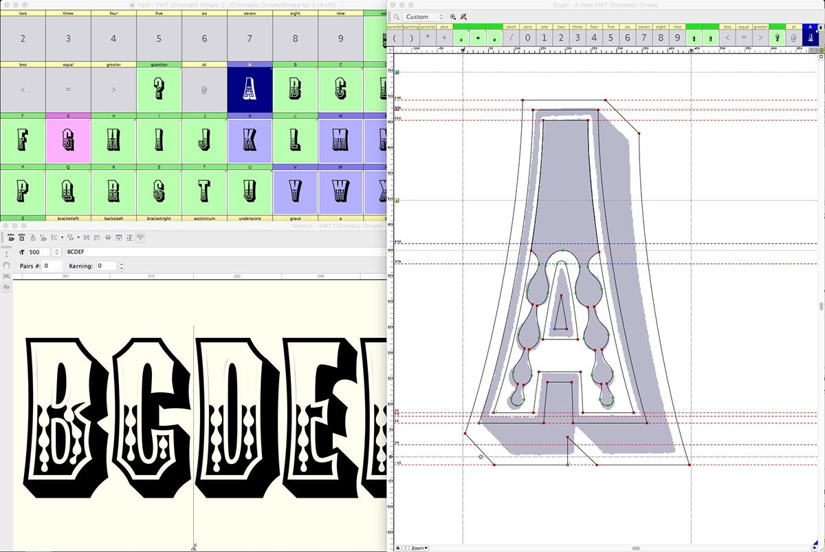
Drawing, redrawing, and modifying of the source material had to be done to compensate for our equipment and the constraint of the ratios we could accomplish on our pantograph router. We had to make the inline larger, and consequently the outline larger to match, and then the shadow in turn, changing the look from the original slightly.
The goal for the final wood type, is registration on press of two separate hand made blocks. Anecdotally, we understood that both parts of a two-part font should be cut from the same pattern, on the same machine, by the same person, at the same time, to ensure best registration possible. We had never seen any of Page’s patterns, because, as we understand it, they were all destroyed long ago when the company who bought out Page no longer felt they needed to continue making these fonts.
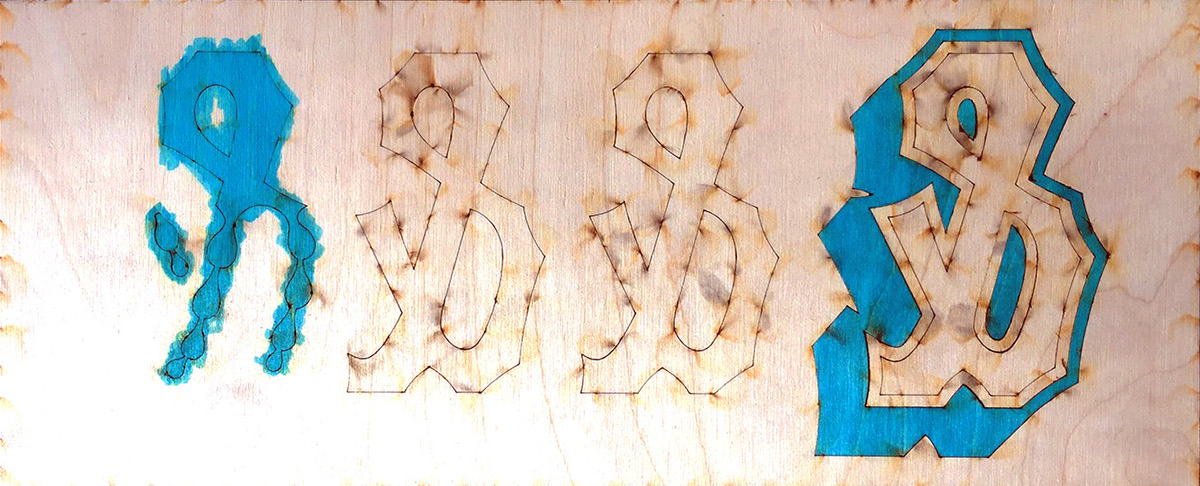
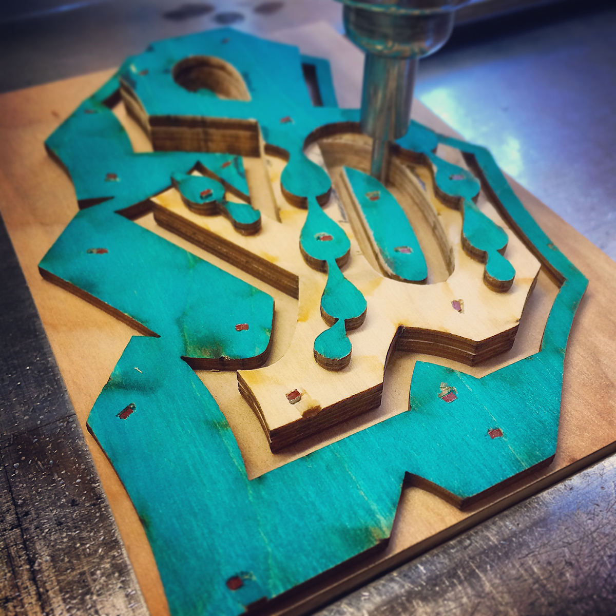
We figured we needed to make a two-layeded pattern, where both parts can be traced in one sitting without moving the pattern between cuttings. We had our digital drawings laser cut from thin plywood to assemble into a multilayer pattern. In our case, we ended up making a three-layer pattern to make it easier to cut the fill block, with a larger bit/follower ratio.
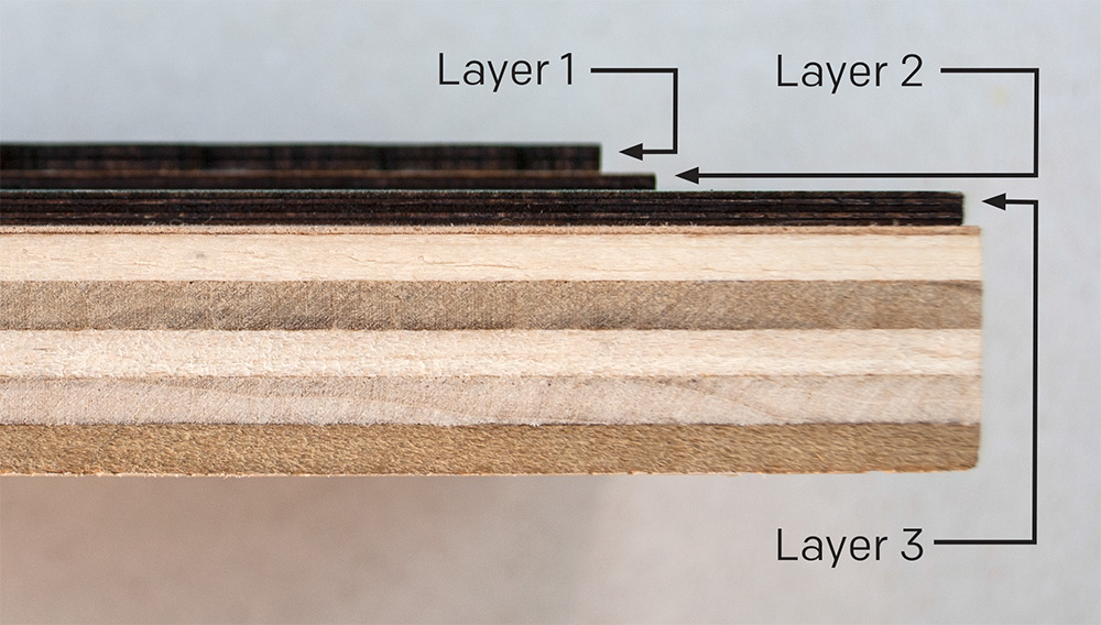
Because of the depth of a three layer pattern, we had to have custom followers (tracers) made by Raven Workshop that had longer tips and did not taper so that we could get down all three layers without any distortion.


Once the patterns are assembled, then the cutting takes place on our pantograph router. We specially prepare our wood from end-grain maple to type-height, then shellac and burnish to a smooth surface.

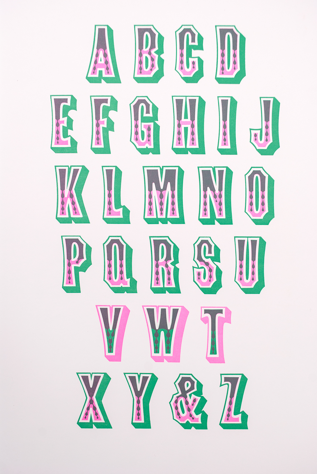
Success! When printing with the final type it registers and the two parts overprint a third color. The type is now in production in 12-line (that is wood type speak for 144 point), and you can get a font of your own at Virgin Wood Type.
