With a product inventory that spans from dining flatware and furniture to gardening tools and kids toys, A+R is an independent and internationally renowned resource for modern products, gifts, and furnishings.
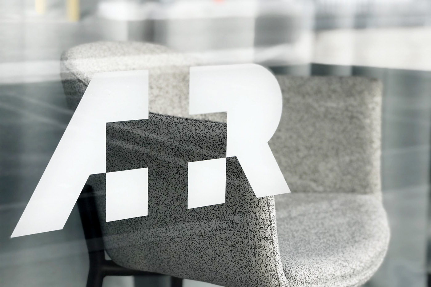
Ben Loiz Studio began to develop the identity for A+R in 2005. The name is a take on “artist & repertoire,” the music industry shorthand for the talent scouts who work as mentors, promoters and liaisons between creators and the world. A+R is also the initials of owners Andy and Rose. Using negative space to create the + sign, each letter is dependent on the other to finish the mark and create one whole.
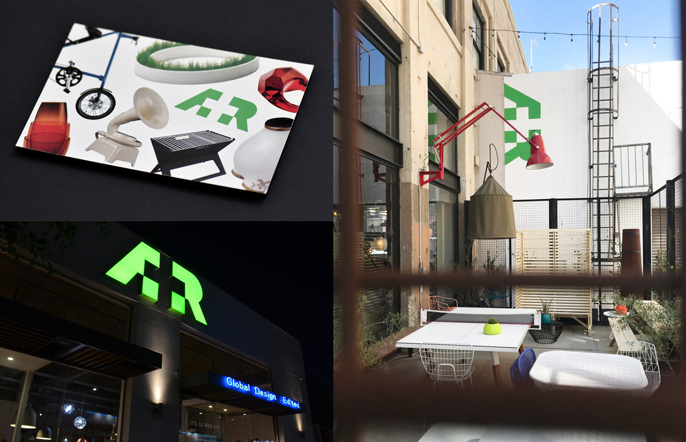
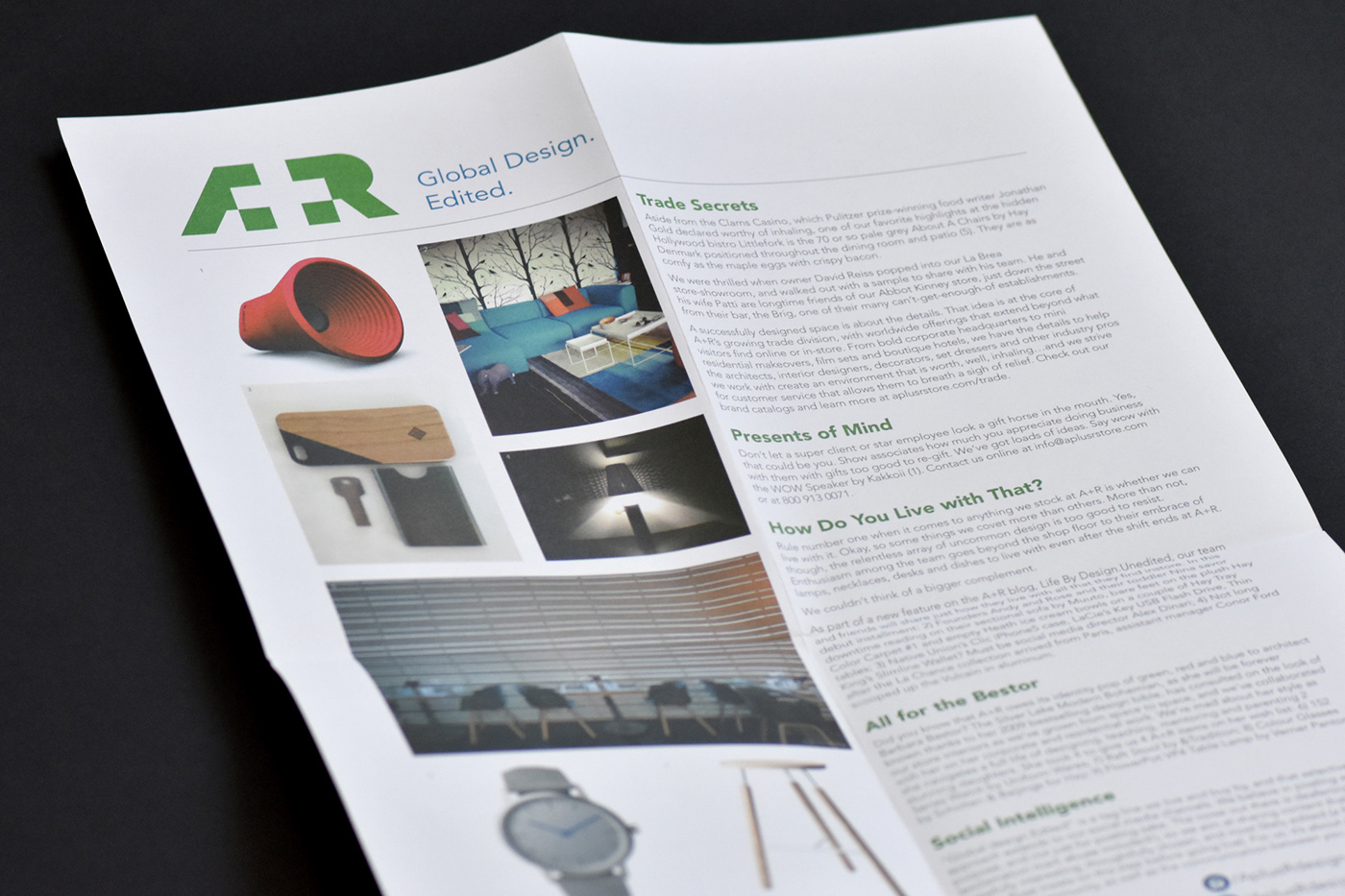
Following the logo, work began on a number of materials including a style guide, stationery, store front signage, promotional material, and an eCommerce website.
Since opening their first store in 2005 they have opened a number of new locations, each shop growing larger in scale, collection, and fan base.
A logo is the heart of a company’s identity, and Ben designed one for us that is modern, joyful, graphic—and the embodiment of what A+R is all about. We also engaged him immediately to design our website, which has been key to our success since the site launched in 2006. What’s more, he is professional, courteous, good-natured and understands what collaboration is all about. —Rose Apodaca, A+R Store
