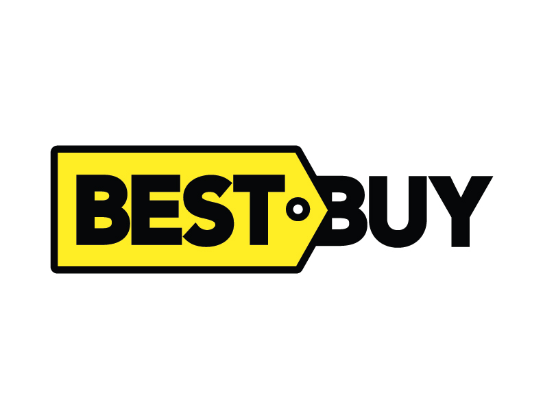
Best Buy is a well known electronics and appliance store. Their logo is quite dated so I took it upon myself to give them a new look. I tried a few different ideas but eventually decided that the yellow tag was something that had to stay! It is such an iconic symbol of their brand and well recognized; removing it runs the risk of being detrimental to the company. The tag is now used as an arrow pointing from what is best to where you can buy it.
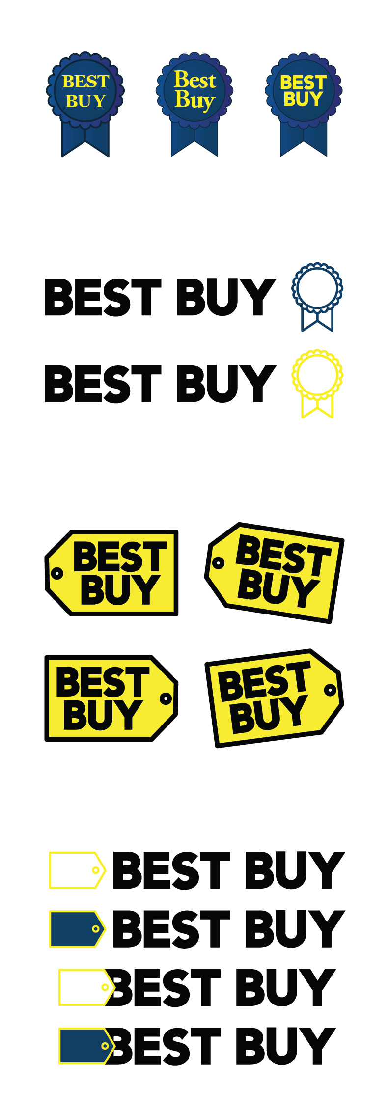
Below are some process logos that I explored along the way.