


2016
A brand all about community and second chances
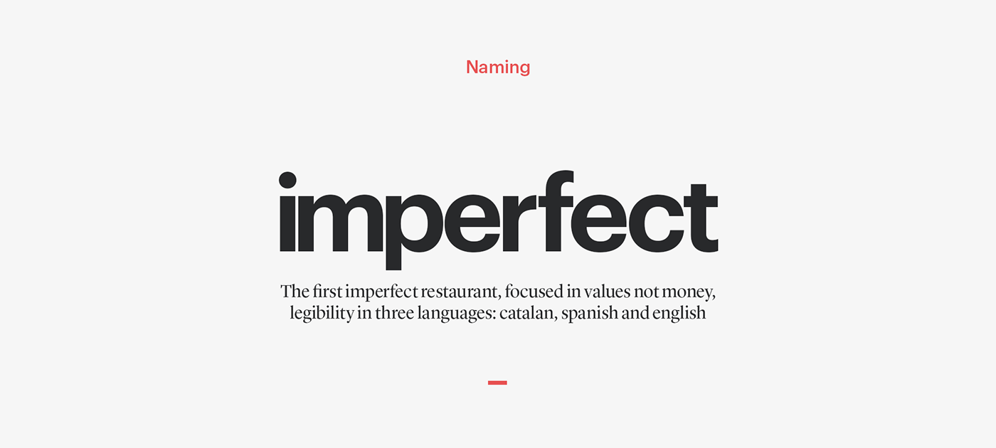
Imperfect
DESIGN FOR GOOD — BRANDING — RESTAURANT
Imperfect is a community restaurant that was created with the aim of helping people at risk of social exclusion to reintegrate into society, by offering personal help and training in catering. It is a local project that aims to serve the community and focuses on reintegrating people into society and work.
—
PROJECT DETAILS
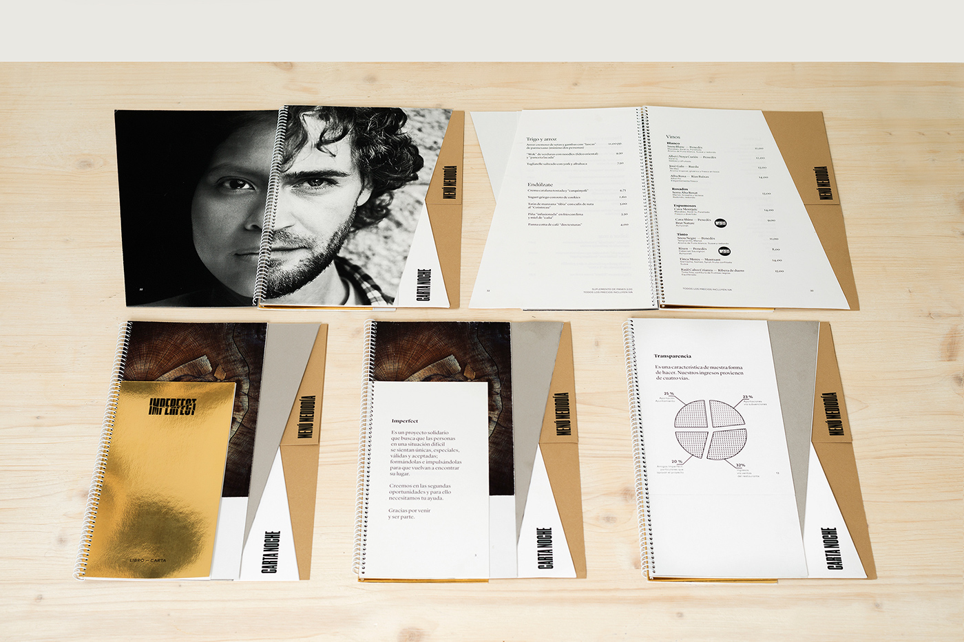
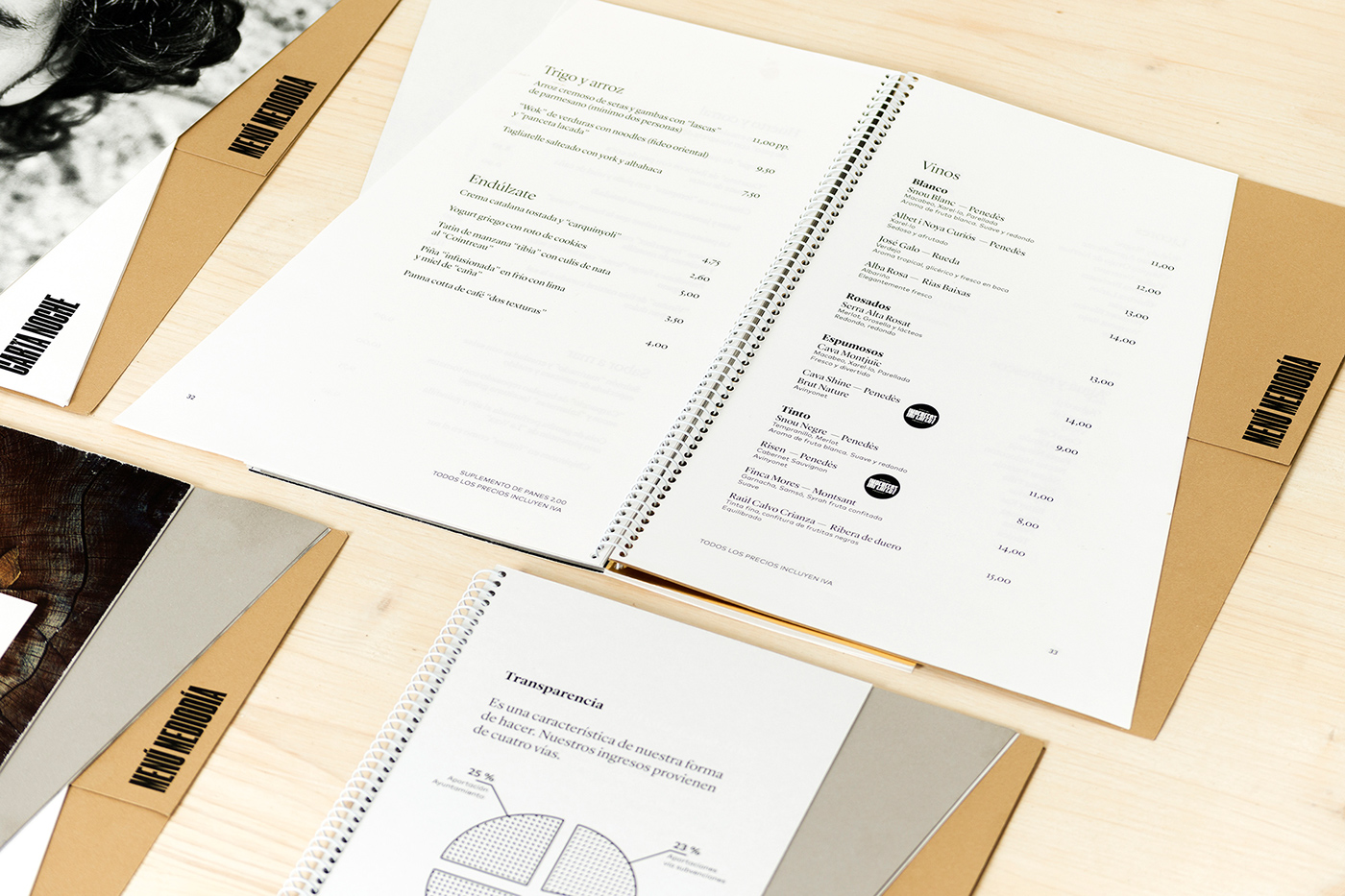
Paper: MATERICA + SIRIO PEARL BY FEDRIGONI & MATERICA LABELS BY ARCONVERT/MANTER
PRINT Tech.: DIGITAL OFFSET + SILKSCREEN
PHOTOS: KOLDO CAStILLO

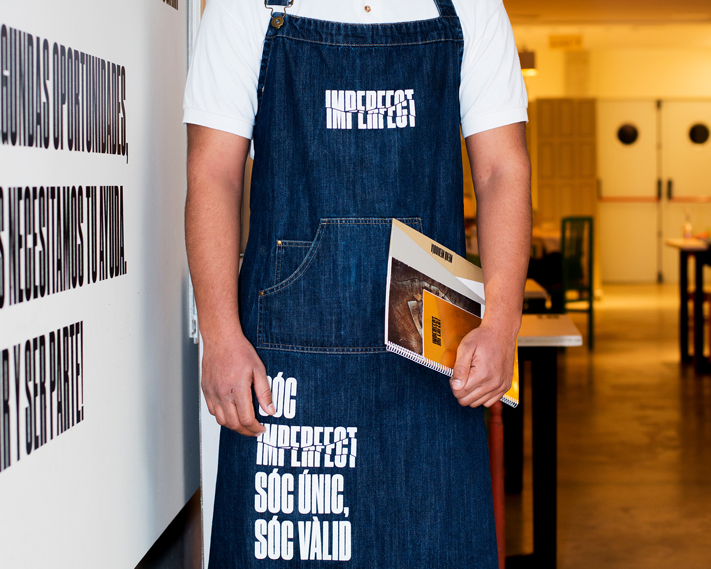
Text in image: Imperfect is a social project that helps people in difficult situations to feel unique, special, valuable and accepted. They are trained and they are encouraged to find their place again. We believe in second chances and we need you to help us to offer them. Thanks for coming along and being a part of it!

Our contribution
We created the brand strategy and identity and was in charge of the naming and the design of coordinated elements in the restaurant-café, as well as the signage. We also helped to design some of the spaces in the restaurant.

CONCEPT
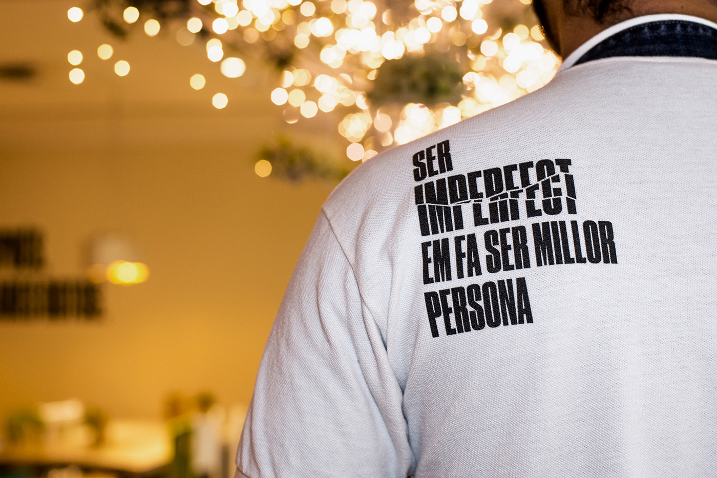
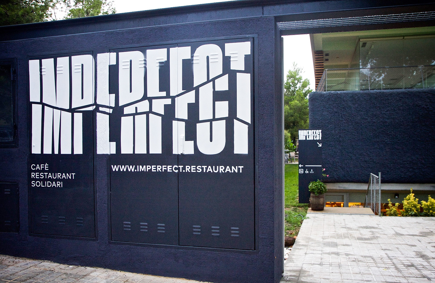
To develop the branding we drew on the philosophy of the Japanese technique of ‘kintsugi’, which views breakage and repair as part of the history of an object that should be displayed instead of disguised, as this history and transformation makes the object even more beautiful.


IDENTITY
We wanted to use design to communicate the message and values of Imperfect, and to help to promote a social project that has an impact on people – on those who take part in this social programme and also on the customers, as they are invited to reflect on and identify with the project when they come to the restaurant.
To develop the branding we drew on the philosophy of the Japanese technique of ‘kintsugi’, which views breakage and repair as part of the history of an object that should be displayed instead of disguised, as this history and transformation makes the object even more beautiful. Imperfect is ‘kintsugi’ applied to people.


The power of the message
We created an identity based on direct messages to users, to raise awareness of how ‘we love imperfection’, to highlight that imperfection can be useful and reused.
We speak in two languages, catalan and spanish in all communication pieces.

WABI-SABI INFLUENCE
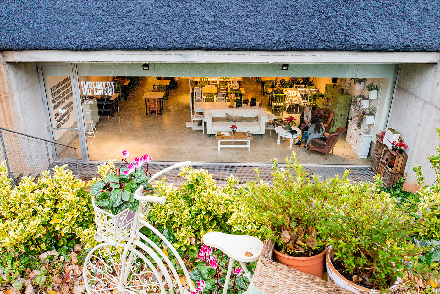
Using the aesthetic notion of ‘wabi-sabi’, a Japanese term that highlights ‘the beauty of imperfection’ and that is presented as elements with a natural or rustic look, or elements from nature, we wanted to give all the designed elements a warm composition, with materials that resembled nature, like recycled paper.
The identity had to be produced at a low cost, and to reduce the cost of the production of the printed elements we worked in collaboration with Fedrigoni and Manter.


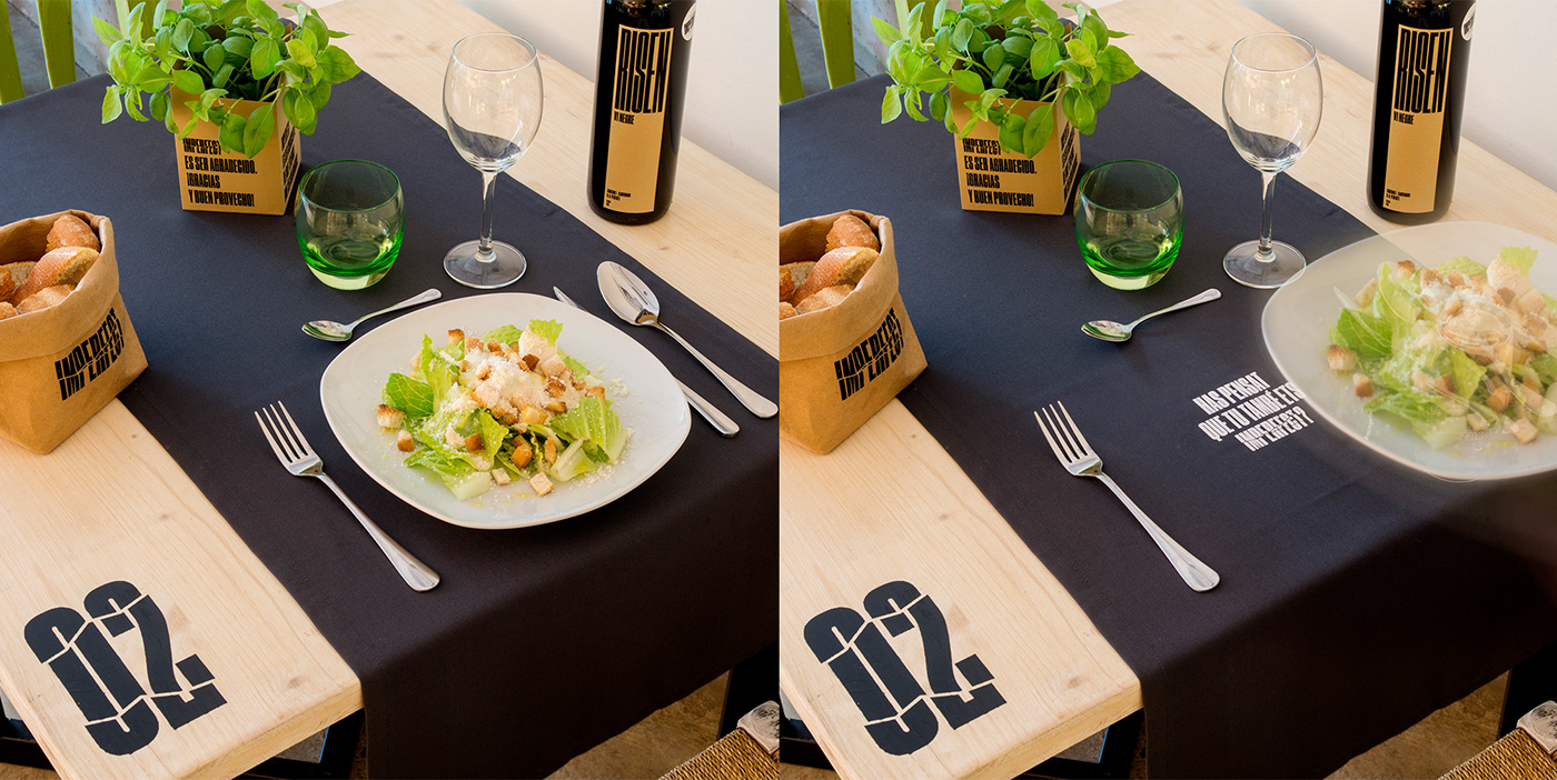
SPACE DESIGN
We designed the exterior signage and some details of interior design.
» Furniture design by Maren Barcelona
» Illustration by Carla Cascales


Imperfect is a clear example
of design for good.
Using design combined with a low-cost production,
we can create the ideal atmosphere
that helps to improve society


