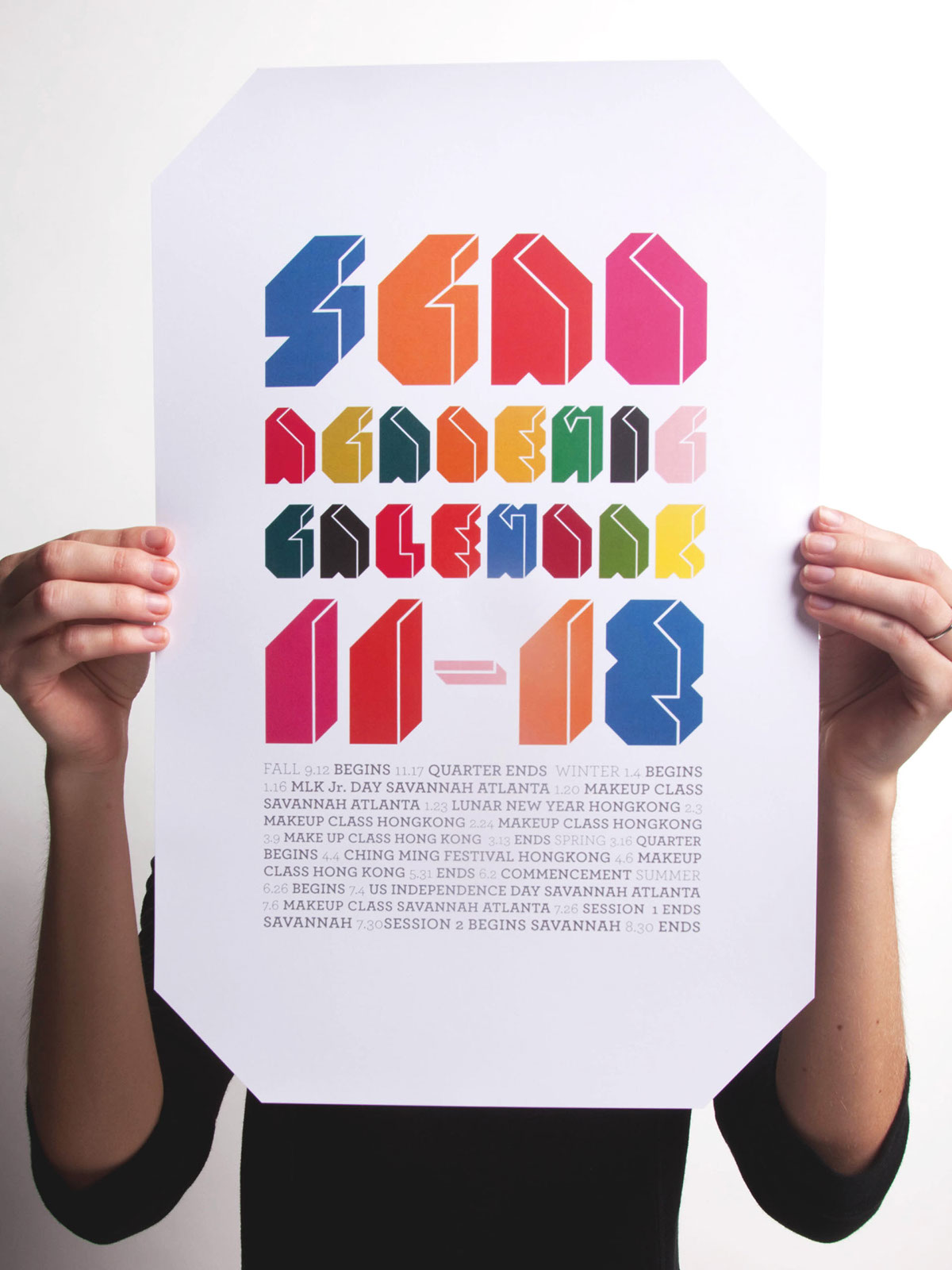
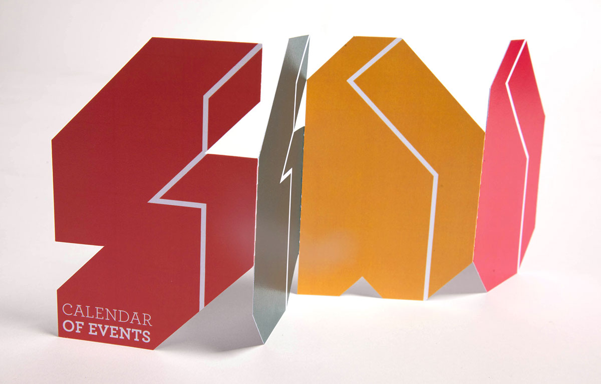
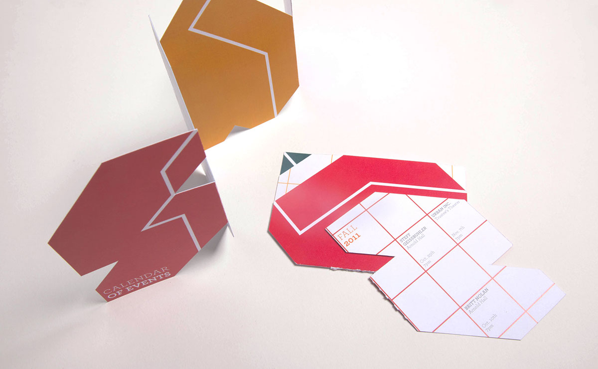
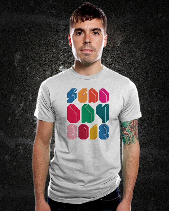
L7 Typeface
February 2011
A typeface created with the intentions of being both the type and image in the design. The multicolored letters definitely give the face visual interest and give it the pull to act as both type and image.
The name of the typeface, L7, was inspired by a quote from one of my favorite movies, The Sandlot. At one point, one of the characters called the other an L7 Weenie, which is a fancy way of calling someone a square. And because my typeface is so geometric I decided that it was a very fitting, appropriate, and fun name.
Submitted by the Savannah College of Art and Design to the Type Director's Club National Student Competition in New York City.