

The brief I received from the founder and CEO of Can before designing the logo for her company.

The Moodboard using pictures of the Can office and pictures of textures and colors from paintings and artworks around me that are relevant to the idea of "recycling and redesigning" of Can and are going to determine how exactly the brand will look and feel like in the future.

Analysis of colors used for objects produced by Can (or should I say re-produced!)

First thoughts and trials inspired from the OOBA bookstores project.


Some developments of the logo after a first feedback from my client.

Finalizing the logo and adding some extra elements.

Adding the slogan and trying different ways of saying the same thing.

Emphasizing the word "Redesigned" was important for the client.
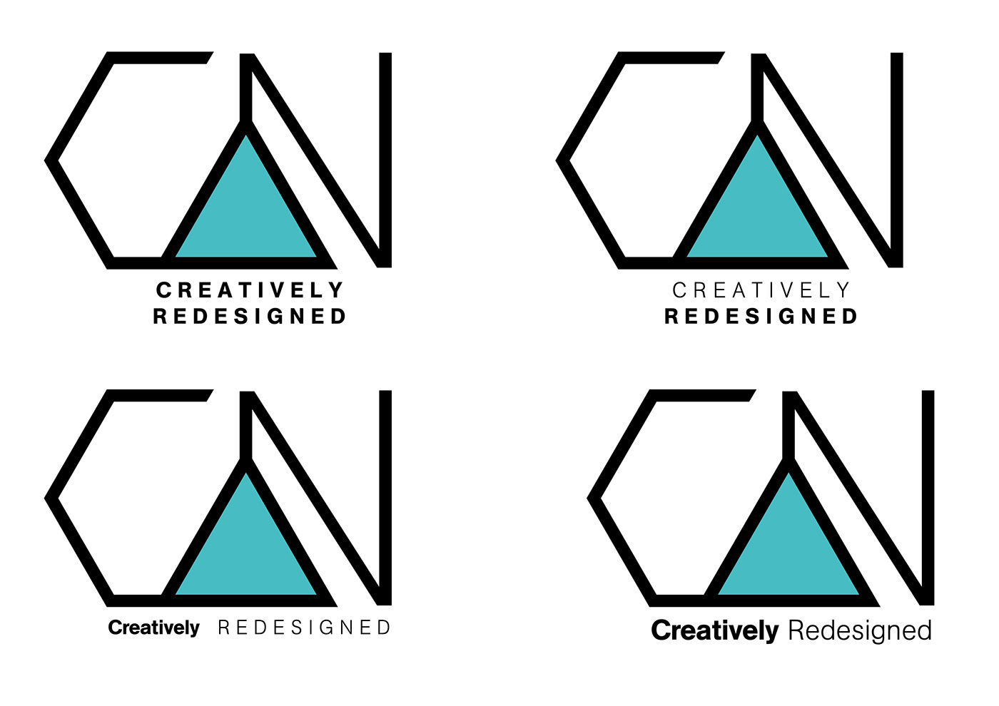
Emphasizing the word "redesigned" by using different methods.

Final logo. The angles convey the feeling of rough recycled materials used to redesign an object. The A is simplified and emphasized to underline the simplicity of Can's productions. Also the "N" is connected to the A as the A is connected to the C and this is to show how new things can be built out of other things and by connecting other things.


