Read the small print.
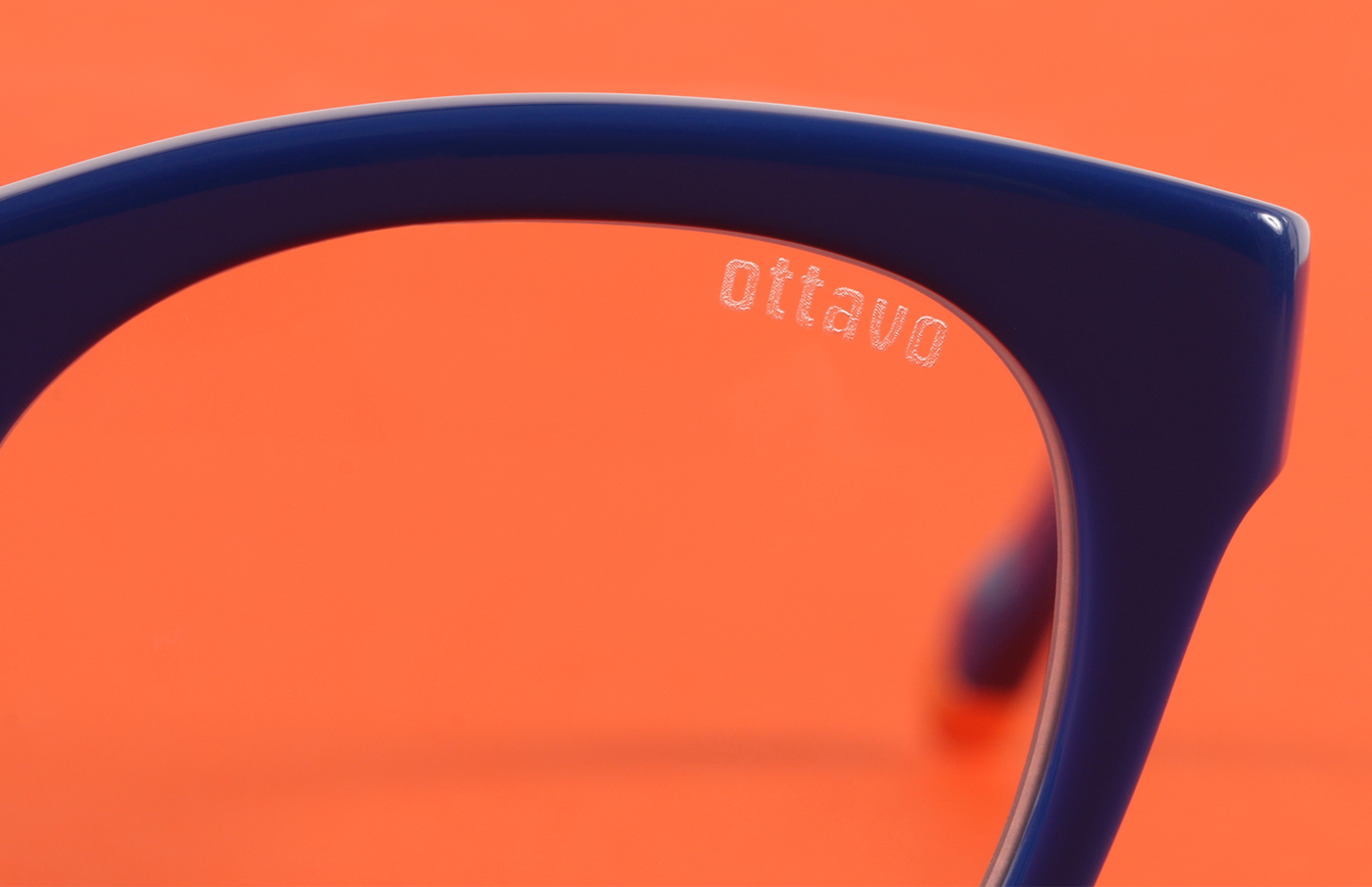
We partnered with designer eyewear company, Eponym, to develop a new line of reading glasses for a consumer base that’s cultured, confident, and searching for readers that don’t come from a drug store. The spirit of Italian modernism defined everything from the name to the packaging and details of the product design.
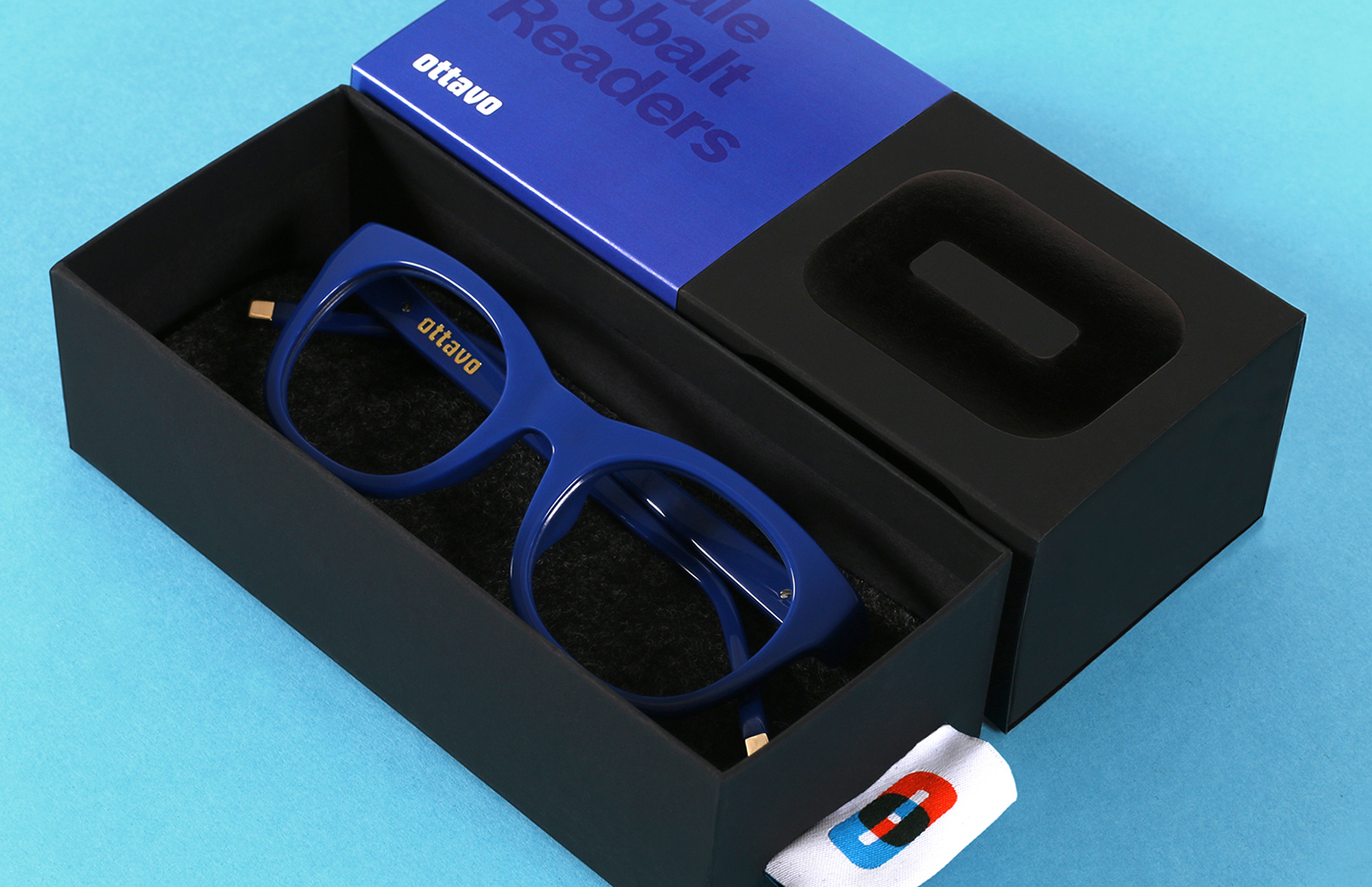
We designed the packaging with luxurious materials and the credo that form follows function: a belly band allows a single box to be used for many combinations of lens powers, shapes, and colors; and the tag on the glasses sleeve doubles as a pull to upon the box.
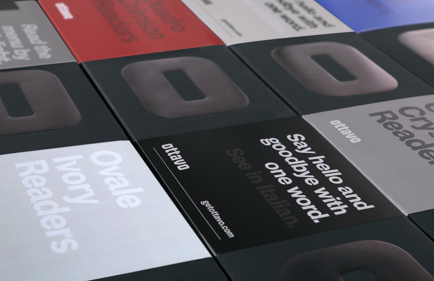

The brand’s modernist ideals are expressed through a minimal color palette, plenty of negative space and clean sans serif typography, lightened by an irreverent tone of voice.


