


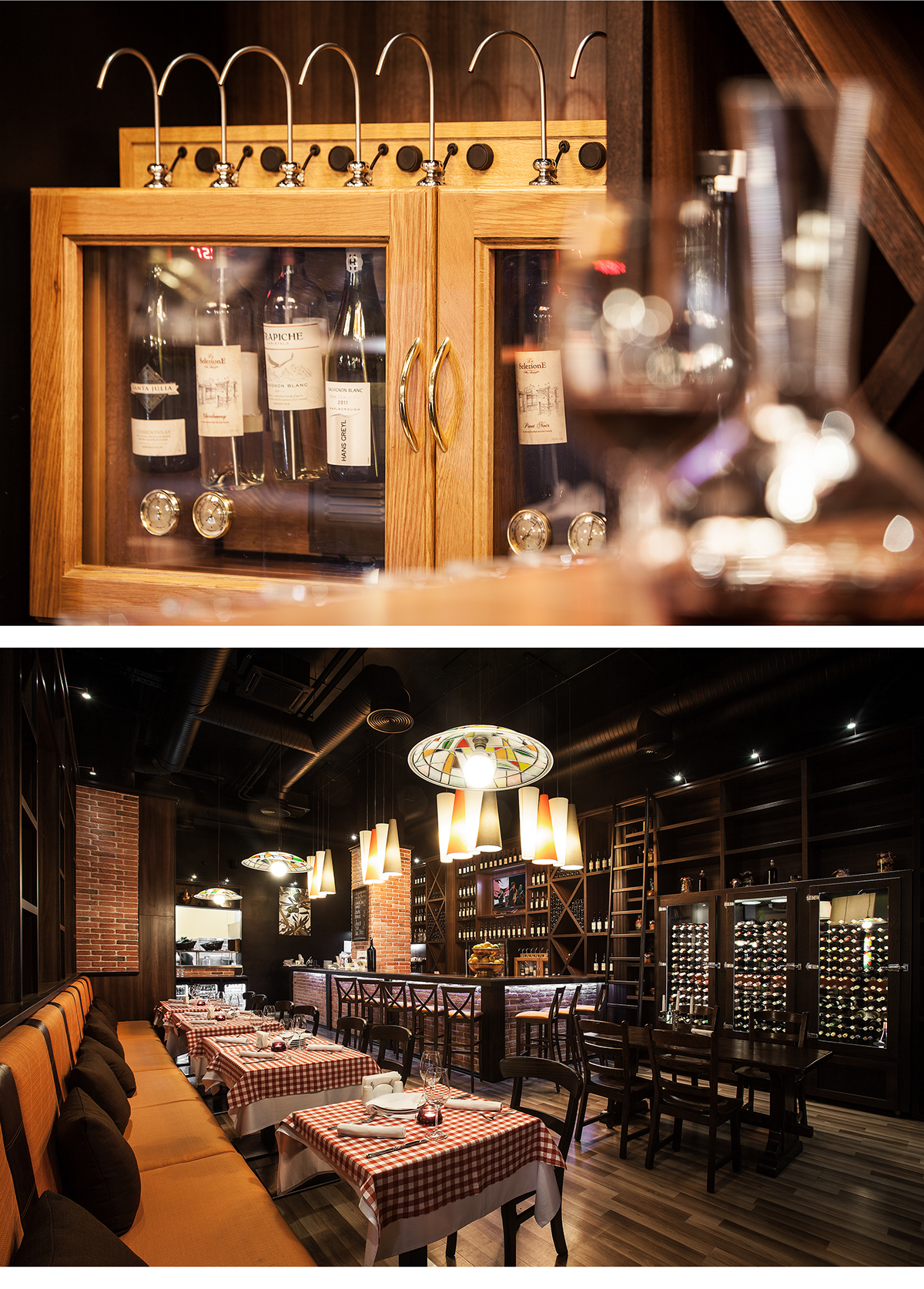
La Pastaria offers authentic Italian cuisine with a contemporary twist. So we were able to create an identity rooted in the Italian culinary world, but reflected the freshness and joy of life alongside with tradition.
The iconic graphic olive tree was a way to tell the story behind the brand name and the vision of the founders. The menu cover, table pads and brand stationary were all centered around the olive tree as a symbol of La Pastaria.


La Selezione is a collection of fresh home-made pasta, sauces, desserts and special wine list - selected tastes from the kitchen of La Pastaria, offered in package for preparing a real Italian dinner at home.
We identified that important lack of differentiation between these products and mass produced alternatives and presented it in the label design.
The hand made graphics of the main ingredients appreciate nature’s vibrant curves and assorted shapes and highlight the essence of Italian cuisine and focus on authentic flavors of Italia.


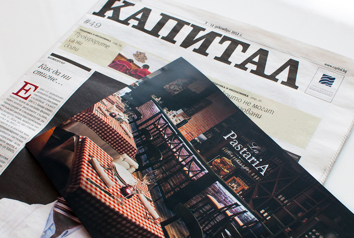
We used an impactful creative approach to integrate La Pastaria`s successful brand design, graphic symbols, food photographs and menus across multiple media and target groups.


The delivery menu of La Pastaria changes in pace with the four seasons but the passion and quality of their service is constant and recognizable - just like the famous scooter Vespa as the icon of the Italian style which we launched as another graphic symbol of La Pastaria brand for its delivery service.


