

CNMS Office Lobby Interactive Display
Background
The College of Natural and Mathematical Sciences (CNMS) at UMBC comprises of several academic departments, including Biological Sciences, Physics, Chemistry and Biochemistry. CNMS coordinates research and education and supports its students, faculty, and staff.
Project
The college had acquired a touch-screen display they hoped to use to replace having a front desk in the lobby. My role was to design and develop an interactive interface using Rise Vision. The features required were an advising appointment check-in for students and an office map (the layout of the office is very confusing).
Process
At the beginning, there were a lot of ideas thrown around, like the weather and recent news about the department. There was trouble trying to fit all these in and the resulting initial versions of the display looked cluttered.
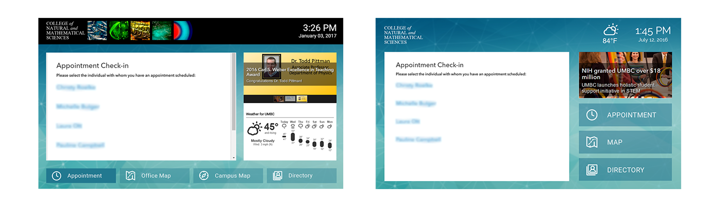
Left: first version. Right: third version; weather was reduced but there are still issues with visibility of the features.
I conducted informal usability testing by watching people as they used the display in order to understand where they get confused or stuck and why did they get confused. I learned that just hovering by them creeps some people out and explaining that I made the design caused a Hawthorne effect, so I ended up pretending that I was also a student just waiting in line to check-in.
Students were having trouble figuring how to check-in and either I or an advisor had to show them how to use it. I originally had the office map being the “home page” (rather than the appointment check-in, since students already knew they had to use the kiosk), hoping more people would see it as they walked in, however visitors just walked by it and found someone to ask for directions. So not only did it look cluttered, people couldn't find anything or even knew what was there.
Lesson Learned
Focus on what the client needs.
The features had to be reduced to what was absolutely necessary for the goals of the display. The weather wasn’t that useful, as if you were to walk out of the office, the glass doors of the building would be right across. Showing recent news also was unnecessary because that wasn’t what the users would use the kiosk for and people would not be standing around long enough to view it.
Final Design
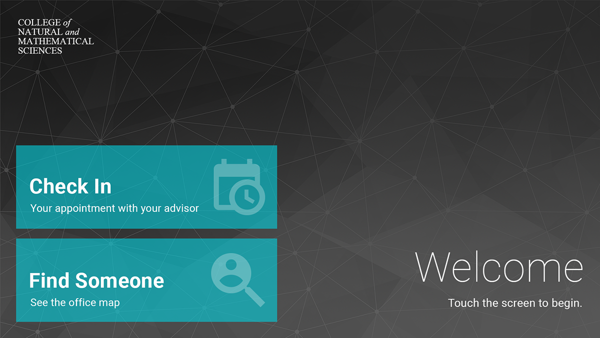
The “home page” was changed to focus on the two required features, check in and the office map. It was made clearer that this is an interactive display, not one that just shows circulating information. The display has been reduced to two possible actions, making it clearer what you can do and easier to understand and find what you need. One feedback after the new design was implemented was, “That’s great that you added the office map! We really need that, people are always having problems finding us.” The office map had been included since the beginning, so that really spoke to how bad the initial designs were and how much better the visibility of the final design is.
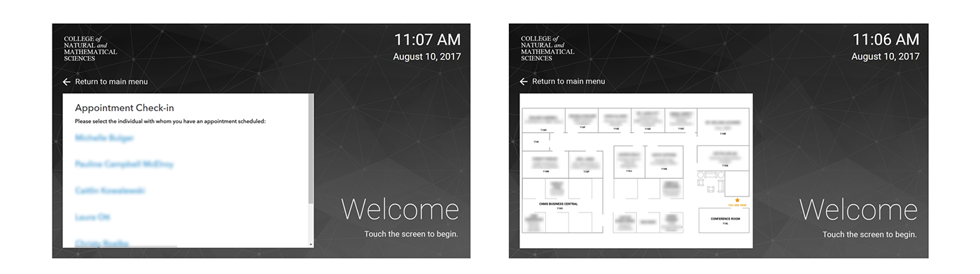
Left: appointment check-in screen. Right: Office map screen.
Results
There has no longer been a need for me or staff to assist students with checking in. This may be partially because the final design was implemented later in the semester, when most students had gotten used to using the kiosk in general and the technical issues had been ironed out. However, students are also spending less time at the kiosk than they did with the old designs.

