DIN Text® Condensed Pro
Copyright ©2002
Designer: Panos Vassiliou
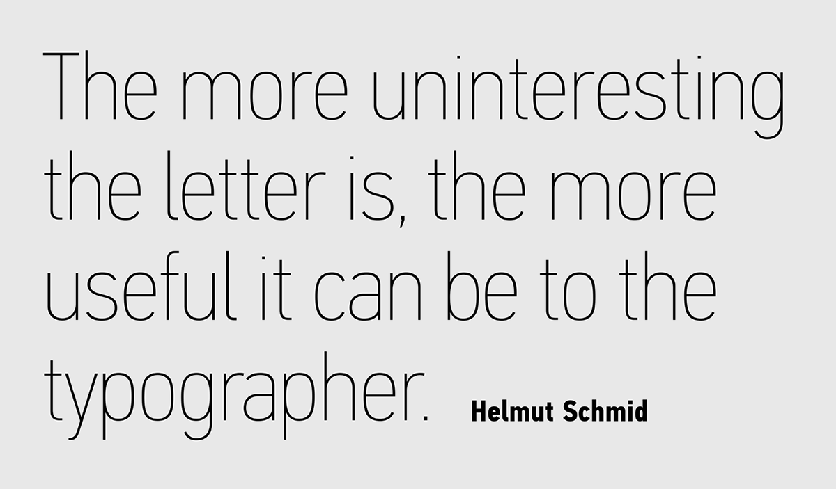
The purpose of the original DIN 1451 standard was to lay down a style of lettering which is timeless and easily legible. Unfortunately, these early letters lacked elegance and were not properly designed for typographic applications. Ever since its first publication in the 1930s, several type foundries adopted the original designs for digital photocomposition. By early 2000, it became apparent that the existing DIN-based fonts (which were limited to a few Latin-only styles) did not fulfill the ever-increasing demand for additional styles as well as support for languages other than Latin.
Parachute® was set out to fill this gap by introducing the PF DIN Text type system in 2002, which ever since has become one of the most functional, reliable, convenient and sophisticated DIN series. Based on the original standards, it was specifically designed to fit typographic requirements. Its letterforms divert from the stiff geometric structure of the original and introduce instead elements which are familiar, softer and easier to read.It was completed in 2002 as a group of 4 families which included condensed and compressed as well as a special display version. In 2010, Parachute® released 4 new families DIN Monospace, DIN Stencil, DIN Text Arabic and DIN Text Universal. Altogether, the Parachute DIN series is a set of 8 original superfamilies with a total of 102 weights. With its vast array of weights, the extended language support, but most of all its meticulous and elaborate design, it has been proven valuable to numerous design agencies. Ever since its first release, it has been used around the world in diverse editorial, packaging, branding and advertising campaigns. It was quoted by Publish magazine as being “an overkill series for complex corporate identity projects”.
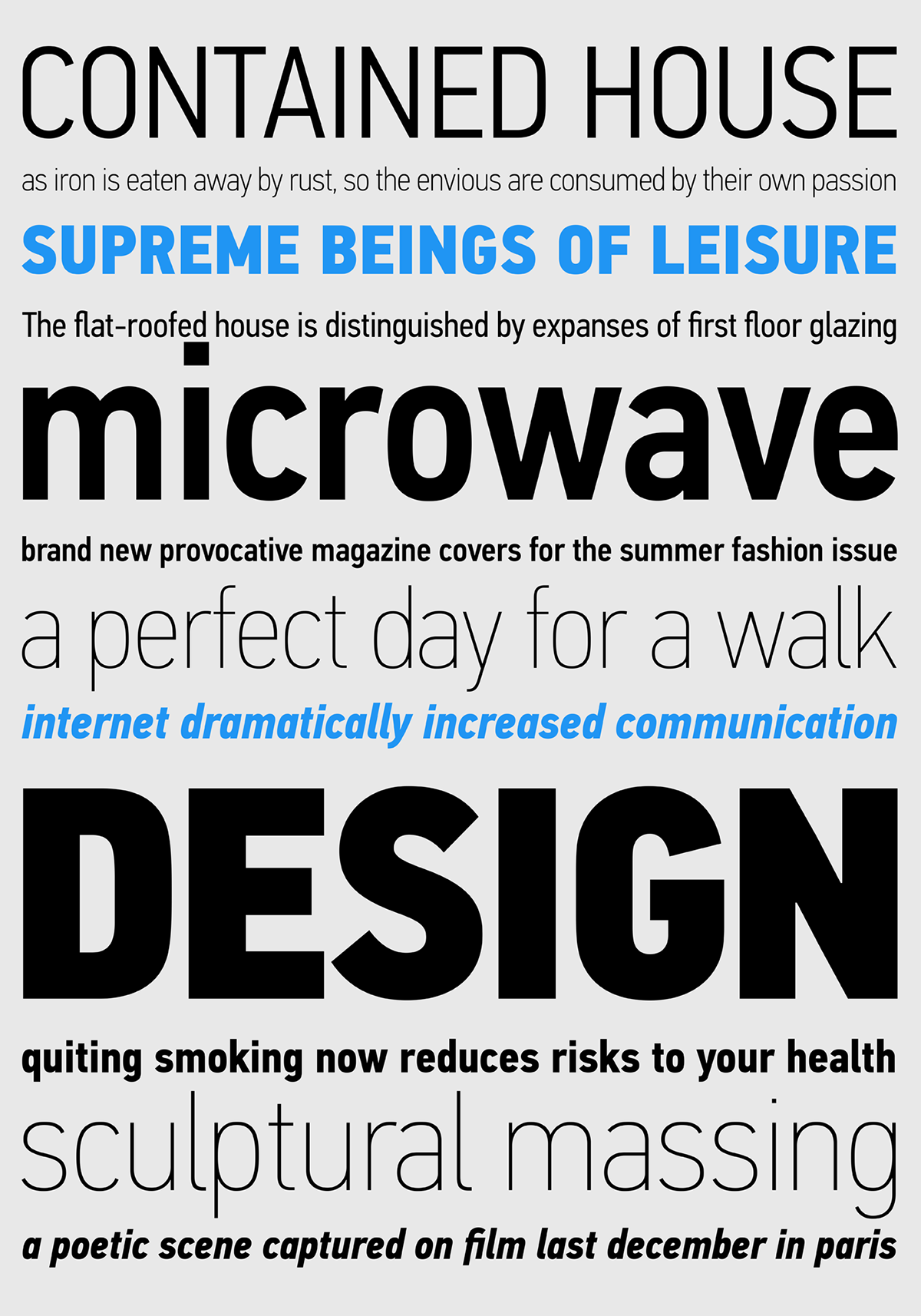
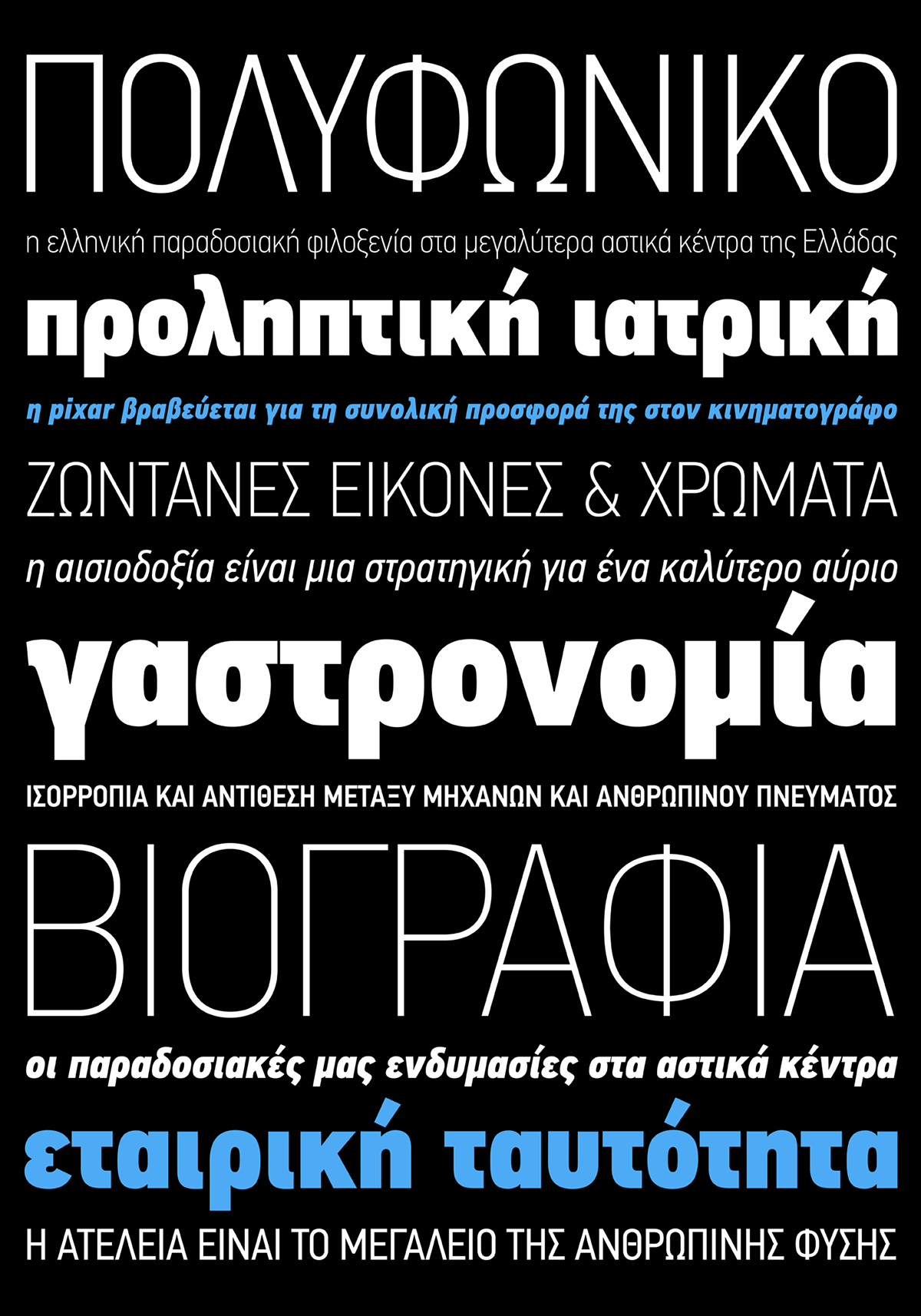
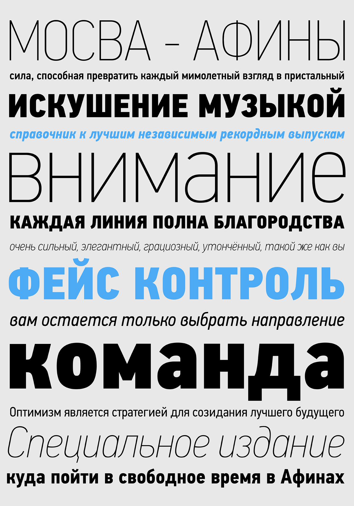
The latest condensed version 3.0 includes new glyphs such as the German capital sharp s, Russian rouble, Ukrainian Hryvnia, Azeri and Kazakh letterforms, kerning and enhanced language support in all family variations. The whole PF DIN Text type system includes 51 weights from Hairline to Extra Black including true-italics. Additionally, every font in the Pro series is powered by 270 very useful symbols for packaging, environmental graphics, signage, transportation, computing and fabric care.
Parachute® was set out to fill this gap by introducing the PF DIN Text type system in 2002, which ever since has become one of the most functional, reliable, convenient and sophisticated DIN series. Based on the original standards, it was specifically designed to fit typographic requirements. Its letterforms divert from the stiff geometric structure of the original and introduce instead elements which are familiar, softer and easier to read.It was completed in 2002 as a group of 4 families which included condensed and compressed as well as a special display version. In 2010, Parachute® released 4 new families DIN Monospace, DIN Stencil, DIN Text Arabic and DIN Text Universal. Altogether, the Parachute DIN series is a set of 8 original superfamilies with a total of 102 weights. With its vast array of weights, the extended language support, but most of all its meticulous and elaborate design, it has been proven valuable to numerous design agencies. Ever since its first release, it has been used around the world in diverse editorial, packaging, branding and advertising campaigns. It was quoted by Publish magazine as being “an overkill series for complex corporate identity projects”.
The latest condensed version 3.0 includes new glyphs such as the German capital sharp s, Russian rouble, Ukrainian Hryvnia, Azeri and Kazakh letterforms, kerning and enhanced language support in all family variations. The whole PF DIN Text type system includes 51 weights from Hairline to Extra Black including true-italics. Additionally, every font in the Pro series is powered by 270 very useful symbols for packaging, environmental graphics, signage, transportation, computing and fabric care.