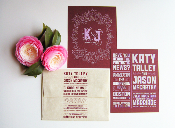
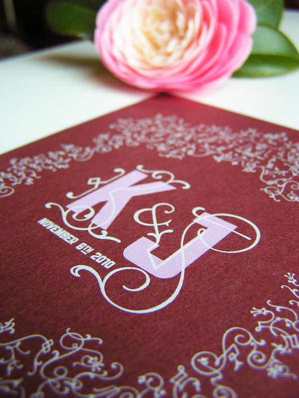
These Save the Dates are an excellent example of what happens when Derek and I really come together on a project for RageHaus. At first, we each played around with a few design concepts and eventually we ended up taking our strongest ideas and combining them. Even though our personal styles are extremely different, there's just something special that happens when we combine the two. My style leans towards organic, illustrative typography and imagery. Where as Derek's style leans towards brash, rambunctious typography and imagery. Both styles are clearly represented in this design. Between the strong typography and the delicate ornamental elements, we were able to create a modern, yet elegant Save the Date card. Once those were taken care of, we extended the design and copywriting to the flap-side of the envelope.
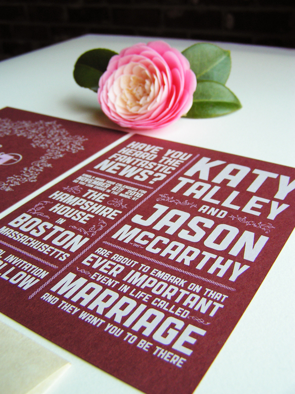
Specifically, the cards were two color screen prints on both sides with white and light pink ink on Wine Speckltone French Paper.
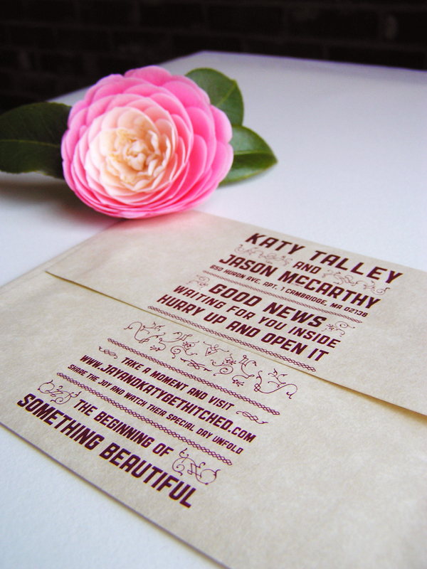
For the envelopes, we wanted to counteract the weight of the dark cards with Aged Parchtone French Envelopes. The ink for the envelopes was matched to the color of the Wine Speckletone. All of which was pulled, by hand, in our closet.

The color palette of maroon, soft pink and white turned out to have a warm, romantic quality. Perfect for a November wedding.
Featured on Oh So Beautiful Paper.
Featured on Oh So Beautiful Paper.

