MAD Architecture – Identity
MAD architects Marie-Lyne and Anthony's work is contemporary and geometric. But what is especially different about them is the sustainability in their design – they recycle and reuse objects and materials in unusual ways and places.
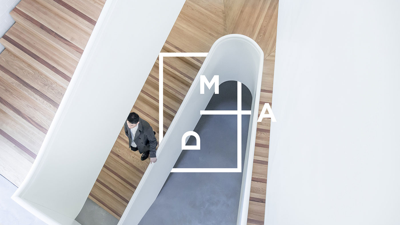
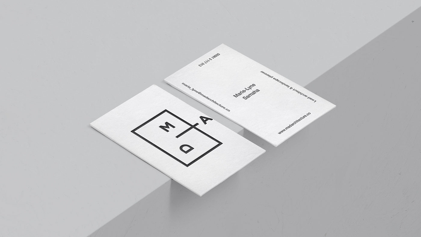
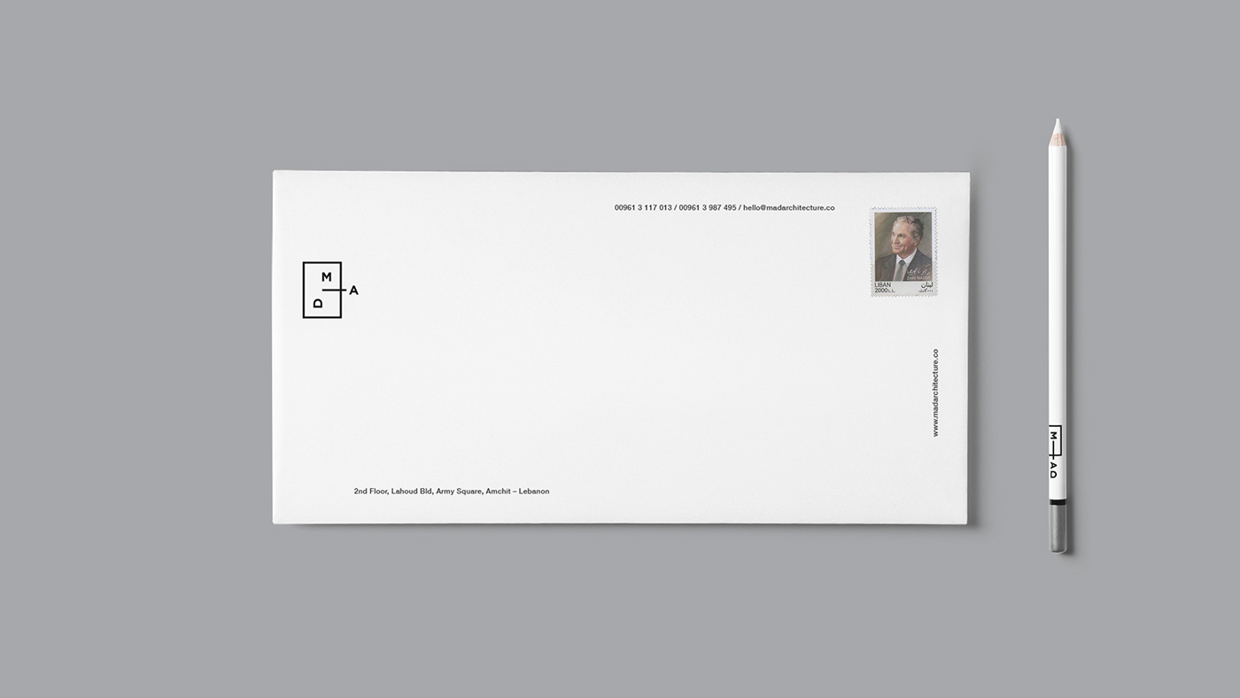
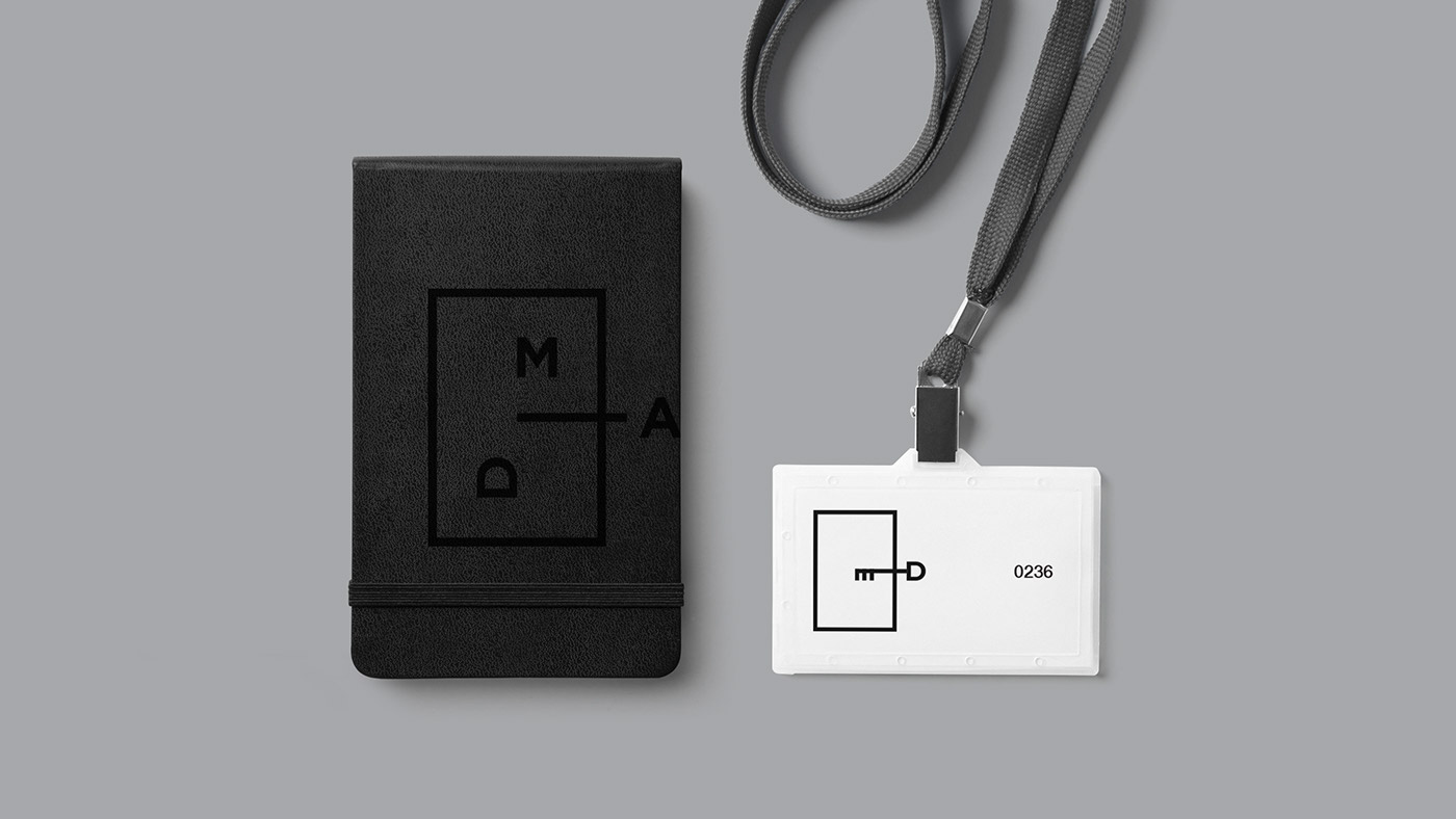
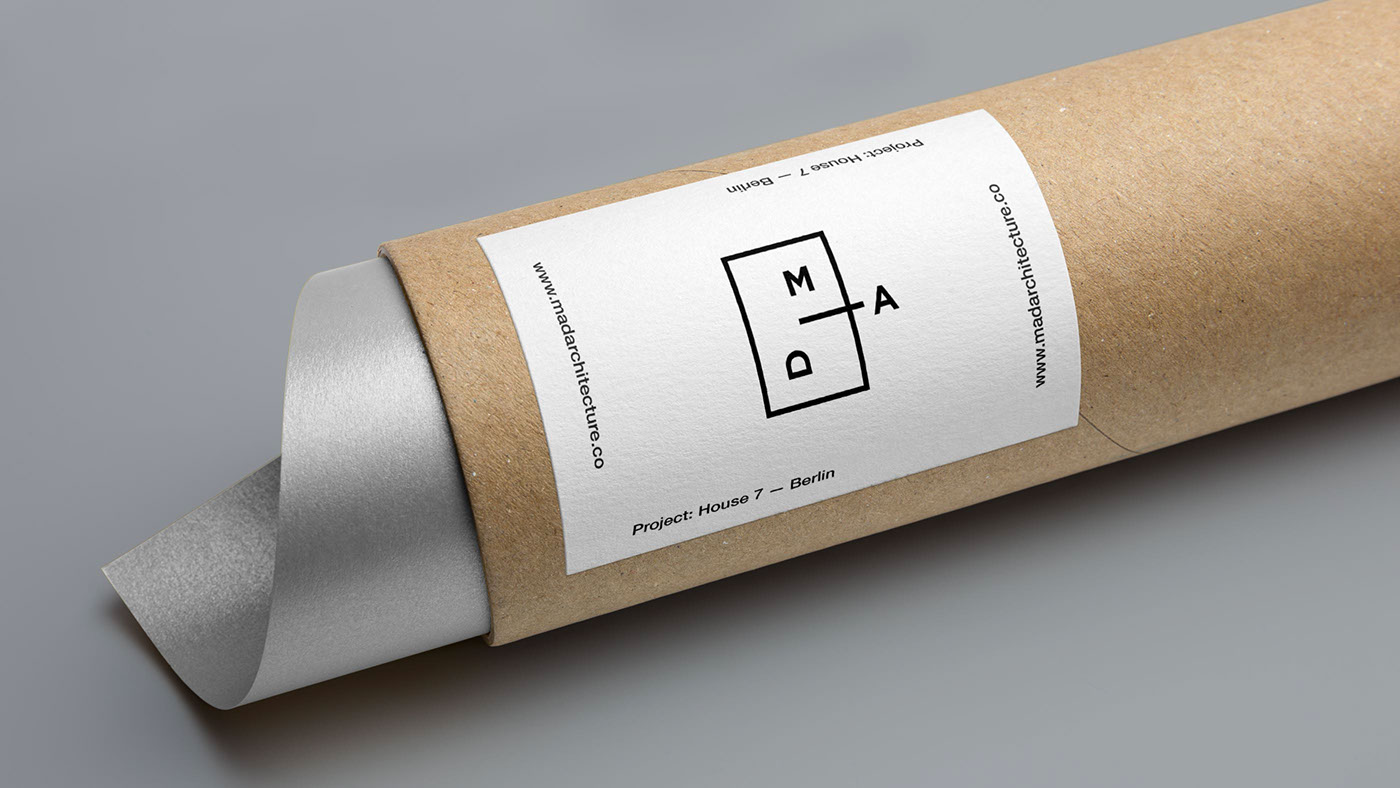
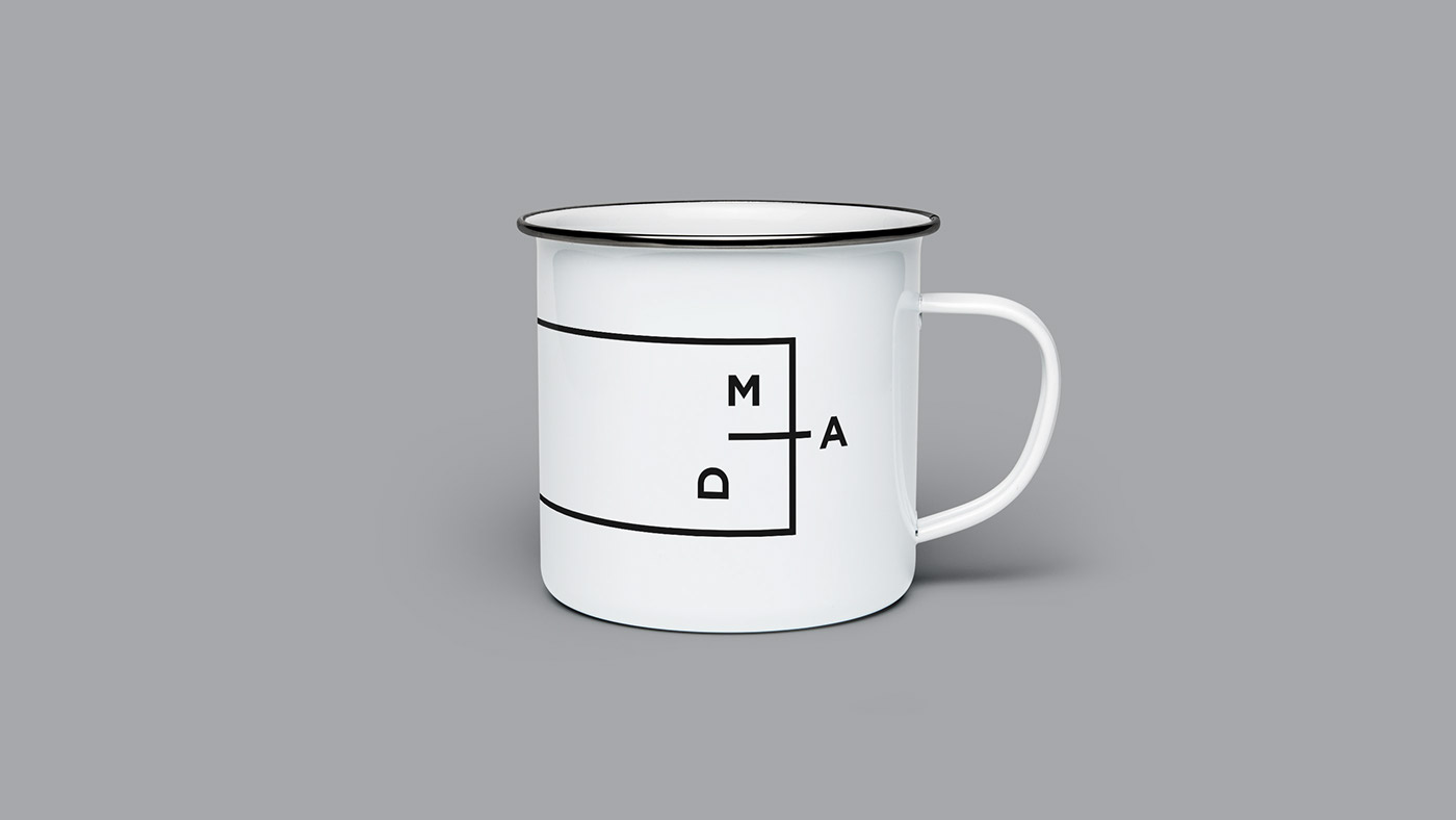
Thus, came the idea of displacement in an otherwise geometric and measured identity. The initials M, A and D are moved and rotated, creating an arguably better outcome than the original by using the same elements. The "A" moves 'outside the box' which looks like a floor plan. Overall the identity is minimal, creating a large white space for their architectural work to stand out.
The Logo

Typography

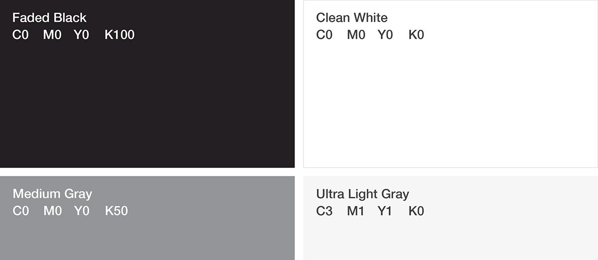
Colours (or the lack thereof)
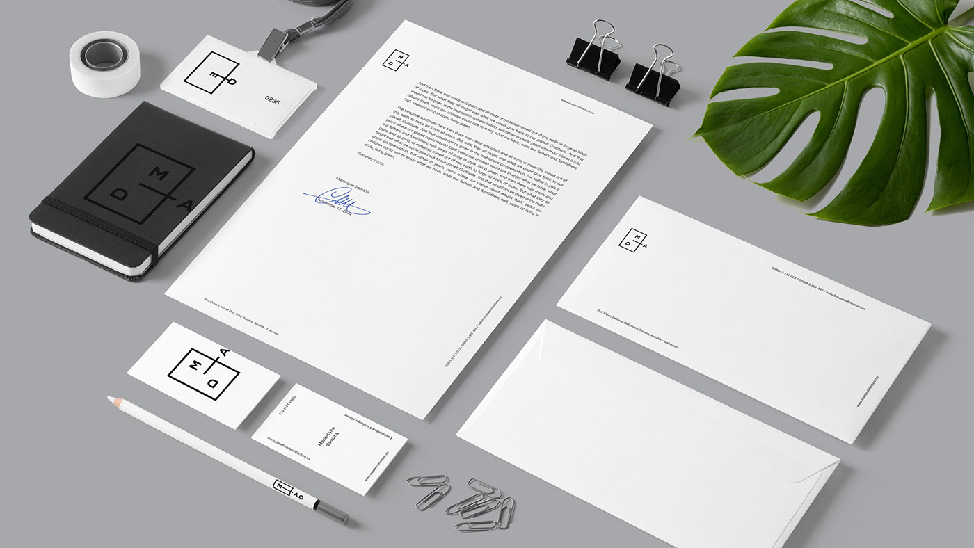
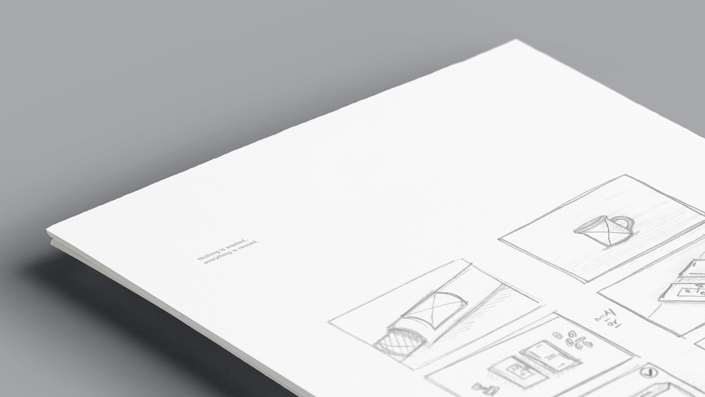
Stationery
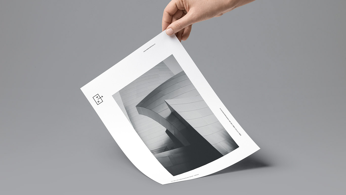
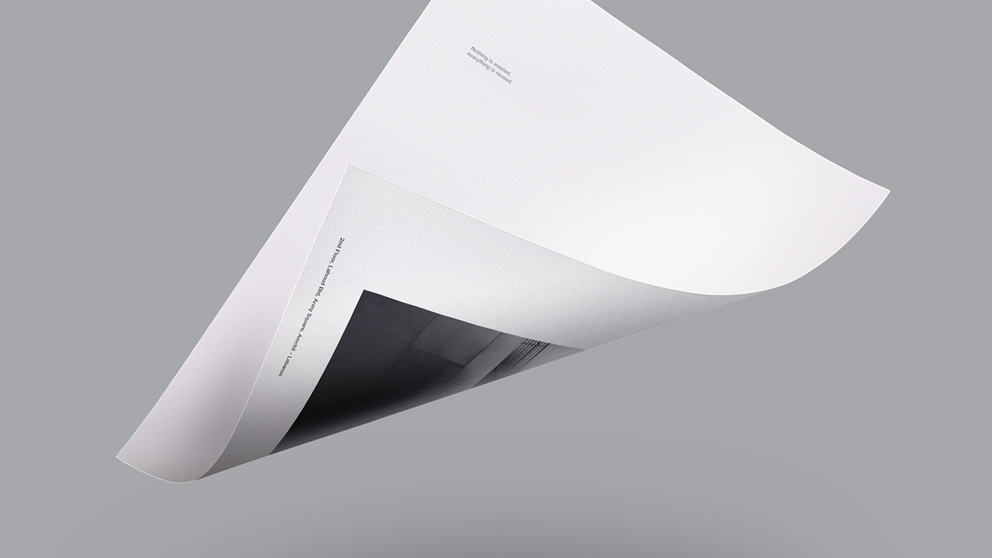


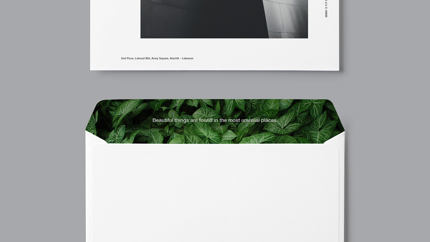
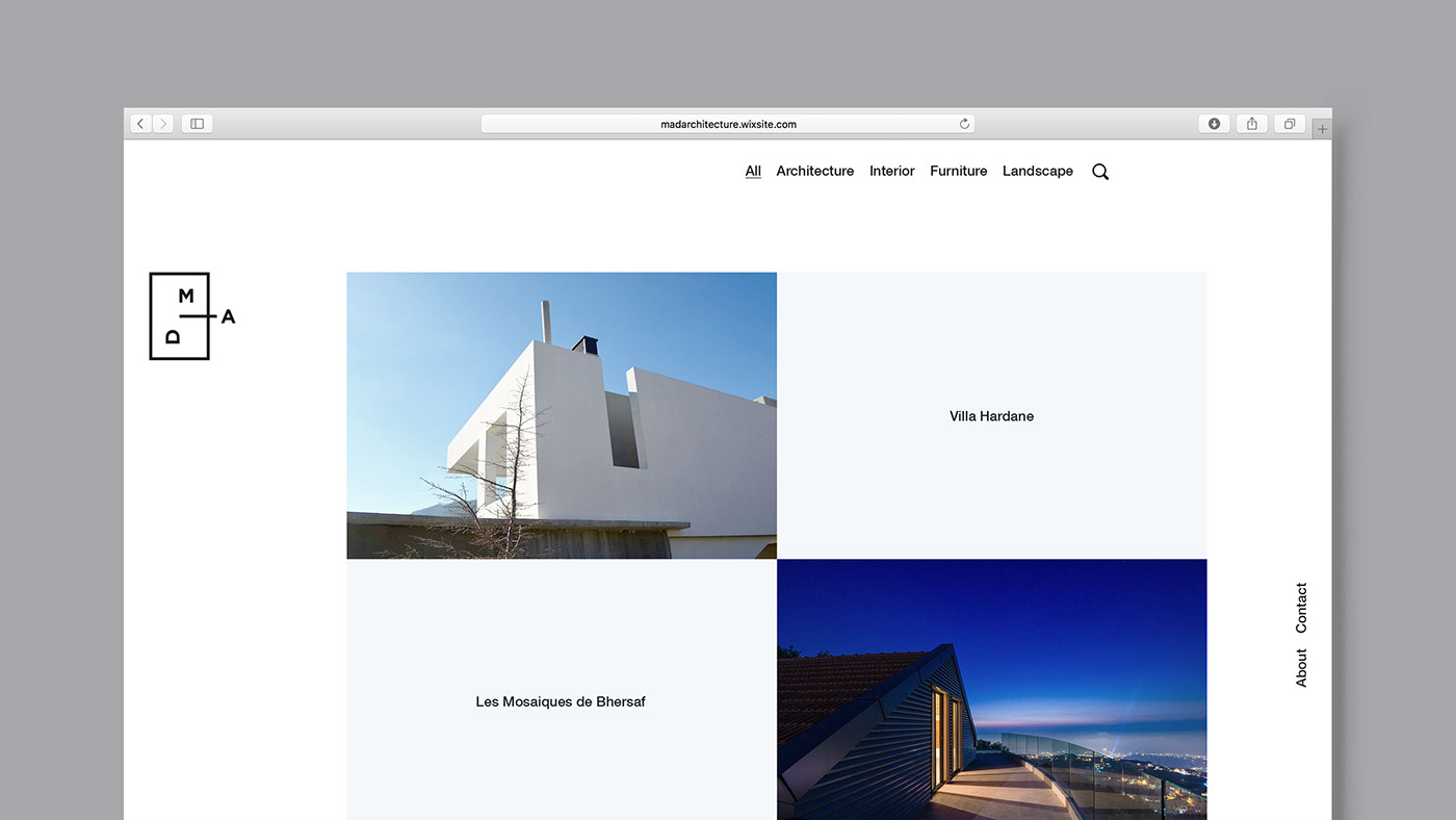
Visuals
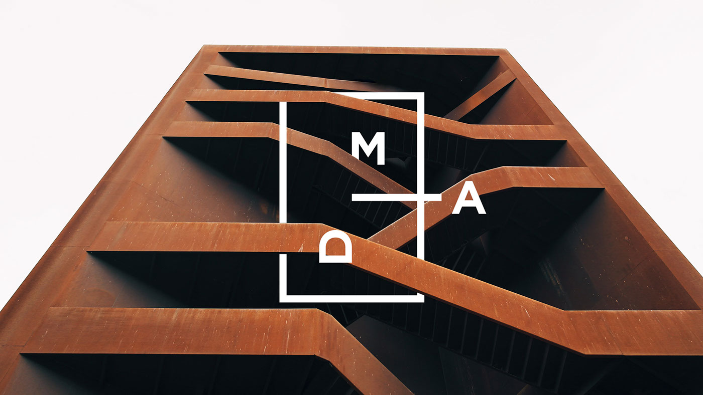


* The large architectural images used in this presentation are not the works of MAD Architecture and were presented to showcase the usage method of the logo on large scale visuals of their work.

