Creating Attractive Science
CSIRO Logo Rebranding - 2016
This project is a part of college project to re-brand the CSIRO organisation logo. CSIRO is a government body operating in scientfic research and development to find solutions and betterment of everyday issue. It is an organisation infamous to develop the Wi-Fi, Aerogard, plastic banknotes and many more. The current logo is is rather plain and outdated as well as having unfortunate similarity with another organisation called CISCO.

Vertical Logo
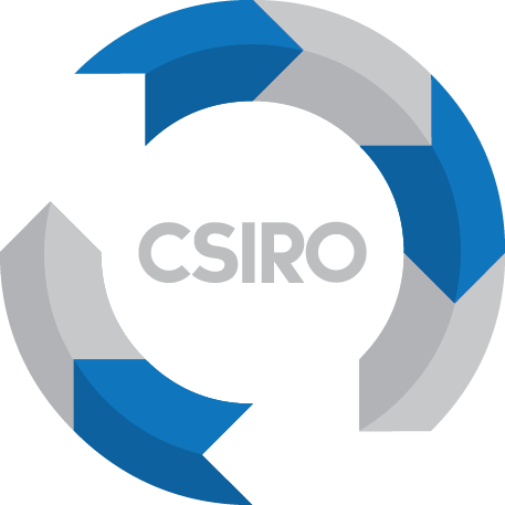
The re-branded logo is inspired by the nature of the business that always moves towards innovation. The circular logo adapt the character of a circle that is continuous line, representing the continuous work of development. I have incorporated drop shadow effect on the arrow to further emphasis on the idea of moving forward.
CSIRO is a large government organisation that works within many aspects of research. The circular arrow has been segmented into 8 smaller arrow that represents the 8 business units within the organisation. The 2 white spaced arrow cleverly represents the 2 business units Data61 and Energy whose works revolves around intangible assets.

The colour combination successfully creates attractive twist to the logo of an organisation with such a serious nature. It successfully gains attention of the viewer without losing the sense of intelligence and professionalism. The dominantly circular shape of the logo is also quite versatile to translate into other variations. The circular arrow arrangement will be the dominant feature that becomes identifier of CSIRO.


