


Key Brand attributes.


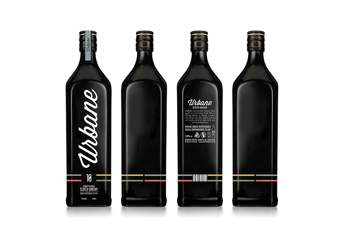


Urbane Scotch Whisky
D&AD Student Awards 21012 - Branding & Packaging Brief
Collaboration with Samuel Mcwilliams
The brief was to completely re-imagine Whisky by moving it away from the heather and weather stereotype it currently possesses.
To refresh and modernise the tired old image of Whisky we introduced it to the city, an area that the product is not normally associated with. The city is seen as a place where many different people mix to create a unique blend of culture, much like the unique blend of ingredients used to make up Whisky. The meaning of the name Urbane is ‘pertaining to sophistication and elegance’, a reflection of the Whisky product as a whole. The name also adds the suggestion that the product is closely linked to its targeted urban market.
Whilst challenging the conventional image of Whisky we thought it was still important to connect the brand to its Scottish roots by using elements of the traditional Tartan pattern. The modern, minimal Tartan created for the brand resembles city grids further reinforcing the new city themes.
To add a special twist to the packaging we thought about how people drink socially. This led is to creating packaging which would act as an visually stimulating, interactive centrepiece to a social occasion where drinks are involved. Whilst it can still function as a conventional box the packaging is also collapsable, this allows it to form a miniature cityscape where Tartan 'roads' lead up to the bottle in the middle. Four coasters are also stored in the lid to encourage sharing with friends.
Featured on thedieline.com


