
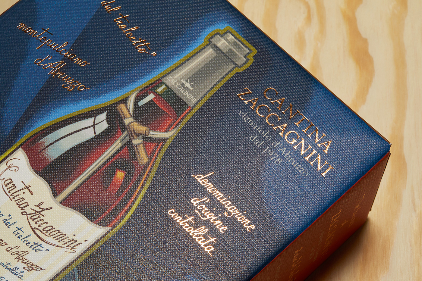


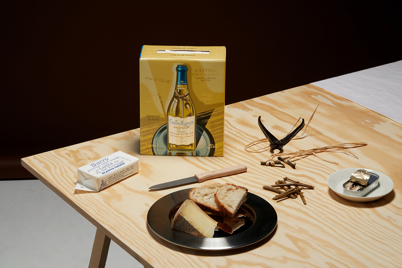
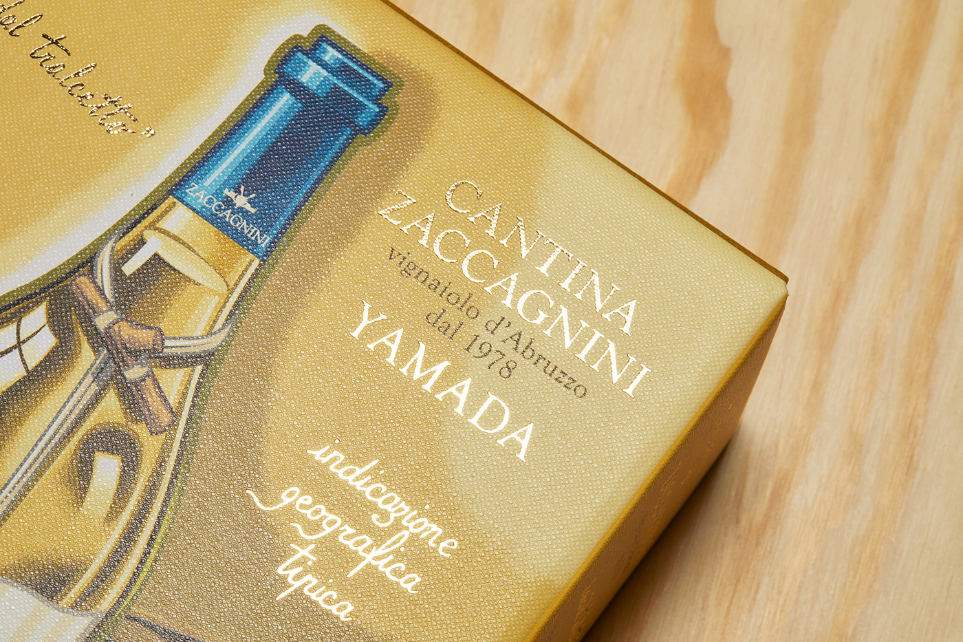


Cantina Zaccagnini has a unique position in the wine market, nicknamed the stick-wine (vino dal “tralcetto”) and the bottle has established a strong recognisability in many markets. We wanted to strengthen the iconic status of the bottle and raise the brand awareness by emphasising the positive and authentic qualities at the core of the brand.
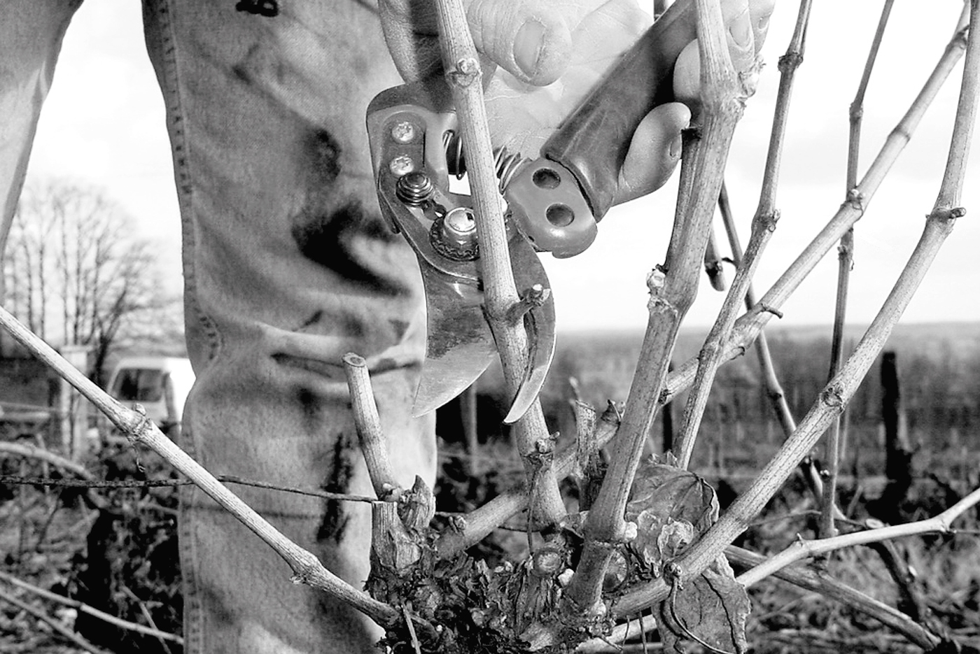
The stick symbolises the connection to nature but mostly it is a symbol of handcrafts and knowledge. The sticks are cut-offs from the vines which are pruned every winter while the vines are resting to maintain the balance and strength of the plant.
We elevated the bottle from photography to an iconic status by creating illustrations inspired by Italian posters from the 1930ies. The colour palette and paper material underpins the signal of a rustic but refined product.
A collateral story was introduced to create consumer awareness about the art of pruning and its importance in wine growing to guarantee the quality of the wine.
Illustration by Mark Bender
Photo Sigve Aspelund (Tinagent)


