
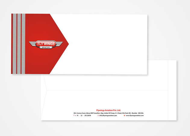
Powerful symbols are needed to illustrate the people that can teach you how to fly, was the principal thought while redesigning branding for the Aviation academy, ‘Fly Wings’. Visiting cards are designed identical to epaulets, the definitive insignia characterizing the men/women of rank, uniform and honour. A similar emblem had been incorporated in the letterheads and envelopes, emphasizing the importance of metaphors in design, yet again.

various categories


visiting card_open & close


moodboard

design evolution

