THE CHALLENGE
Fort Fruit is one of the main suppliers of fruits and vegetables on the North region of Brazil. It is a very traditional company with almost 20 years of history. Last year Fort Fruit comissioned DDID to do a reengineering of its brand and bring it closer to the consumer market as well as design the whole line of tags and packages.
A key aspect in the groceries supply business is the B2B relation and also product quality and looks. We had to take into account all subtleties that permeate this market but most importantly make it simple and direct. One other key aspect was that we could not simply ignore the whole history behind its original logo, after all 20 years is a whole lot of baggage.
THE VISUAL CONCEPT
Providing product quality - color, stiffness, sweetness, etc. - is a big thing, but most big companies do that almost as a commodity. As pointed out by our market research, one of the key aspects that are present in these B2B relations in this market, is having a good range of products, which comes down to two words: variety and diversity. We focused all of the creation on these two, but also on the concept of providing a solid relation with stakeholders and the concept of business security.

THE SOLUTION
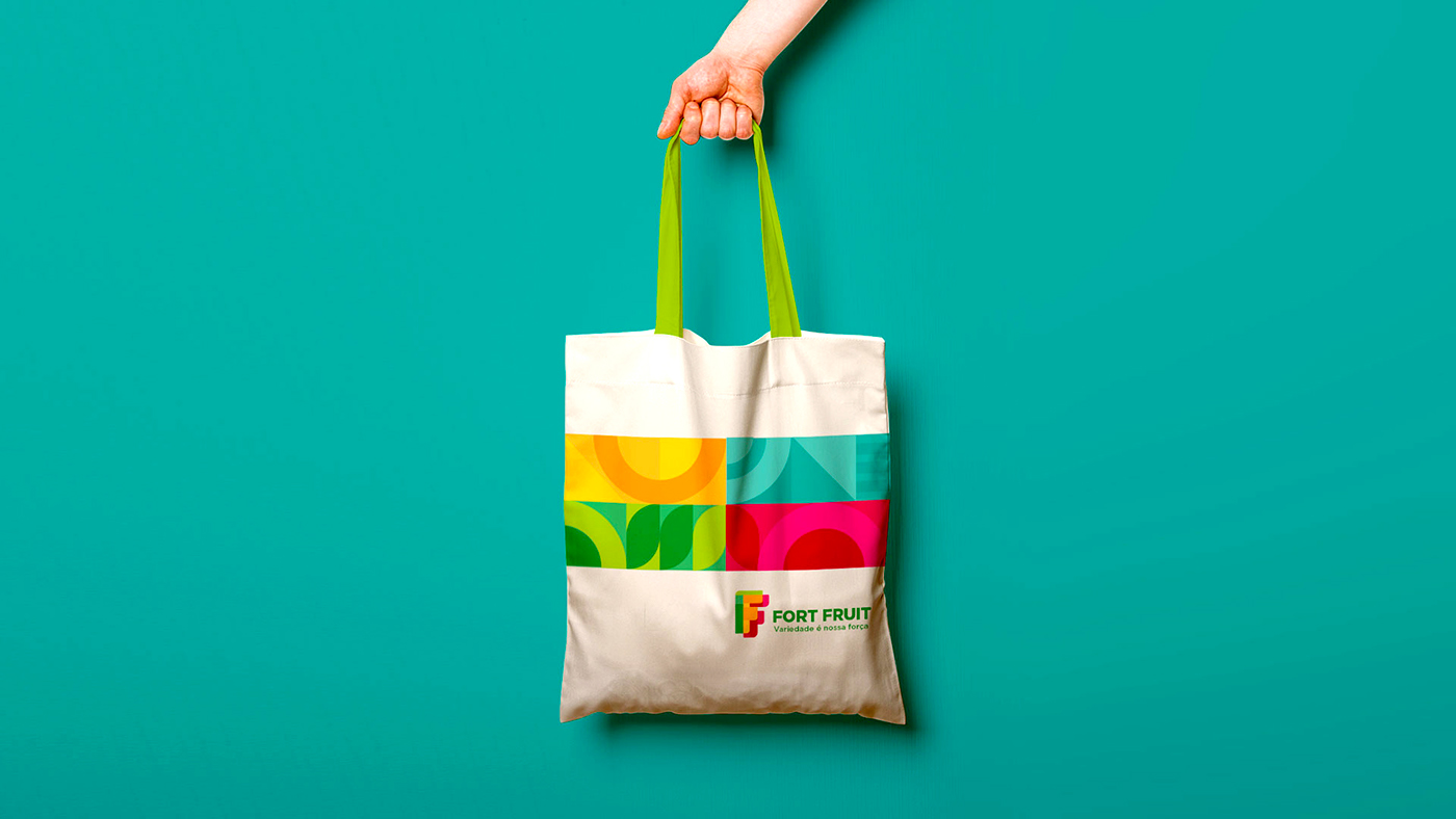
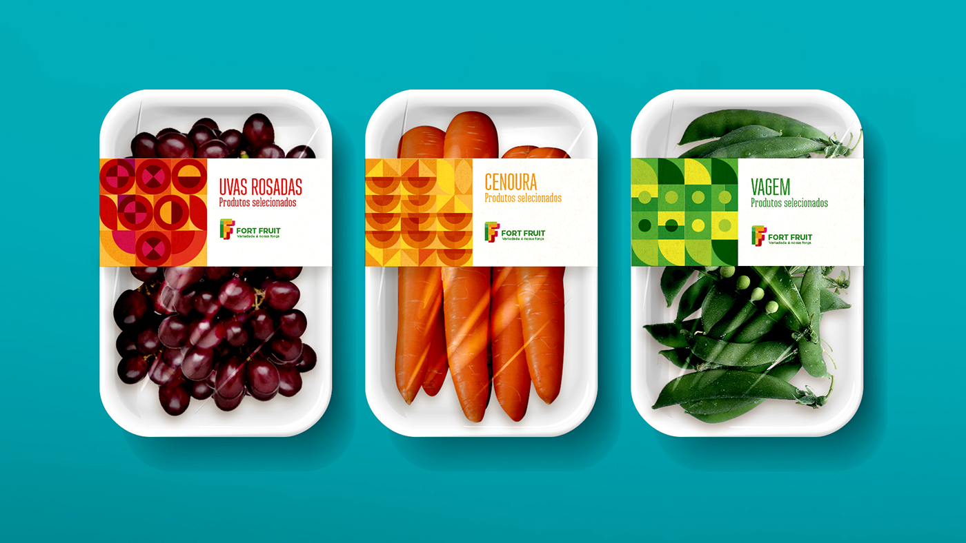
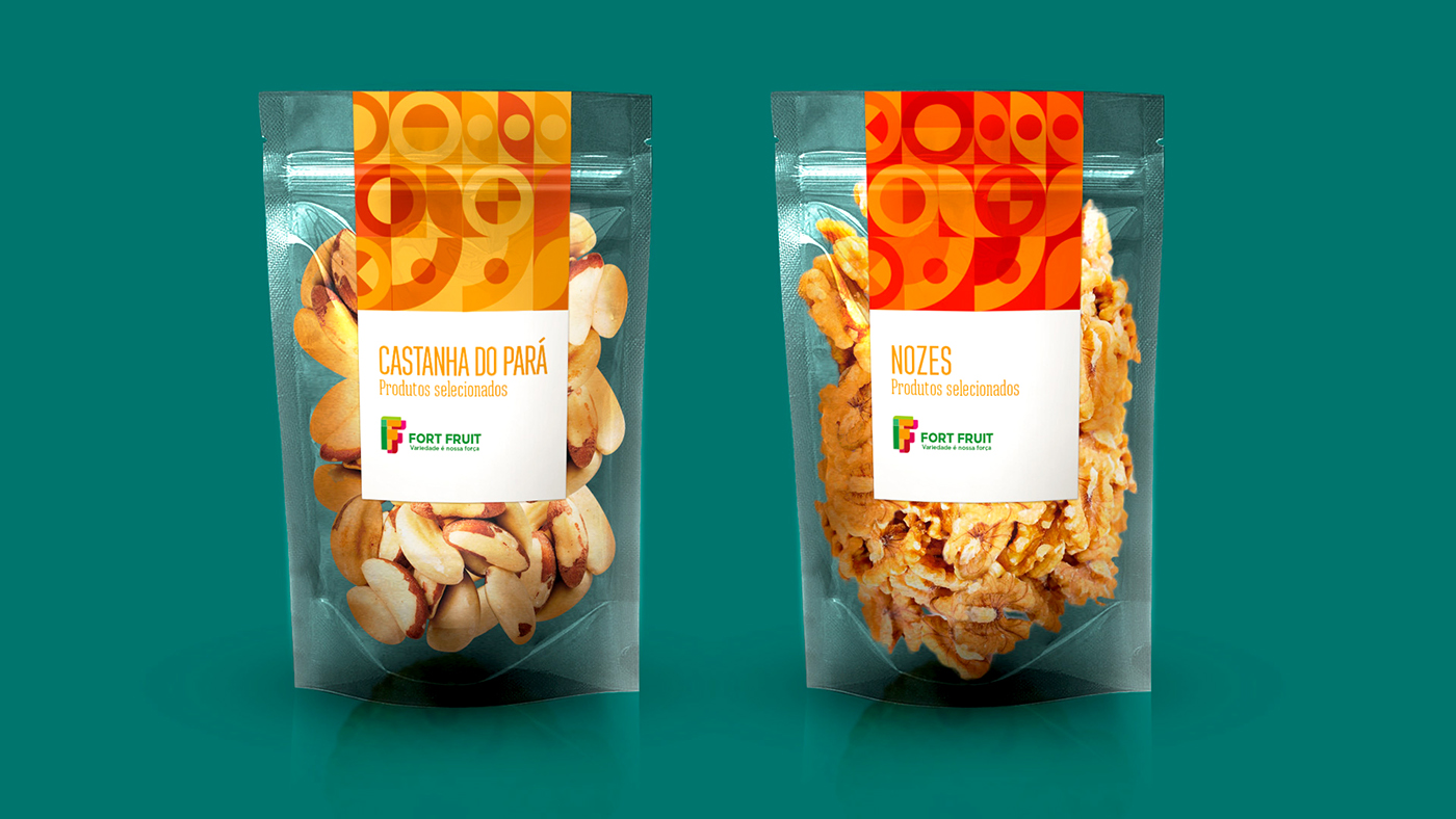
By exploring the concept of diversity and variety we came to a solution that brings out all of the company's key attributes: Variety, Diversity, Product Quality, Business security and Good relations. We presented a range of design itens full of color, very dynamic and bold.