


Dialecticon
Logo and brand identity was developed for Dialecticon consulting company based on the idea of a fingerprint. Dialecticon is a consulting company which helps other brands and companies to be relevant in the era of the green economy, and to be adapted in the climate change.
«Develop intelligent aspiration for lean environmental co-design and trade that iconoclasts consulting for organizational networking for Nature».
For them, the most important thing is to be trusted by their clients, and this is when the idea of a fingerprint showed up. Fingerprint is a very unique identifier, there are no two similar fingerprints. This is related to the clients too, for Dialecticon every client is unique, and there is a unique solution for each client.
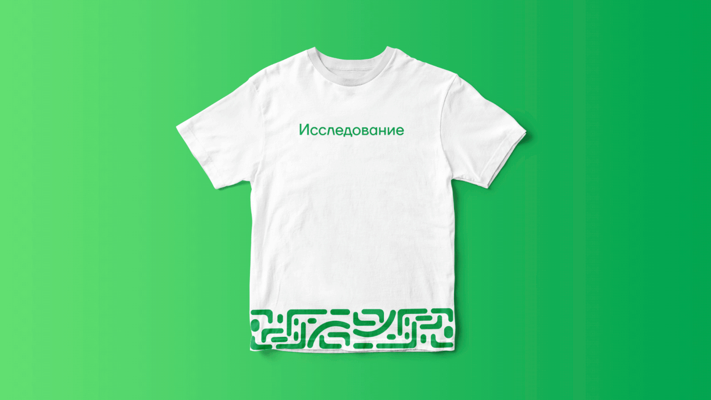
The icon is basically the letter 'D' in a shape of a fingerprint. It was challenging to develop the icon, because fingerprint has lots of lines and the task was to make the icon as simpler as possible. Once the icon was developed, I used it to create the pattern for the whole brand identity. It is necessary to have a brand identity for the company in order to use it in documents and printing materials to avoid using icon/logo constantly. The green color was chosen to express growth, environment and climate.


