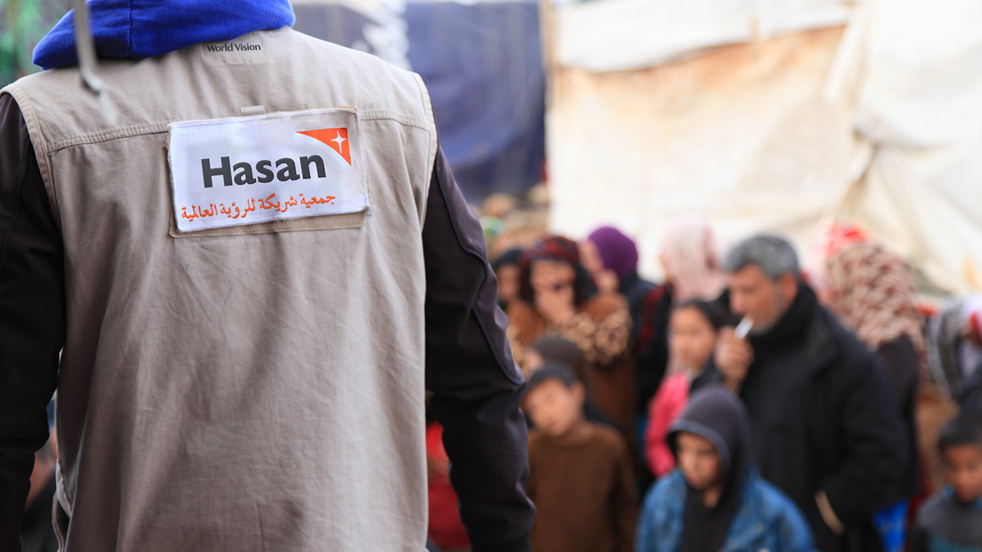
World Vision is famous for pioneering child sponsorship. But these days, their ambitions and their impact extend much further.
What’s more, the not-for-profit landscape had started to imitate their comms style – leading to a loss of cut-through and differentiation. We needed to find a way to communicate the huge range of work World Vision actually does, and set them
apart from a sea of sameness. And we had to do it without losing any of their iconic brand assets.
apart from a sea of sameness. And we had to do it without losing any of their iconic brand assets.
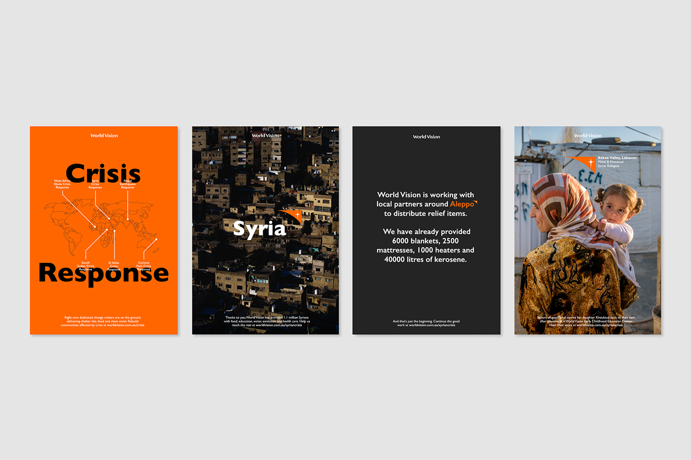
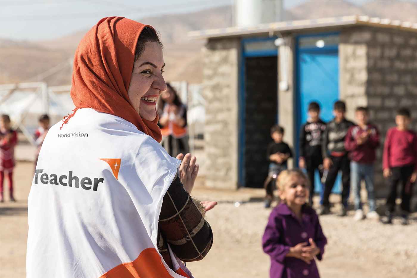
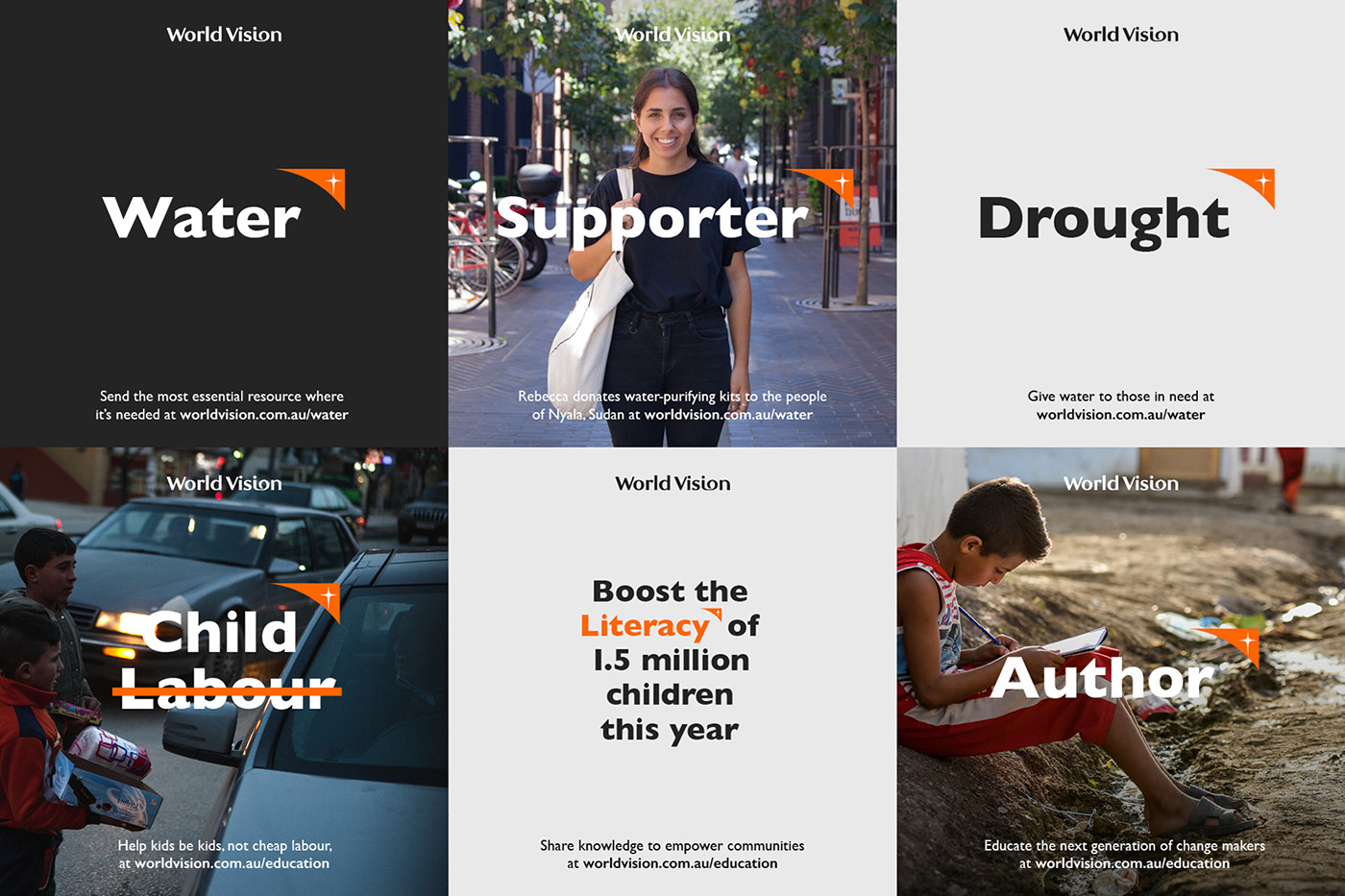
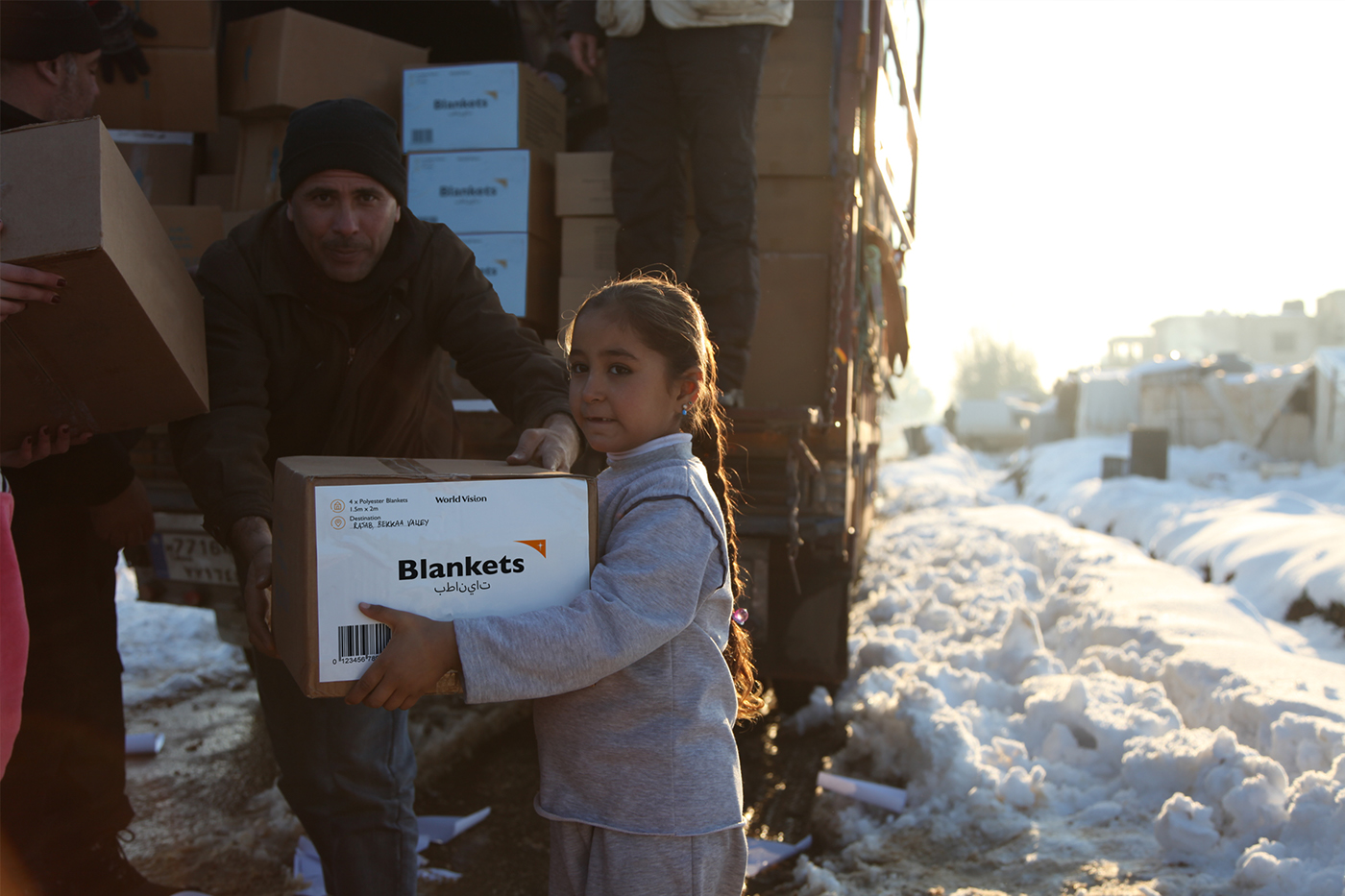
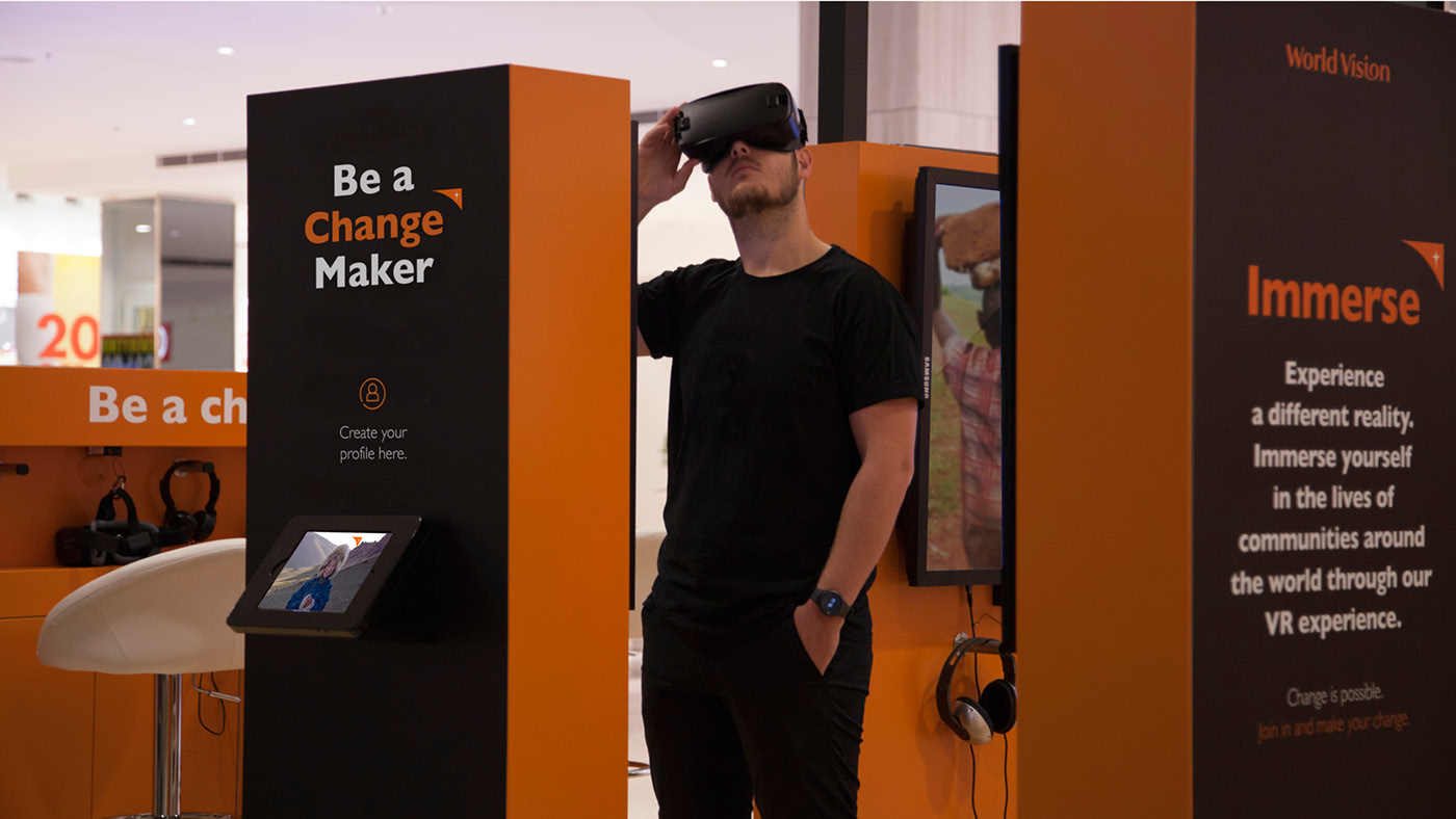
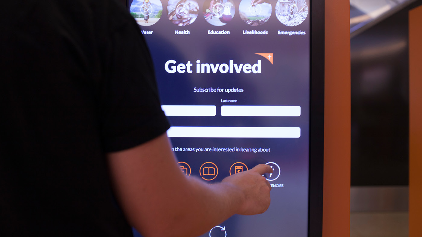
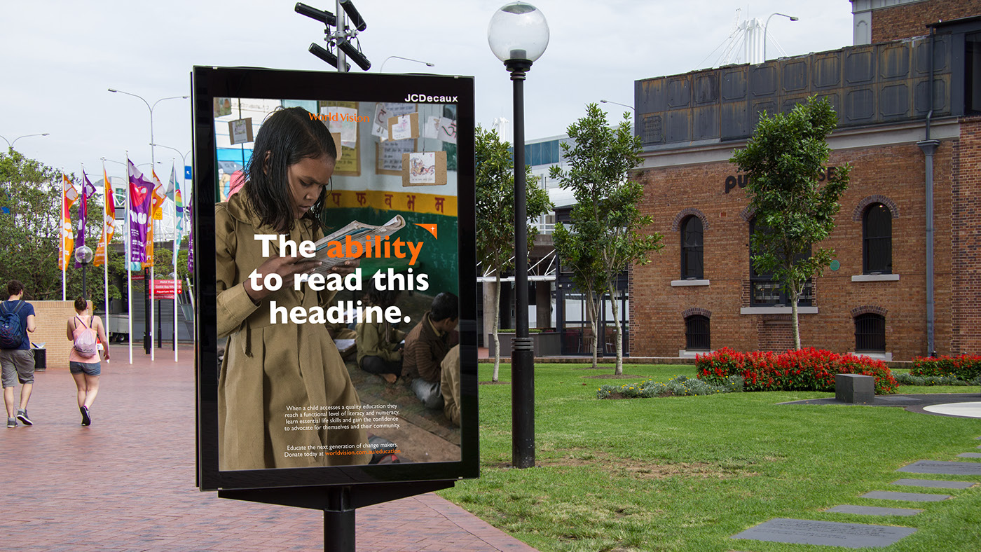
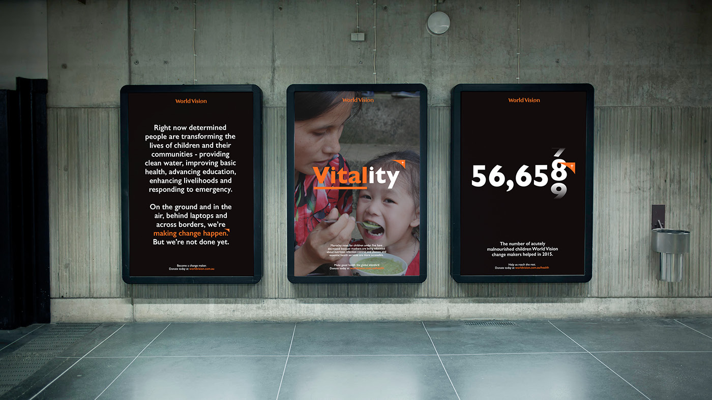
We decided to separate World Vision’s symbol of hope (‘the Beacon’) from their logo, elevating its role by using it to draw attention to the various causes, supporters and people that World Vision supports.
The new identity allows them to shift from themes of loss and hopelessness to those of action and empowerment. With the Beacon acting as a guiding light, it breaks poverty down, cause-by-cause, bit-by-bit, until it feels like something we can all
work at and solve together.
work at and solve together.