Gutwein
This family-owned shop was founded in 1960 in Vienna and has been selling baby & children merchandise at the same location ever since. In this project, the old visual identity was replaced by an aesthetic and recognizable redesign.
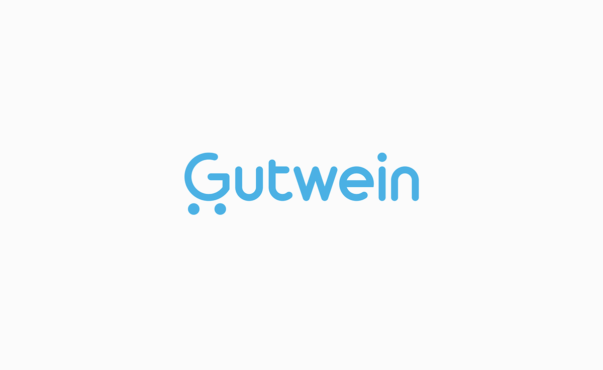
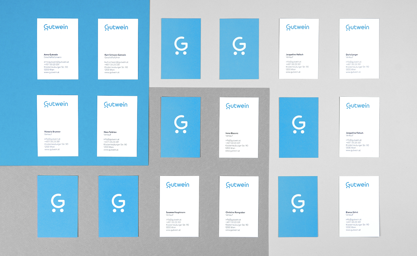
The old logo consisted of the typeface with a baby stroller in the background. The re-invent was to integrate the stroller into the typeface in a very simplistic way. The adding of two circles to the letter G created a simple and clear icon in the shape of a stroller. The logotype was exclusively made in golden ratios.
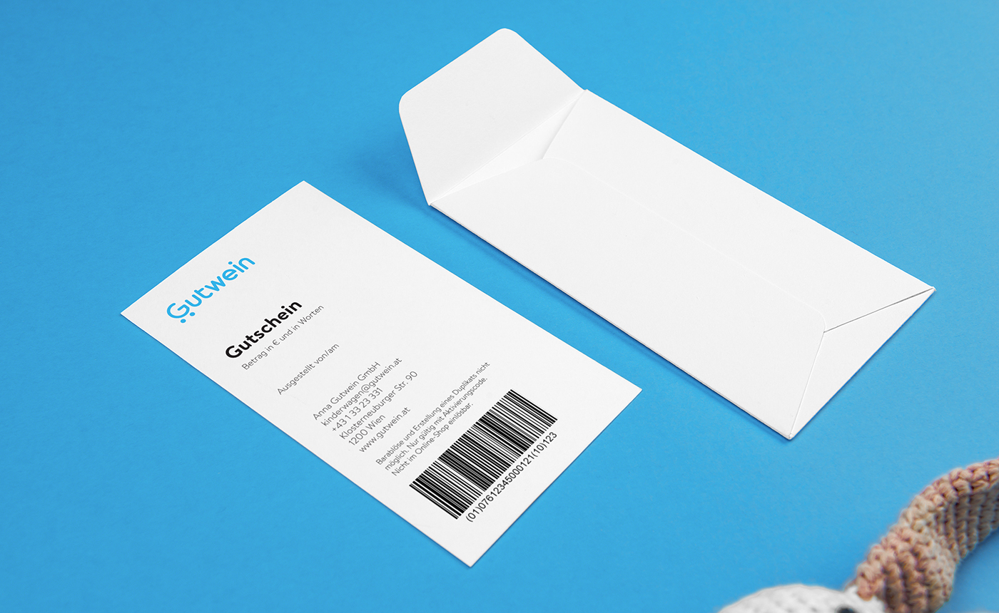
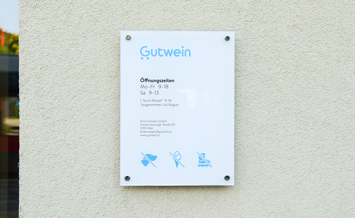
A lovely azure is the leading color throughout the corporate design and is visually assured by the font type Brandon. The identity contains a fascinating pattern made of child-orientated icons, which are again completely arranged by the golden ratio framework.