


R O Y A L G I N
Project Brief
Design a visual identity, graphics and packaging for a new gin product line. The identity should appeal to 25 to 40 year olds. “The design should be colourful, good and easily identifiable. We want people asking for Royal Gin and tonic and not just gin and tonic. A cool fun drink that is good for you. The fun of summer, relax after a hard days work, reasonable priced - the drink of Royals! ”
Concept
Create an identity that appeals to 25 to 40 year olds. How to make "royal" seem more modern, fun and cool - the challenge was to blend all these characteristics into one concept. After brainstorming and ideation for the main characteristics - a playful approach was created.
Approach
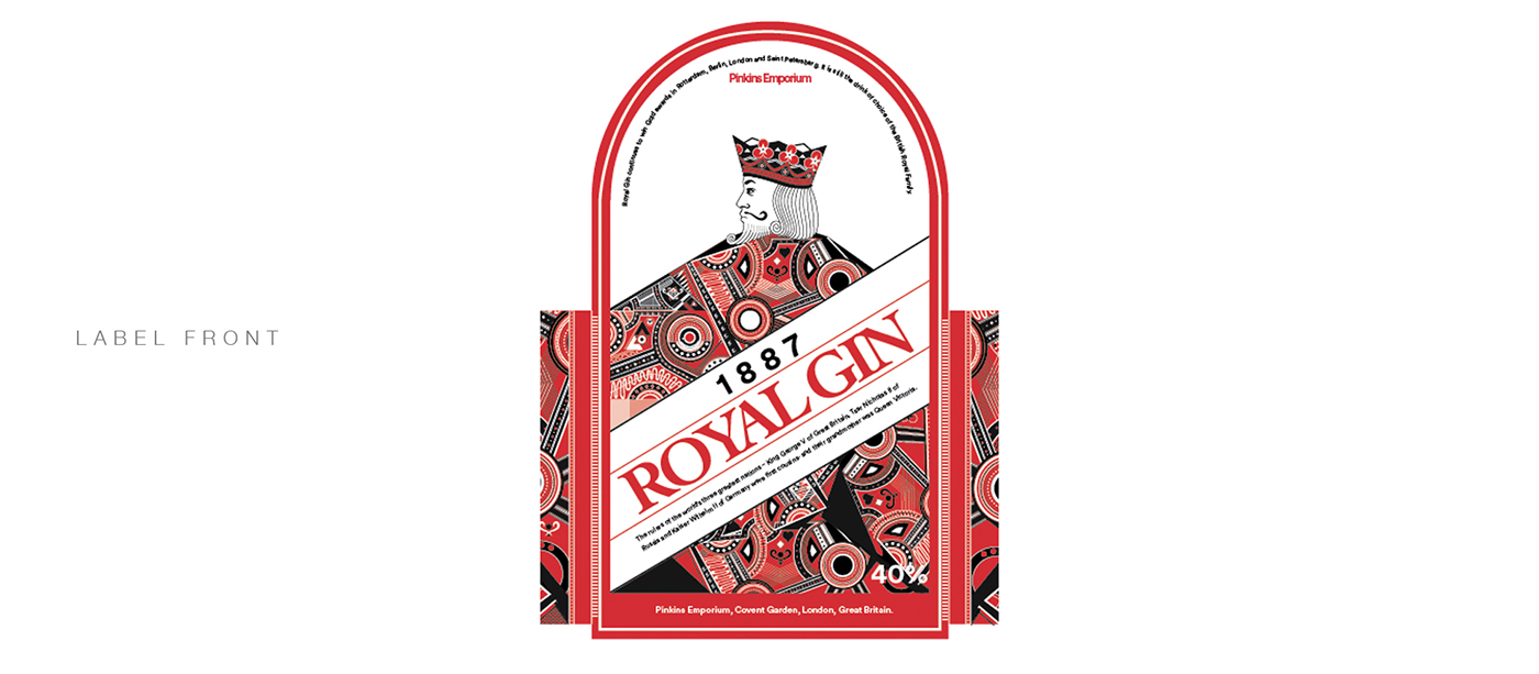
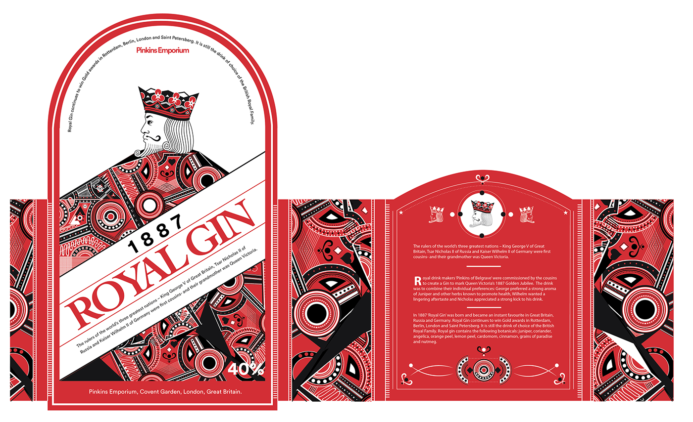
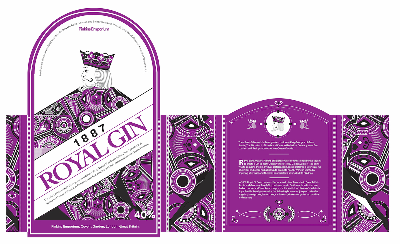
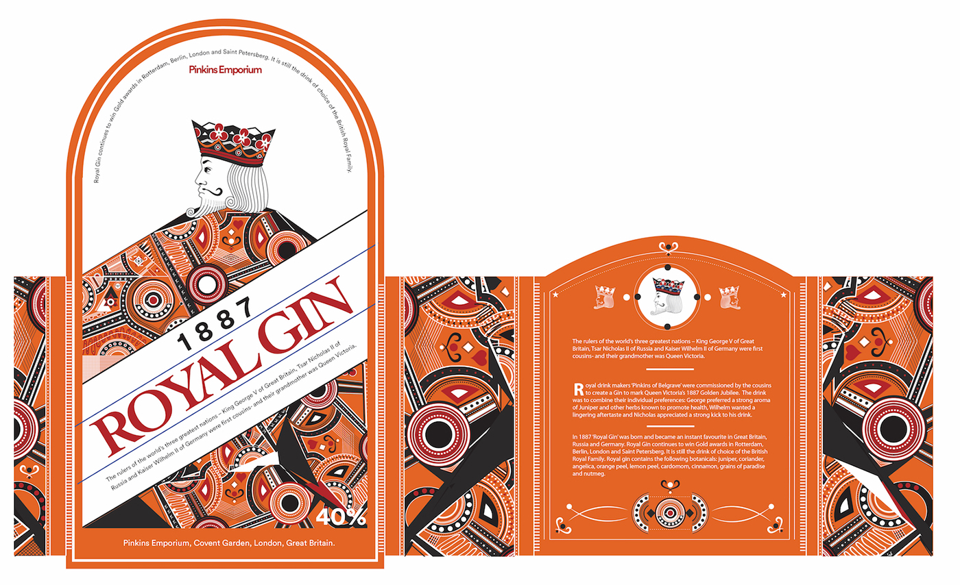
"Royal" as a concept can appear rather formal or "old" - referring to older times, or medieval times, etc. Majority of people enjoying playing cards. The King, Queen and Jack illustrations on the cards does not necessarily appear too "old" or formal, but is something many people can relate to - it is familiar and still very present in modern day. For Royal Gin, the approach is to use the style used in these cards to create a combination of modern and abstract details that is both colourful and playful. In addition to visual identity and graphics, a Standard-bottle complimented with a "Superior"-bottle will bring added (playful) value to the concept - as playing cards is also fun and games, so is the Royal Gin. Something familiar, yet unique and easily identifiable.


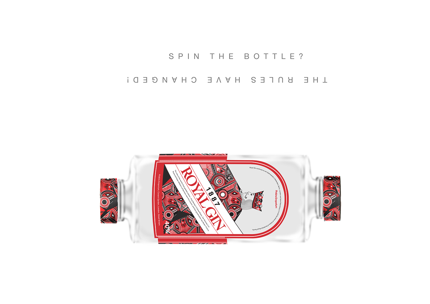
SUPERIOR BOTTLE
The superior bottle is a concept extension to the standard bottle - keeping up with the playful aspect of the design approach. How could the bottle be more engaging and playful with the users? The idea with the superior bottle is to have two same "sides", in contrast to the standard version with a clear front and back labels, the superior bottle has the front label on both sides, reversed however, so which one is the right way? Try it out and find out. This bottle is not meant to be easy to use, but rather to create discussion, create a playful atmosphere - become an item of interaction (i.e. spinning the bottle, opening both sides, wondering about, ice-breaker), giving the interaction a touch of mystery, confusion, laughter? and of course, something to remember.

Thank you for visiting and have a nice day!


