


punch MAGAZINE is a manual for the modern man.
It is a study on type, conversation and interaction between forms, tension, dynamic juxtaposition and simplicity.
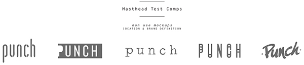
The entire magazine is laid out with only Letter Gothic (headings) and Courier (body), to see how far two mid-century stock IBM typefaces can be pushed to be made fresh. The "punch" main logo is custom lettered with a distinctively spirited style that will have longevity in the marketplace. The front cover intentionally has no photograph to evoke the sarcastic outlook and overall design forward format of the magazine. The publication is entirely monochromatic besides the striking portraits featured throughout that are intended to be a glimpse of real life.
It is a bimonthly (6 times a year) publication. The size is 8x10 to create an impact with the viewer/reader along with it being easy to travel with. The cover is strong with a matte dimpled finish. All the inside paper is uncoated recycled bright white stock.
It is a study on type, conversation and interaction between forms, tension, dynamic juxtaposition and simplicity.
The entire magazine is laid out with only Letter Gothic (headings) and Courier (body), to see how far two mid-century stock IBM typefaces can be pushed to be made fresh. The "punch" main logo is custom lettered with a distinctively spirited style that will have longevity in the marketplace. The front cover intentionally has no photograph to evoke the sarcastic outlook and overall design forward format of the magazine. The publication is entirely monochromatic besides the striking portraits featured throughout that are intended to be a glimpse of real life.
It is a bimonthly (6 times a year) publication. The size is 8x10 to create an impact with the viewer/reader along with it being easy to travel with. The cover is strong with a matte dimpled finish. All the inside paper is uncoated recycled bright white stock.


