


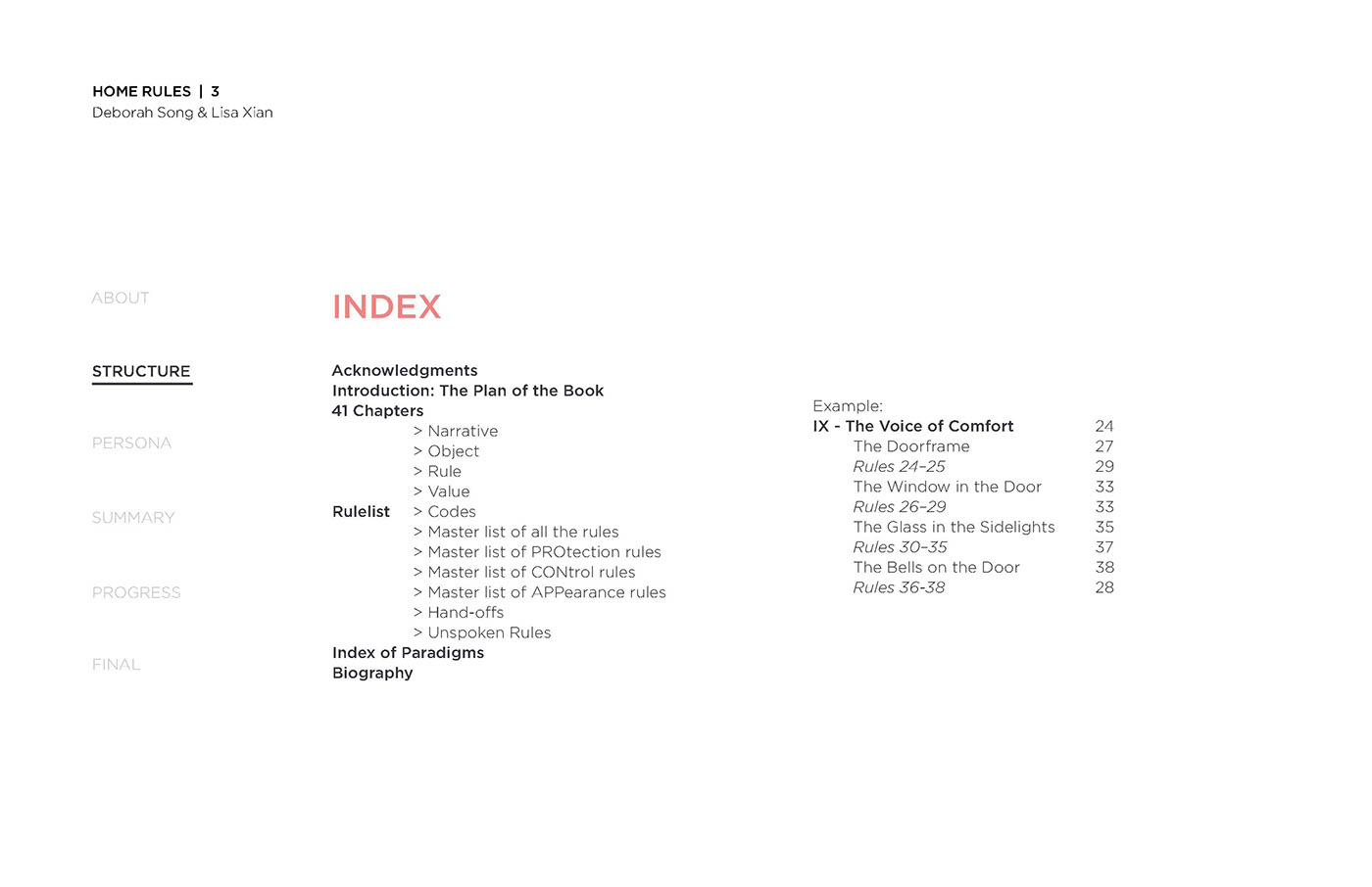
329 pages of a case study analyzed, organized, and strategically designed into a user-friendly iPad app.


Our first design fell short of strategized organization. The different colored quadrants had the user assume that they were categorized together. How could we redesign the map of the living space to provide information of connections between objects that spanned the entire room?

The small drop down menu created a larger disruption in the reading by covering a third of the screen width. The menu bar on the side also seem unnecessarily expansive.

We redesigned the map to be explored at full size instead of separated into quadrants. This minimized the steps to view an object. We also reduced the colors of the overall app design to follow the theme of a scientific study and a blue-print of a living space. Each object also had it's own "profile" that was highly inspired by Role Playing Game (RPG) profiles.
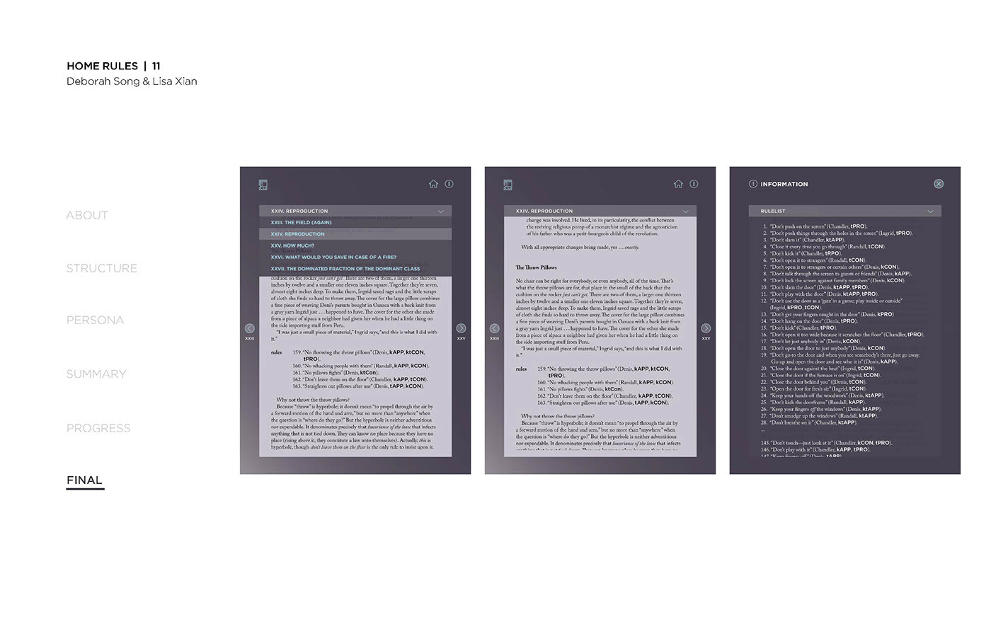
This is a screen capture of the iPad app.
The time span of this project highly emphasized user experience research over user interface design and programming. My dear friend and partner, Lisa, and I hope to revisit this project in the future to continue the design studies and creations.


