SUESWEET D’LIGHT
MALAYSIA
Design by Izzad Baharuddin
SUESWEET D’LIGHT is a local company specializes in food, sneak and candy around Malaysia.
Purpose:
Creation of a brand new identity, advertising, packaging and graphic support, which will create innovative and smart visual communication for the brand’s representing on the market.
Expected Result:
It should change the perception of the brand. The company should deserve the customer’s trust and make them come back more than once.
Positioning of the brand:
We supply not only the product, we supply the emotion, the tone and the mood that fun, happy and enjoy, which our customers get, using our products.
Creation of the logo:
The main objective is to fulfill the company mood and tone. The name itself SUESWEET represent something that fun, happy and lovable. The visual images which reflect the main idea of the brand are the following: family, partnership, trust, reliability, improvement, development.
The visual images which reflect the main idea of the brand are the following: family, partnership, trust, reliability, improvement, development. The name itself SUESWEET represent something that fun, happy and lovable. It suits the company name and the mood and tone of the company.
I use Kuih Bangkit as a shape of the logo to represent one of the products that this company sells. Kuih Bangkit is the traditional nyonya cookies.
I put the vintage aesthetic to represent the organic; quality feel of the vintage inspired the whole brand.

on gray colour

on black and white colour

logo on grid

on green colour

on brown colour

the final logo
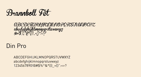
typo that be use

business cards

letterhead

envelope

packaging

packaging and labelling

Desktop Wallpaper

iPhone and iPad Wallpaper


