WNYC App: A Timed Whiteboard-to-Redesign Challenge
TL;DR: I’ve always been a fan of local public radio. As a user of the WNYC app, I realized some possible improvements. Tools used: whiteboard (sketching) and Sketch (UI designs).
Roles: UX/product strategist, UX/UI designer
Improving the Playback and Content Experience
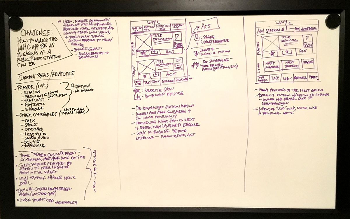
As a challenge, I set a 20-minute timer and picked up a dry erase marker to work out my assumptions, including those related to the user and the business goals.
The UX/UI goal was to make it easier and more enticing for users to find and play content. Success is boosting the amount of listening (listen time), exploration of more/new shows (number of shows), or expression of their opinions using the “Talk” feature of the app (number of Talk audio submissions). The assumed business goal would be to translate overall engagement into donations.
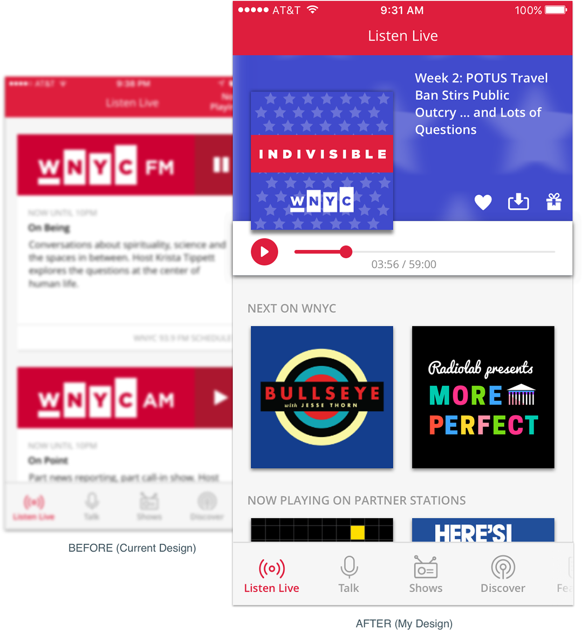
I decided my time would be best spent on the home screen aka the “Listen Live” screen, where I could improve the audio playback and content scanning experience.
Revisiting the Original "Listen Live" Design
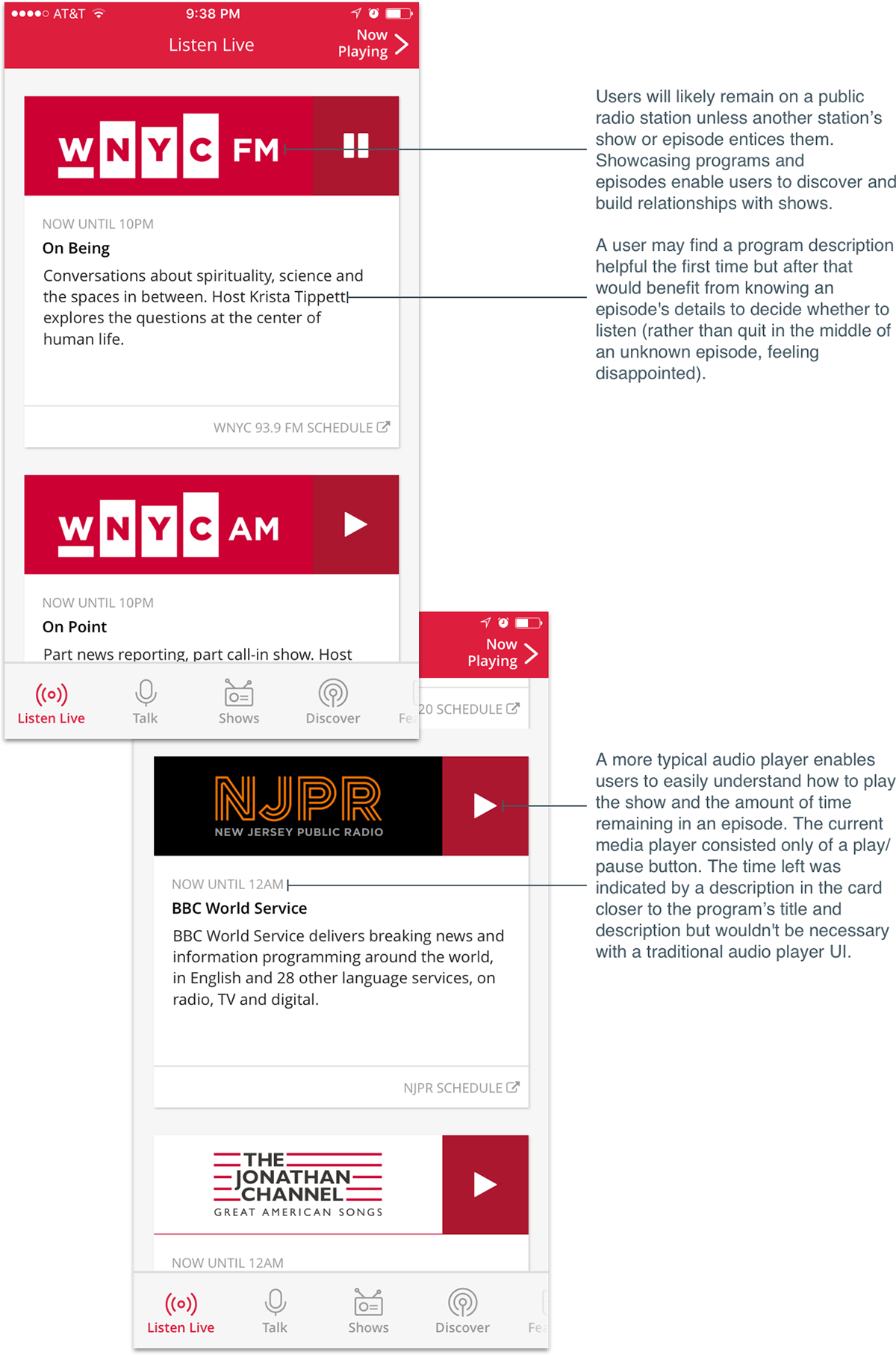
In the “Listen Live” screen, a user must scroll down a few times to reveal four local stations and start playing either of them in the same screen. I immediately noted a few ways to improve the screen.
I gave myself a few hours to work on a new design. Given the time restrictions and armed with a whiteboard sketch to work from, I opted not to wireframe. Instead, I jumped into the design once I figured out WNYC’s branding, shows’ artwork, and sample content.
Version 1: Photographic, Episode-Driven Design to Make Content Distinguishable and Accessible

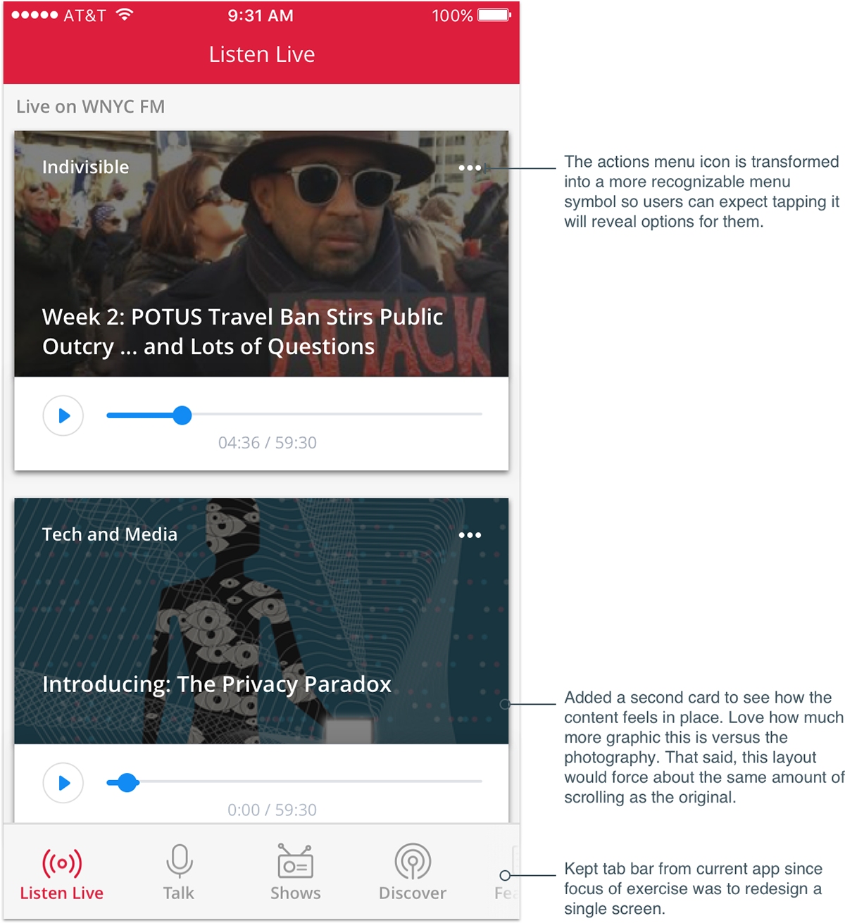
The new visual design distinguishes the content and enables an easier playback experience for users. The action menu can also engage users by allowing them to favorite a show, save the episode for later, or “give” by sharing their opinion through a voice recording, donating to WNYC, or taking an action related to an issue mentioned in the episode. The "give" action needs a little more thought since it has a few associated activities which could lead to confusion.
I decide to take the app in a different direction to see if I can improve how users identify program content and to create a connection between them and the shows.
Version 2: Graphic, Show-Driven Design to Improve Content-Type Recognition and Program Loyalty


Results + Reflection
I’m pleased with what I accomplished in a short amount of time. If I were to spend more time, I would research the podcasting/online radio space and speak with WNYC and its listeners to inform and test the designs. I would also look at all of the screens in more detail and determine a user flow and supporting interactions to drive listener engagement and donations.
I could have also thought more about the general listening experience. I ended up with a more traditional audio player interface but could that have been reimagined?
As a reminder, here’s where the screen started and ended.

P.S. Hey! You’re still reading? Here’s a quick word on unsolicited designs:
Unsolicited redesigns are tricky because if you’re not part of the team that designed the product, you don’t know the user research, business goals, or technical and resource constraints behind what’s released.
That said, unsolicited redesigns are useful for someone like me to test my thinking and challenge my design skills for a domain outside of my day-to-day work.


