Poster Series 2016: Designers Go Rogue
As a “passion project,” Hyperquake’s design team screenprinted a poster series featuring our core values.
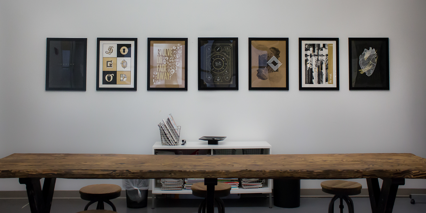
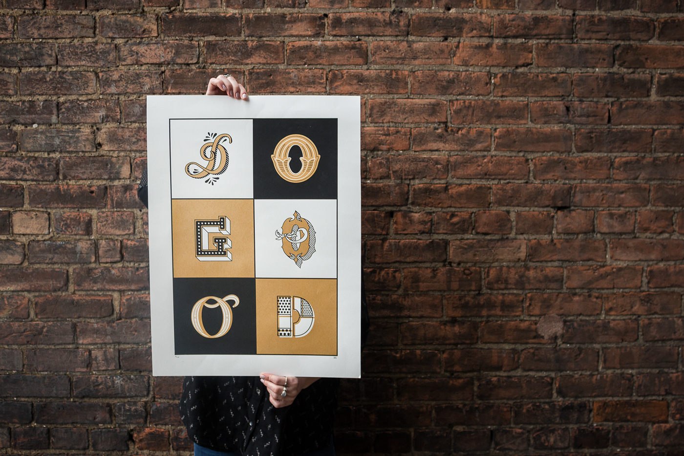
A hanging visualization of our values.
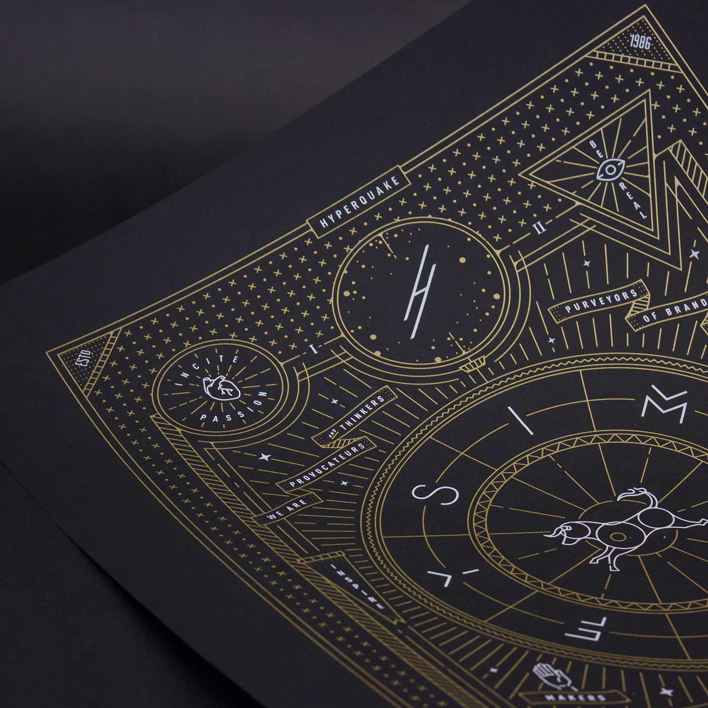
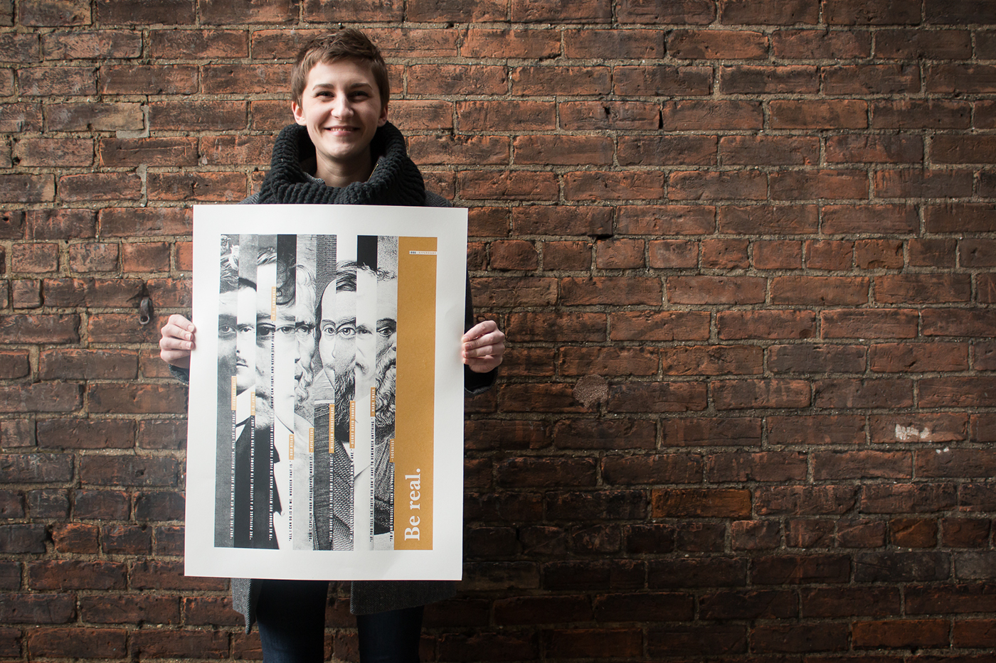
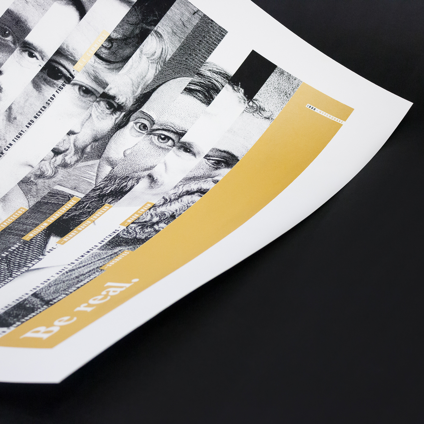
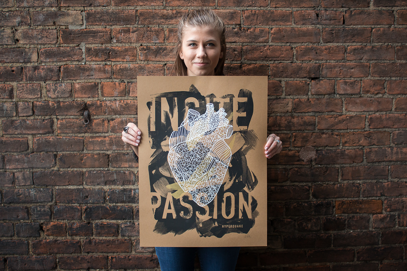
Hyperquake has been through some changes over the last few years—new faces, a full rebrand, a new website, and growth of our leadership. But throughout the many shifts, we’ve stayed grounded by our core values. These words have stayed the same for many years, and each fresh face that walks in our door brings new meaning to the phrases. Even after 30 years, we are still guided and driven by our ability to shift, incite passion, be real, and respect.
Toward the end of 2016, our design team wanted to do something different to celebrate the end of the year, and to thank our Creative Director and Design Director for another year of good times and good work at Hyperquake.
Just three simple rules.
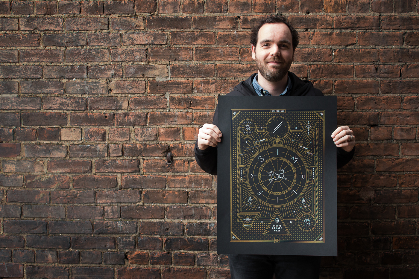
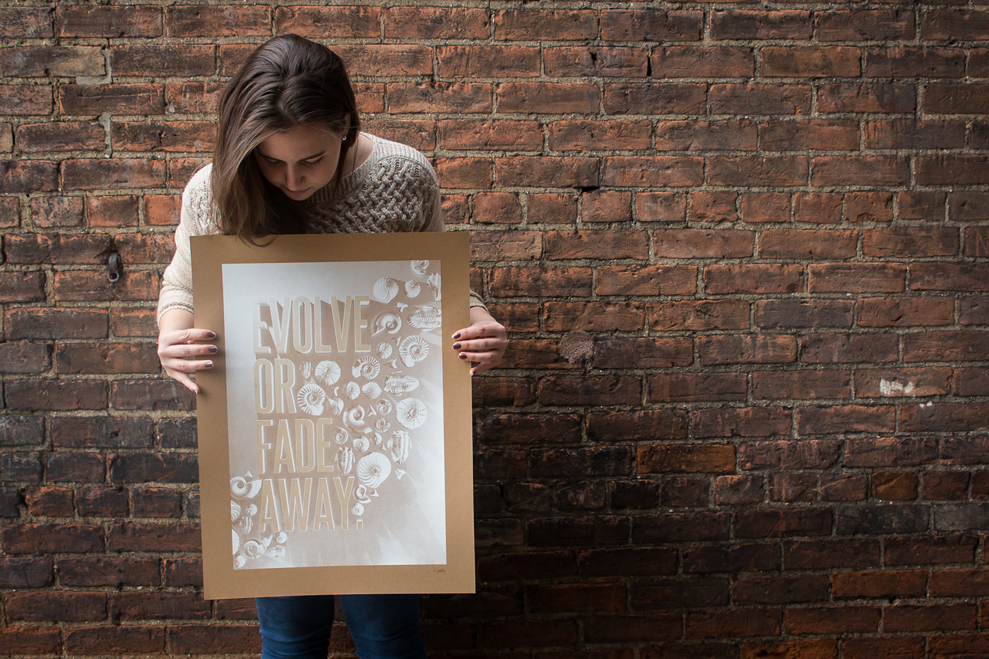
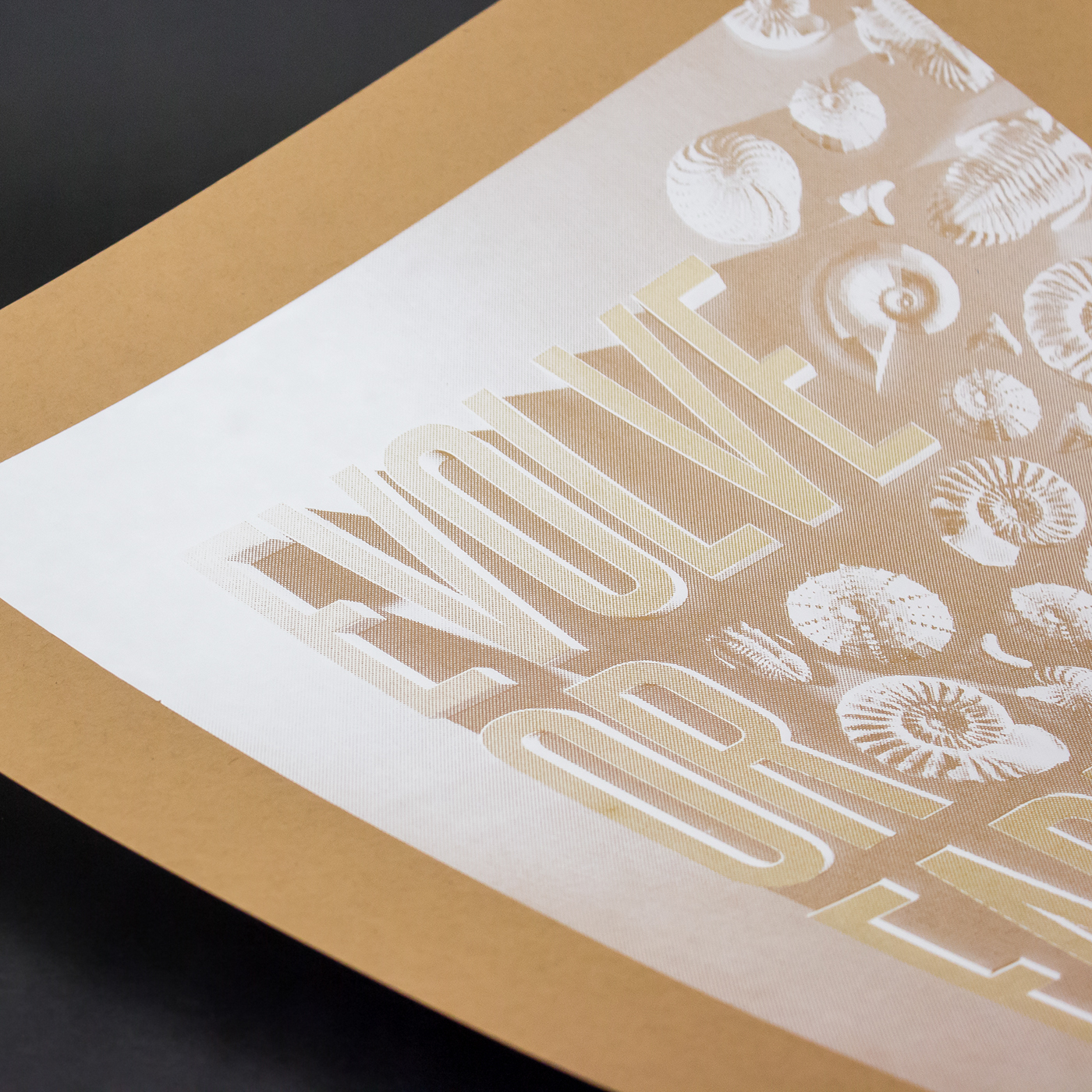
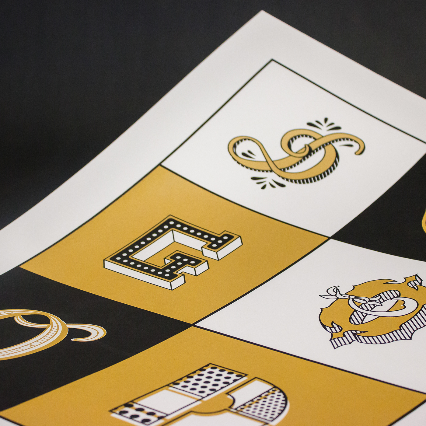
Our team of 6 designers created a poster series in our spare time, each of us designing around a single core value. The only parameters we set were these: (1) Your word/phrase must appear on the poster. (2) Choose from one of three papers (French Brown Box, Whip Cream and Black Licorice). (3) Use only three ink colors (black, white and metallic gold). Beyond those parameters, we were free to explore any method of image-making we wanted.
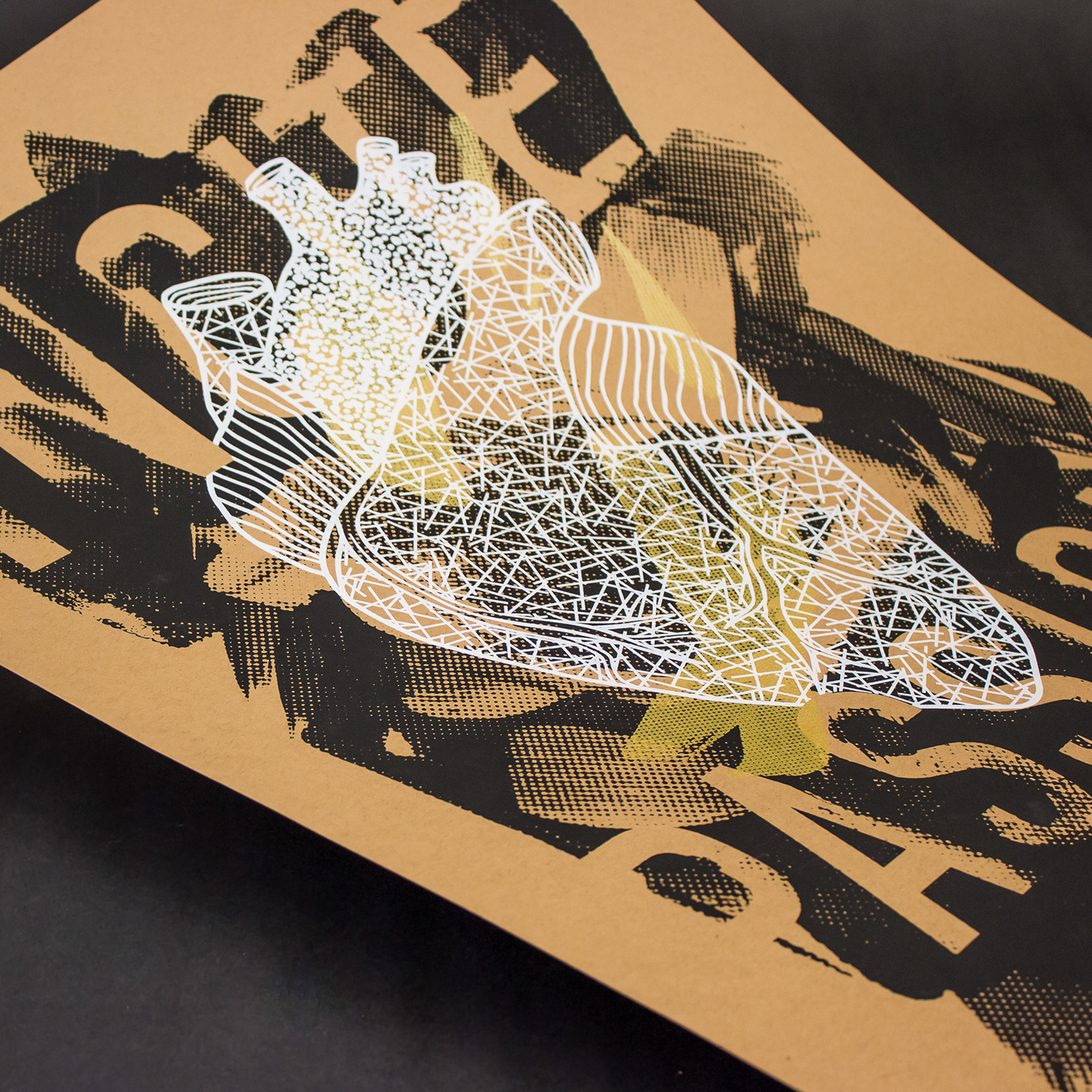
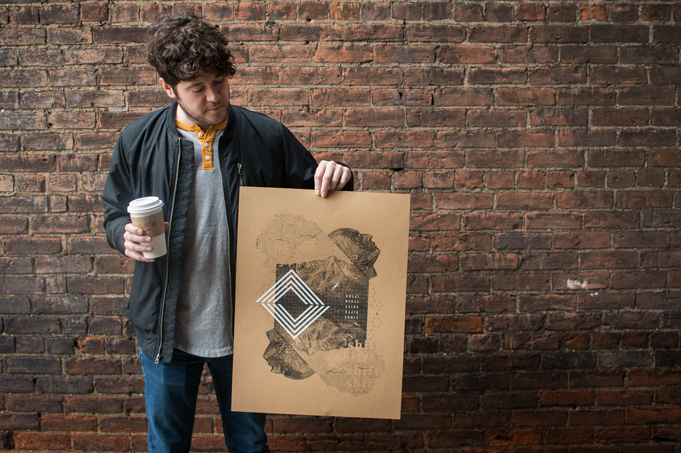

No two designs alike.
The project was a reminder of the diverse talent and style of our team. We had a poster design built entirely with the Illustrator pen tool in one line weight; another collaged from vintage textbooks; one drawn in Sharpie; another 3D-modeled in Blender; one made up of halftoned portraits; and another comprised of custom lettering. They go together, somehow, but they certainly don’t match. It’s a hanging reminder of how lucky we are to learn from each other’s expertise and passions.
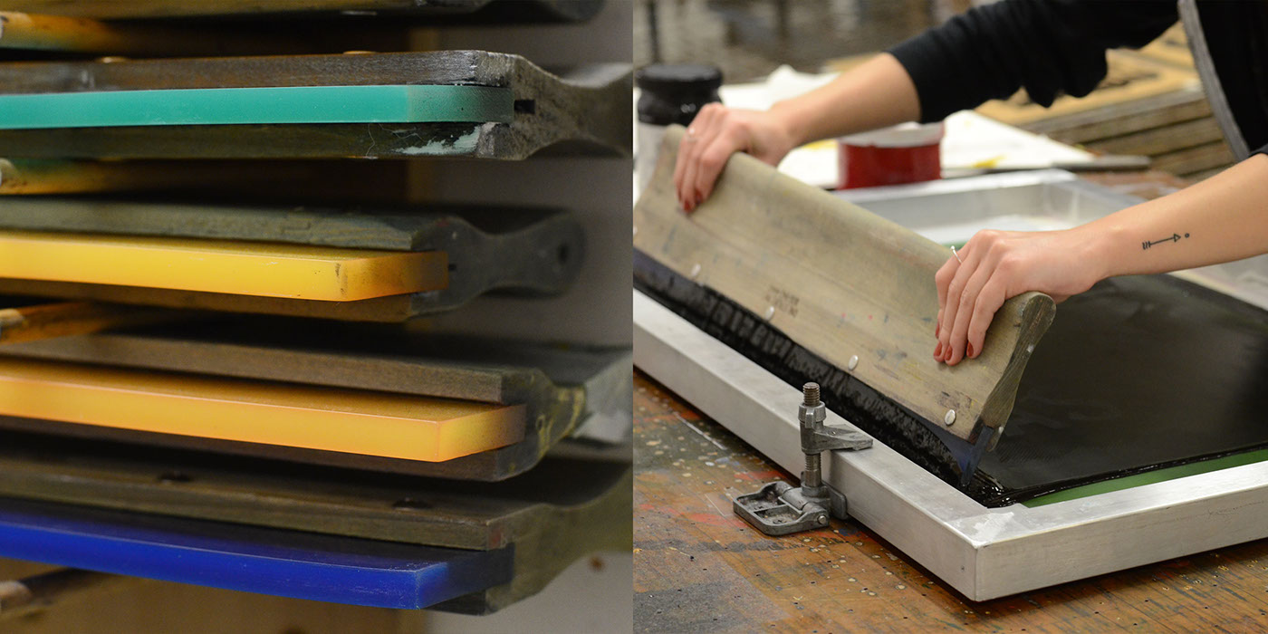
Back to making by hand.
Thanks to the generosity of DIY Printing’s open studio, and the expertise of a couple of our team members who screenprint there regularly, each designer was able to print his or her own poster by hand. We had plenty of failed test prints—and actually, some of those looked cooler than the perfect prints—but after 8 sessions of nighttime printing, we had the complete set. Stop by the agency to see it in person!