


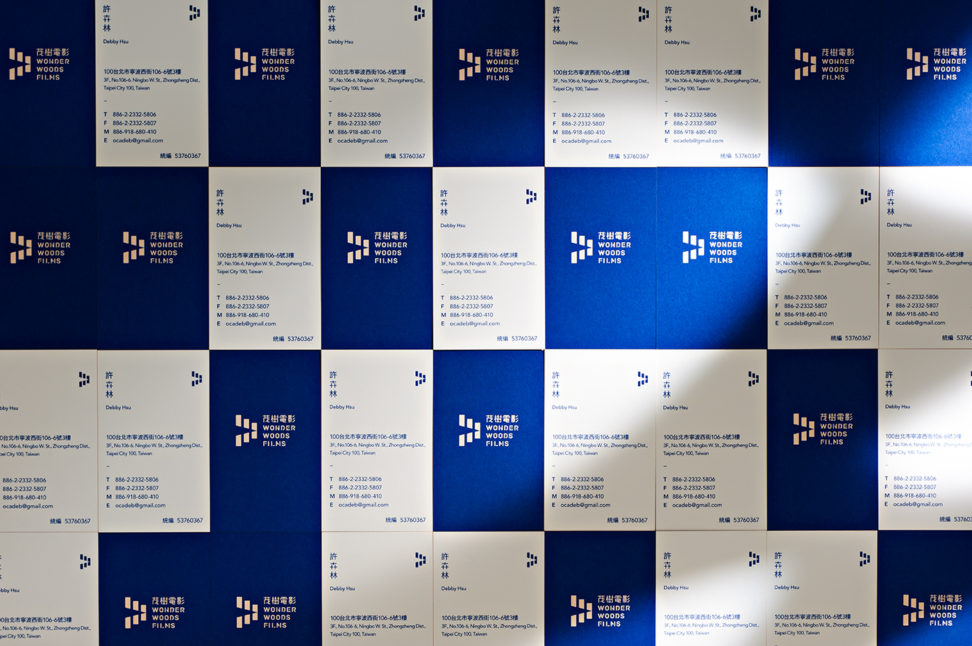


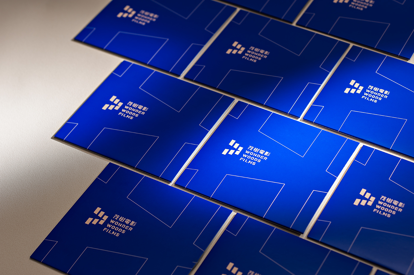
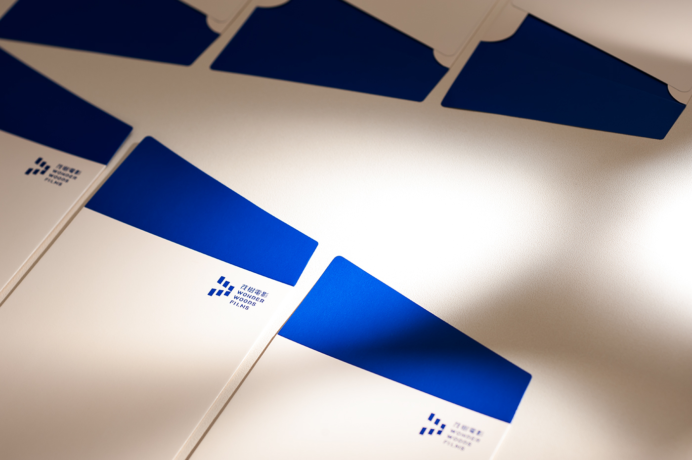


The logo of Wonder Woods Film has been designed based on the concept of "projection light" that cuts across the whole symbol and perfectly divides the counterclockwise-rotated symmetrical "W" that corresponds with the initial of the company name. Meanwhile, the symbol also represents the image of the alignment of trees in the forest. In terms of colors, we designated dark blue and vivid peach colors to express the tough but elegant characteristic and the novelty seeking dynamic of Wonder Woods Films.
茂樹電影標誌以「投射光線」做為設計概念,由中間貫穿整個標誌,並巧妙地切分成上下對稱的“W”字母,以呼應公司英文名稱的字首,同時也像是森林中的樹木排列。色彩方面以沈穩的深藍色搭配對比鮮明的粉橘色,也反映出茂樹電影團隊剛中帶柔的性格,並且持續不斷地努力創新。因此我們在作品拍攝上也特別強調光線所帶來的渲染力,特別感謝攝影師阿修的專業燈光及攝影,與我們共同完成如此具戲劇張力的作品呈現。
Client | 茂樹電影
Design Agency | AWDA 小樹設計
Art Direction & Design | Abingo
Photography | Show Leejuan
Design Agency | AWDA 小樹設計
Art Direction & Design | Abingo
Photography | Show Leejuan
more works > abingowang.com

