Case Study: Lab Logo
Introduction
In this project, I am designing a logo for the genomics (think genetics but all genes) lab in which I work. I designed and created the logo with feedback from my principal investigator (Dr. Pallanck) and labmates.
Situation
I work in a lab that uses fruit flies as a genetic model system to understand the mechanisms underlying neurodegenerative disorders.
The lab does not have a lab logo. Logos are useful for websites, presentations, posters, email signatures, etc. They are also important in creating an impression of who our lab is and what we do.
Action
Initial research into the lab was pretty straight-forward, as I work in the lab and am familiar with what the lab studies.
Next I generated some ideas by creating a morphological matrix.
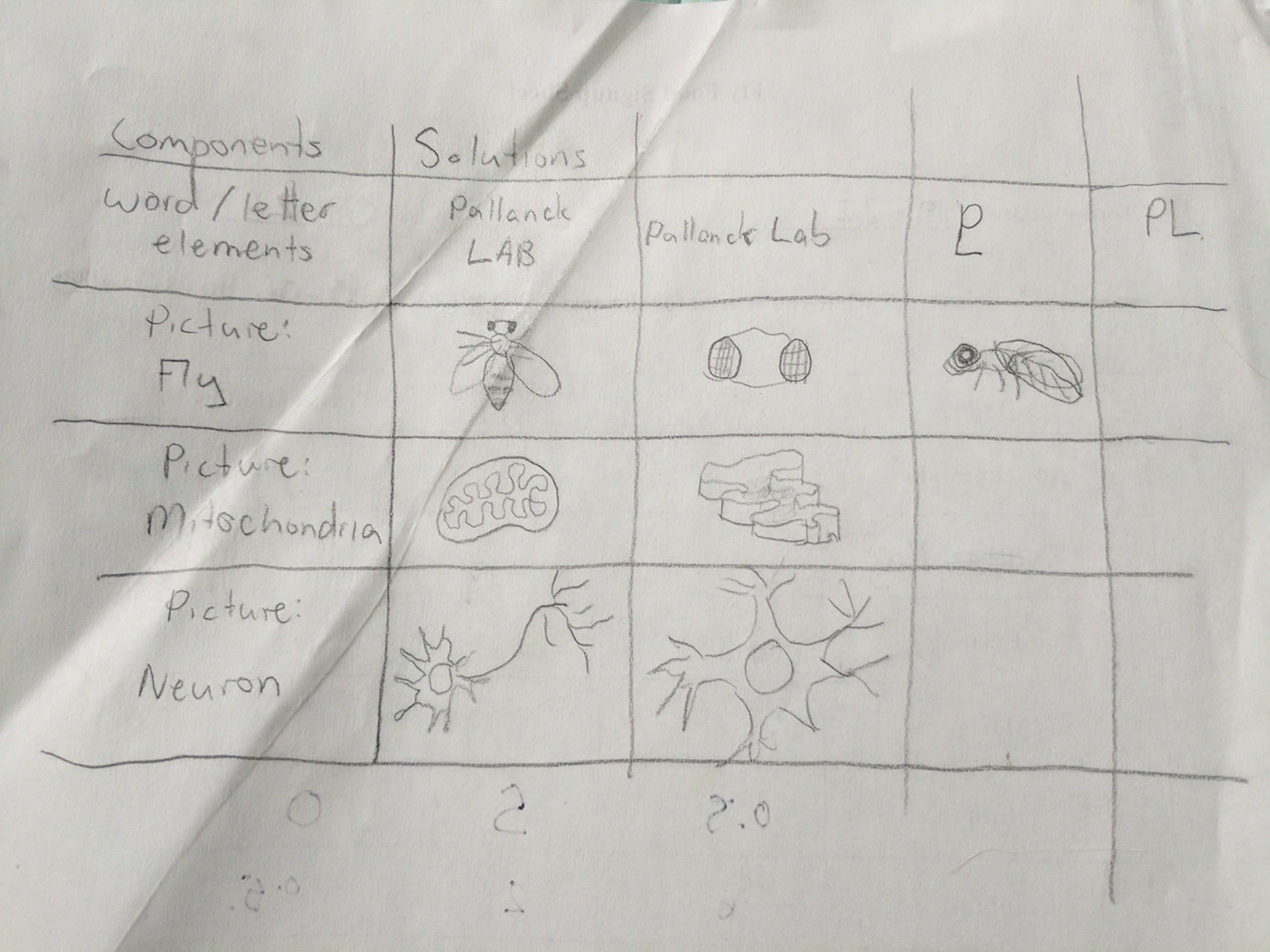
Morphological Matrix.
I then needed to decide what type of logo to create: illustrative, iconic, or typographic.
Since this logo is for a lab and not a corporation and won’t need to be scaled up dramatically, I decided on an illustrative logo. This allows for some details and character.
Typography: I debated between using Geometric Sans or Human Sans. Humanist Sans-serif typeface would mimic a scientist’s handwritten lab notes, while Geometric typefaces are strong and bold.
Color Scheme: I created a few logos in Adobe Illustrator with various color schemes to pitch to the lab.


Results
My client ultimately chose the horizontal ring logo. We thought that it was inclusive of all subjects that our lab studies, instead of just the fruit fly.
Currently we are discussing possible color schemes to implement into the design.
Dr. Pallanck plans to use this logo on his lab website, presentations, posters, and lab email signatures.
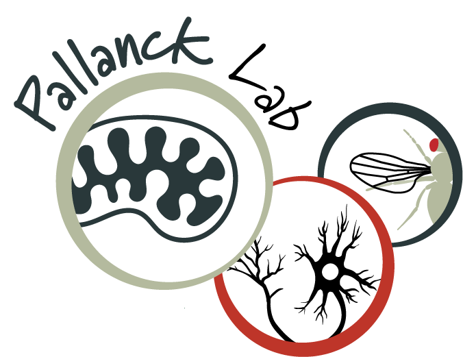
Final Logo