Sqwincher is a hydration solution brand with an odd name for companies with manual labor workforces with a long history that most aren’t aware of. It was created in the 70’s around the same time as Gatorade but over the years decided to pursue industrial channels instead of consumer in order to compete better in the marketplace. The purpose of the rebrand was that Sqwincher wanted to expand into other markets and the whimsical logo and packaging of their current product lacked a certain sophistication to gain credibility with industries like healthcare.
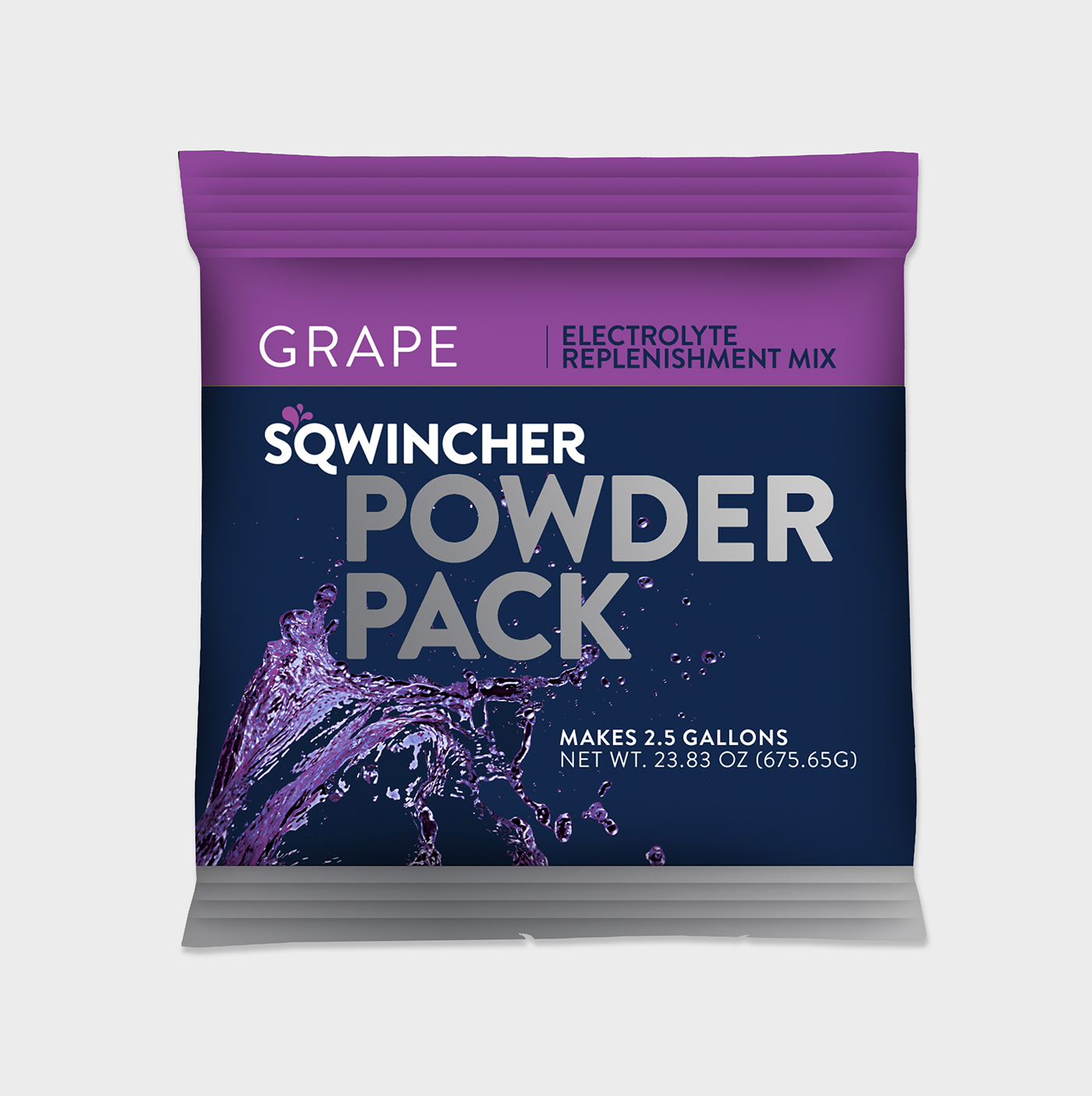
Sqwincher wanted to maintain some of the legacy of the old logo, so the “hydration burst” was required to be kept. The name Sqwincher came from the founder’s grandfather, who in his own southern way, would run the words “thirst” and “quencher” together. Because of this, the burst was moved between the “S” and the “Q” to mimic an apostrophe to pay homage to the history of the name. An updated contemporary wordmark was also created to add the desired sophistication. A new packaging was concept was then created to follow up on the hydration burst concept with the burst changing color depending on the flavor of the beverage or product. Because Sqwincher was not sold in stores, the hierarchy was changed on the packaging so the type of product was emphasized more than brand name for quick reference.
Duties included: Strategy, Concepting, Art Direction, Design
Brand Logo


Social Icon

Product Packaging
Zero Calorie Line Packaging

Other Packaging Applications

Product Accessories


