SQUARE
Brief: This brief was called 'Circle, Square, Triangle'. We got randomly assigned one of these shapes. The shape of a square was the focus for my project. This brief required me to investigate the principles of form, and to explore their functions in visual communication. To examine the form I have been given, and develop a series of practical visual experiments to explore this form. To explore the cultural context of my shape. Critically examine its use as a symbol, sign or representation. Create a visual experiment (or series of experiments) which investigates the potential meanings and values of my shape. Then choose one concept from my work to develop into a single final piece of work (or series of pieces).
STAGE 1: SHAPE
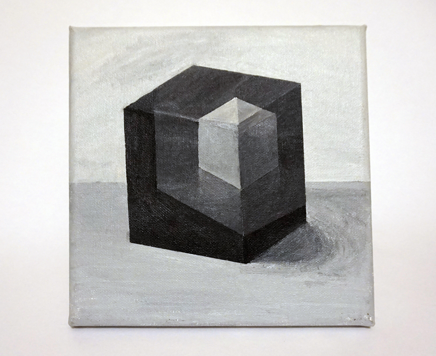
After a series of experiments with cubes, I arrived at the above acrylic painting. My choice of subject, was of course a cube and painted on a square canvas.
STAGE 2: CULTURAL CONTEXT
I also played around with cubes in illustrator and "accidentally" created a typeface. I used fontstruct.com to create templates for the desired shapes of the letters.
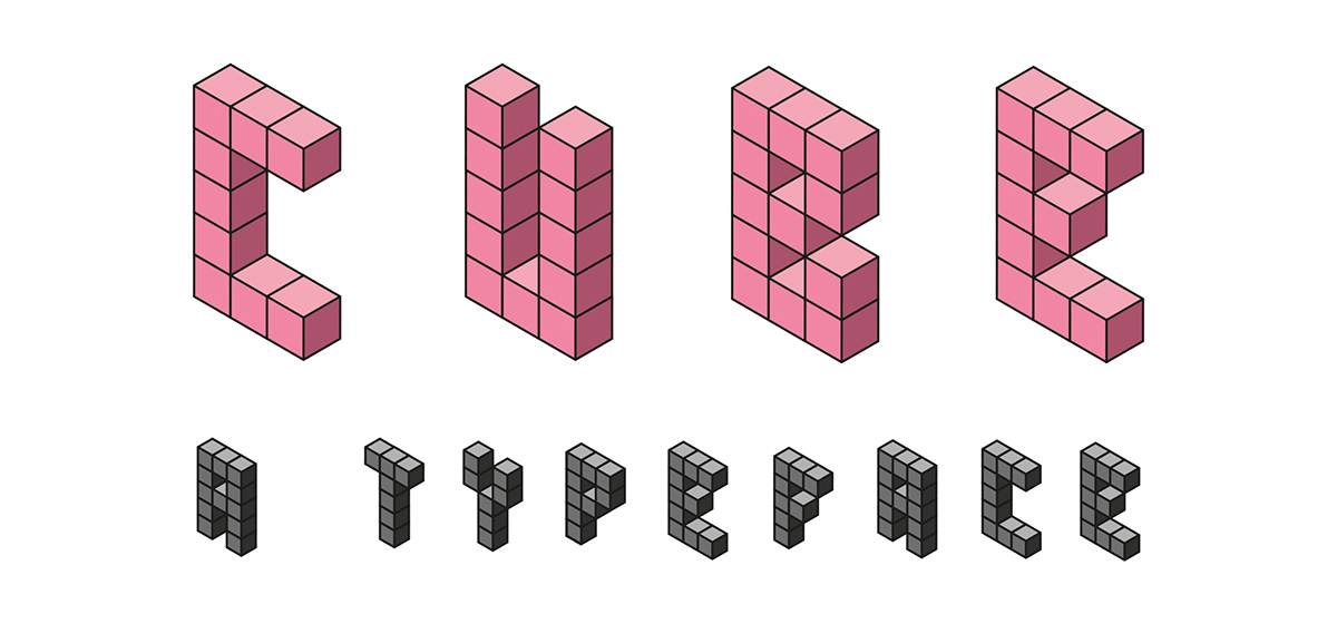
STAGE 2: CULTURAL CONTEXT
I also played around with cubes in illustrator and "accidentally" created a typeface. I used fontstruct.com to create templates for the desired shapes of the letters.


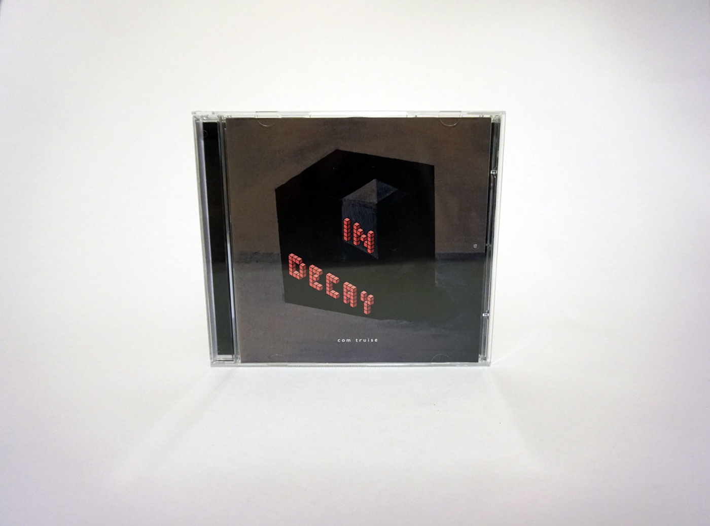
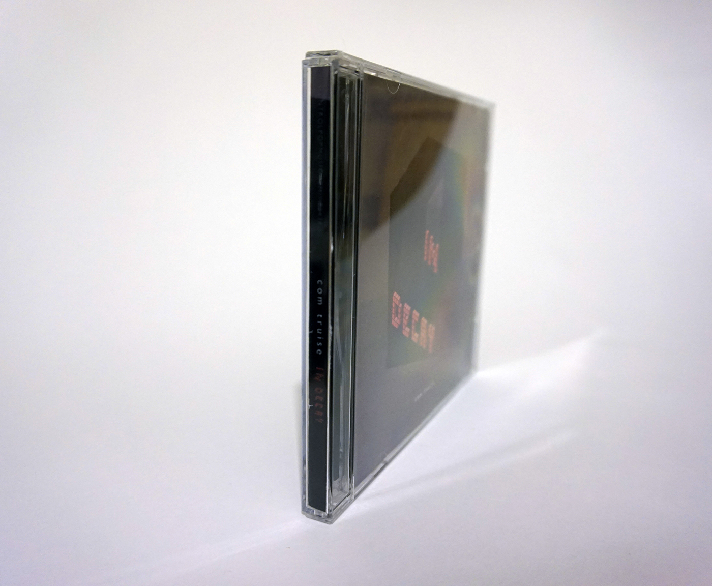
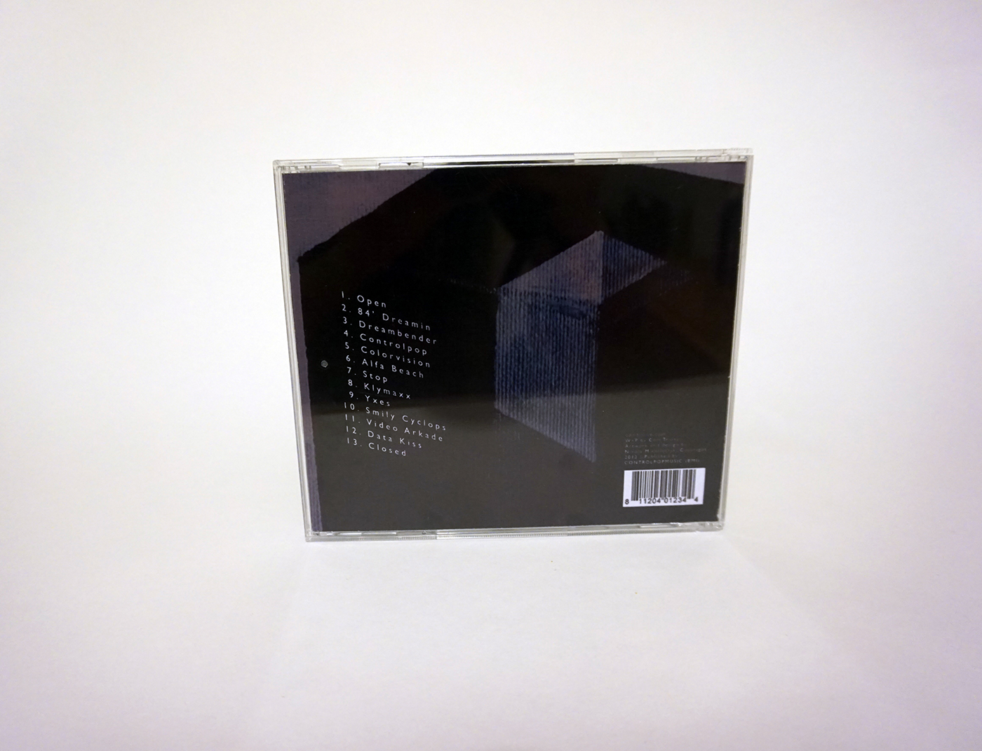
STAGE 3: DEVELOPMENT
In order to develop my work into a final piece, I decided to combine my two strongest experiments from the project into one. I chose to design a CD cover because they are also... square. I chose an artist called Com Truise and his album ‘In Decay’ because the genre is electronic/synthwave and I thought this would go well with the typeface. I edited the painting in Photoshop to make it darker.