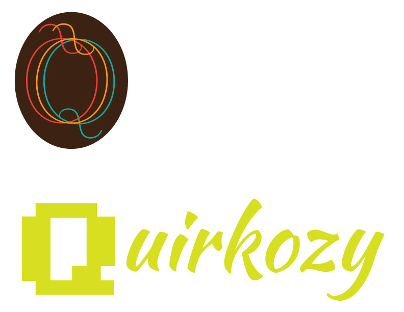
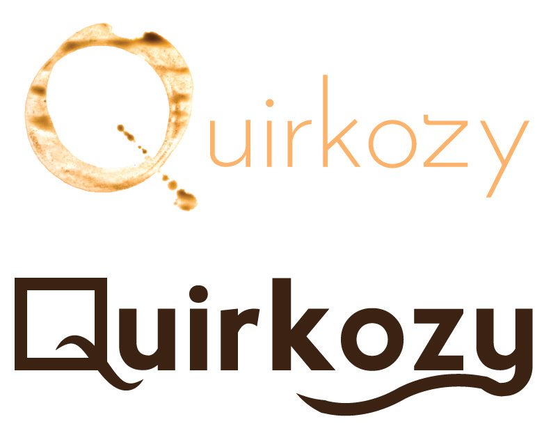
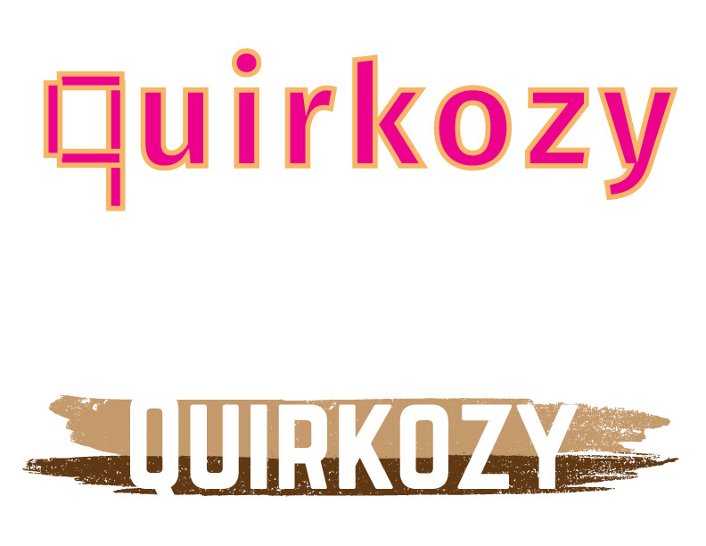
This client needed a logo for her online craft store. Her products are quirky and cozy with nostalgic nerdy flair. She original only wanted to use a pixel font but, when I told her I learned in my research that a quirk is a stroke or pen mark, she also fell in love with the idea of mixing font types. Above are my original sketches and brainstorming and below is the first round of design ideas.
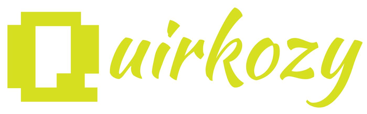
Round 2 - She really liked the lime green from round 1 but wanted to see more variations on the idea.


But in the end we got it right in the first round and the lime green became the final logo.