Blacknanas Packaging
Grupo Empresarial Mawas Escalante se acerca con la marca Blacknanas y presenta el siguiente reto: introducir al mercado mexicano un producto atípico... una botana premium de plátanos deshidratados saludables, negruzcos y suaves que se alejan de los populares, amarillentos y crujientes plátanos ya existentes en el mercado.
-
Grupo Empresarial Mawas Escalante comes up with Blacknanas brand and presents the following challenge: introduce an atypical product to the Mexican market... a healthy-premium snack of dehydrated blackish and soft bananas that contrast with the popular, yellowish and crunchy bananas already on the market.

Después del estudio de la competencia y analizar los productos ya existentes el camino a seguir en el empaque, para diferenciarse del resto, era: dinámico, hiperactivo y saludable.
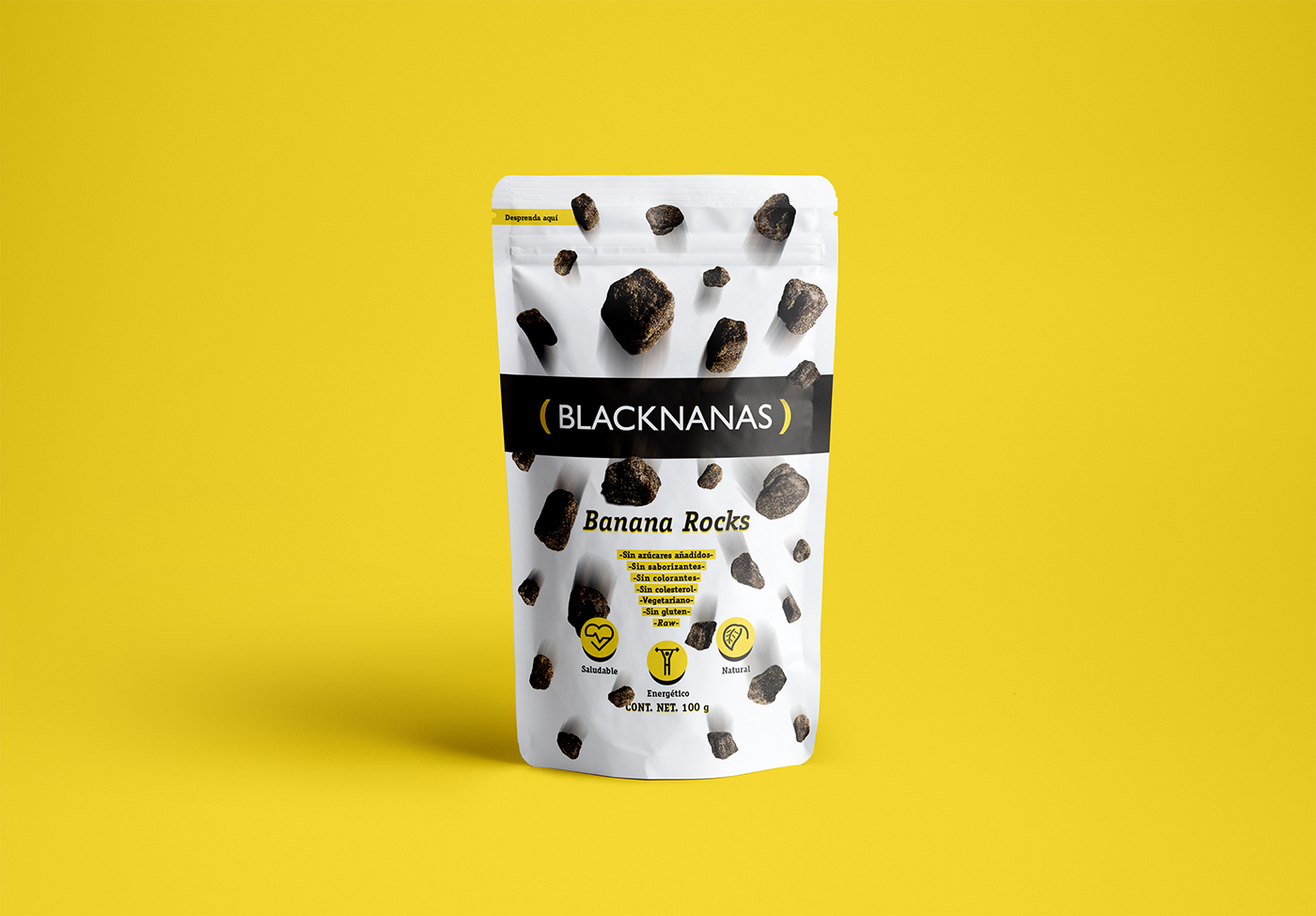
Varias aproximaciones con el público meta sirvieron para entrar en sus mentes y conocer su opinión acerca del producto, la percepción era que los plátanos "asemejaban rocas". Este insight fue la manera de crear una asociación fiel a la rareza del producto: resaltar su unicidad y transformar una debilidad en fortaleza.
-
After studying the competitors and analyzing the existing products, the packaging, in order to differentiate from the rest, demanded to be: dynamic, hyperactive and healthy.Several approaches with the target audience helped to enter their minds and to know their opinion about the product, the perception was that the bananas "resembled rocks". This insight was the way to create a faithful association to the rarity of the product: emphasize in its uniqueness and shift a weakness into strength.

Proceso / Process
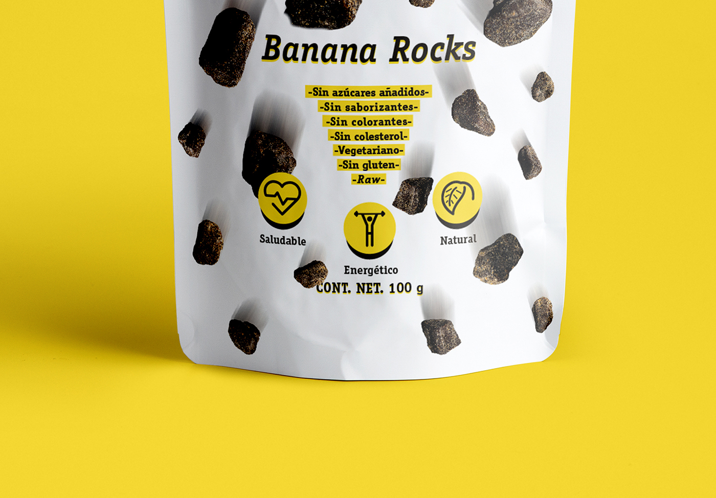
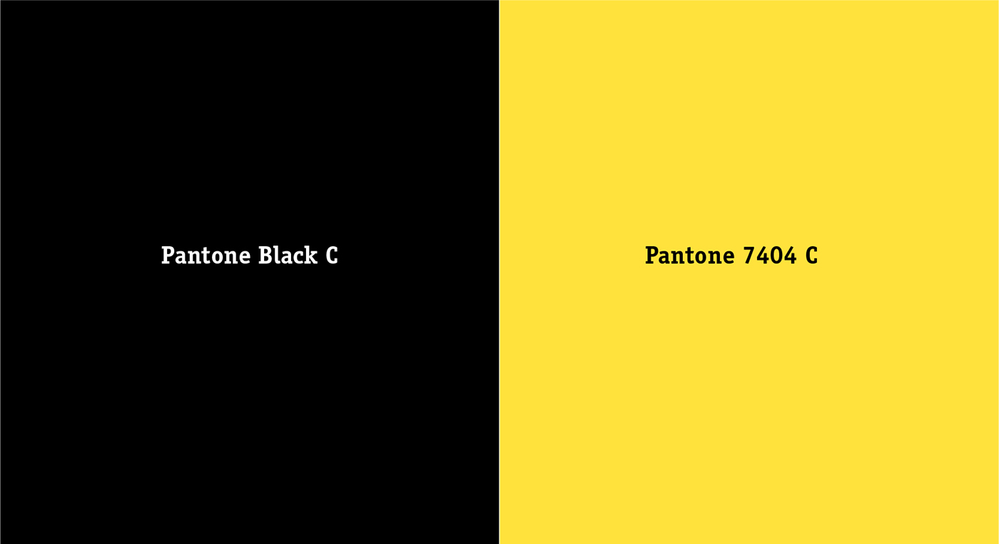
ITC Officina Serif STD es la tipografía seleccionada para contrastar con la fuente sans serif del logotipo, la paleta de color utiliza los códigos PANTONE de la marca, tres pictogramas diseñados para complementar la información y, por último, el producto fue fotografiado en un estudio para tener la resolución óptima de impresión y la calidad fotográfica para resaltar sus atributos.
-
ITC Officina Serif STD is the typography selected to contrast with the sans serif font of the logo, the color palette uses the brand's PANTONE codes, three pictograms designed to complement the information and, finally, the product was photographed in a studio for optimum print resolution and the photographic quality to highlight its attributes.


Diseño final / Final design
El diseño del empaque obtuvo el premio "Mejor Proyecto de Empaque" otorgado por la Universidad Iberoamericana.
-
The packaging won the "Best Packaging Project" awarded by the Universidad Iberoamericana.