


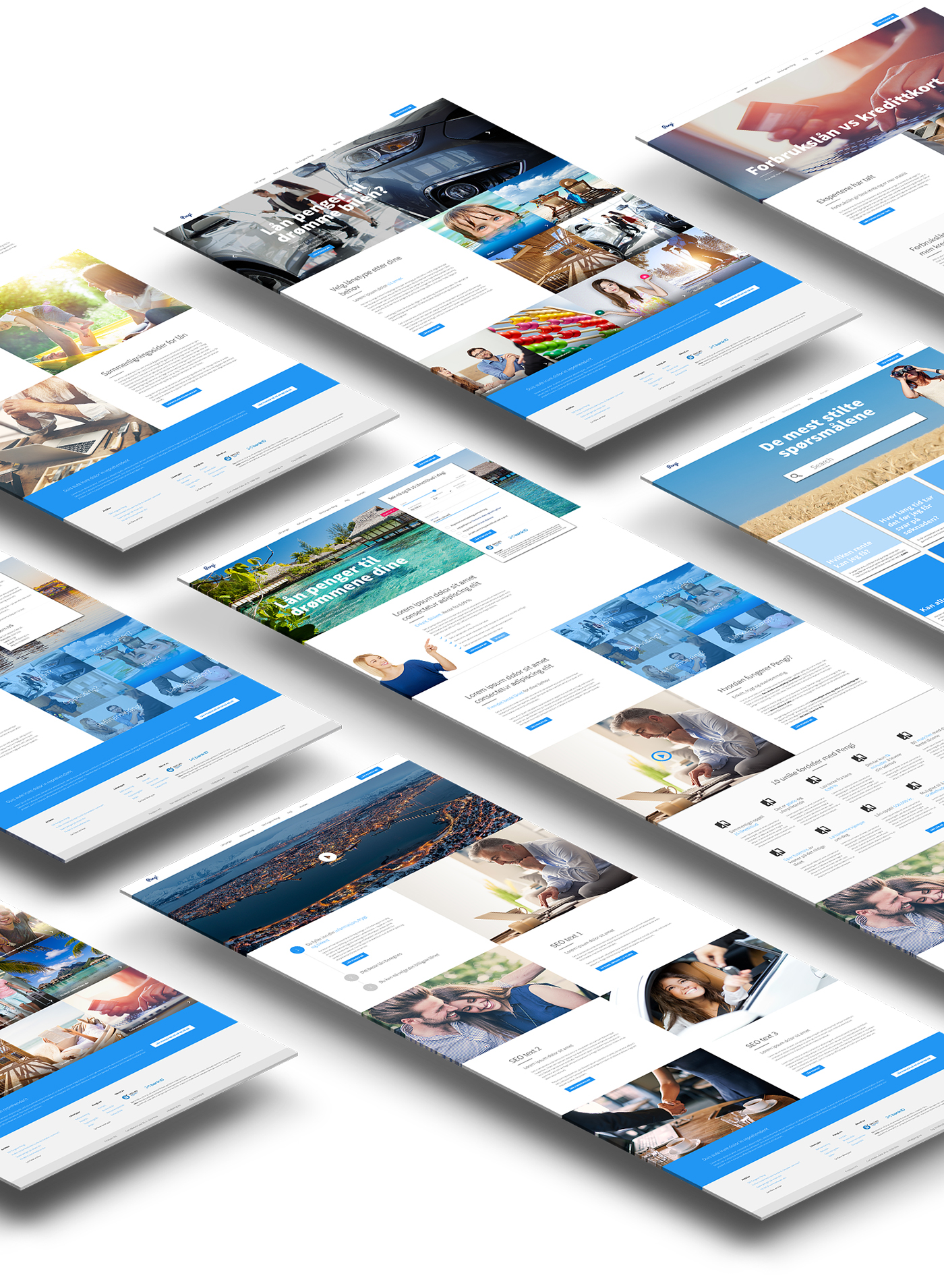
Pengi - redesign
The founders of Firstborn Capital wanted to get my insights and view on how I thought their brand Pengi should look after a redesign. I had completely creative freedom, and before I got into the creative crafting part I went into research-mode. I looked into the latest trends, opportunities, functionalities and competitors, what really caught my attention was Google's Material Design. During the entire research process I found animations/effects, typography, and much more, that I thought would make the best experience and also move Pengi into the future, where none of the competitors would be able to reach anytime soon.
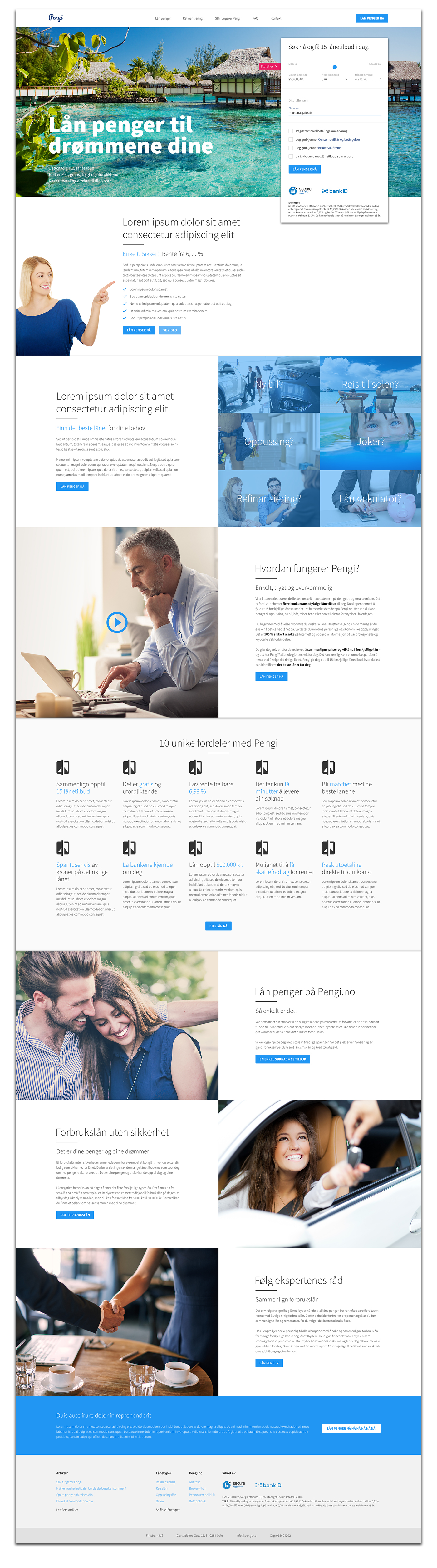
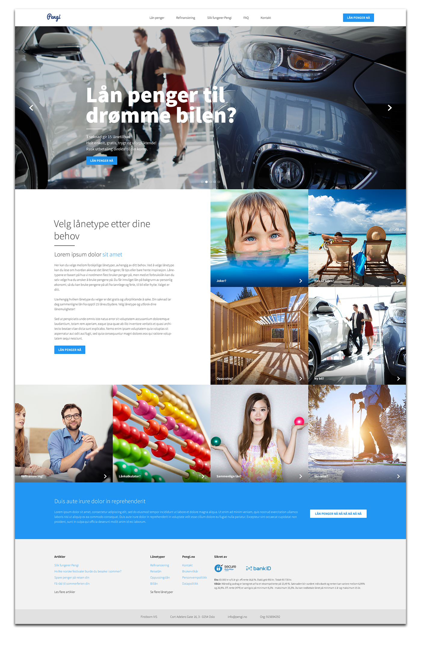
One of the key effects that I thought would give the user a great experience would be the area on the homepage where you see the large image (hero section), and the loan formula. On this hero section I would use a motion blur effect, when the user used the handle, for the amount of money they would like to borrow. Lets say the user was interested in getting a loan for car, then if the amount was 5.000 kr. it would show some really bad/nightmare of a car, but then as they moved the amount up towards the 500.000 kr. it would change the car to something better, at some preset breaking points. The handle itself would also have its own animation for the amount, example from Google's Material Design. (under discrete slider - normal version) These are just some of the animations/effects I have been thinking of using for the Pengi website.
By using these minor animations and effects it would, in my opinion, enhance the users experience greatly. They get a reaction, when they react - mouse movement, touch on screen, etc.. Content or content blocks would slightly fade-in and move-towards-top as you scroll, as well. Combined I truly believe Pengi would move way ahead of their competitors.
Homepage
The loan formula follows on scroll into the section below, but following when it aligns with the bottom of the buttons. The section further down with the gray background and the icons inside is thought to be a parallax area.
How it works
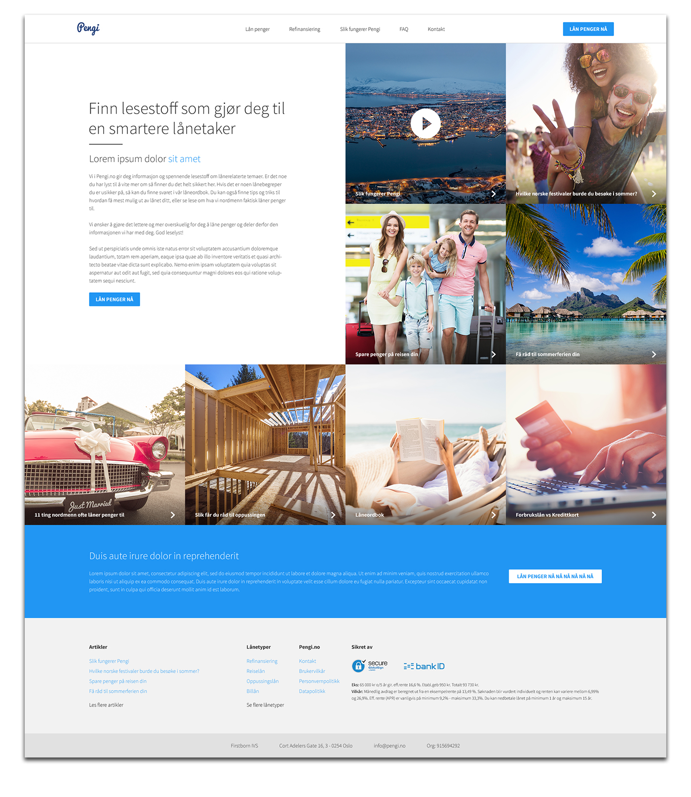
The section with the video will play in the background without sound, an example could be www.la24.org

FAQ
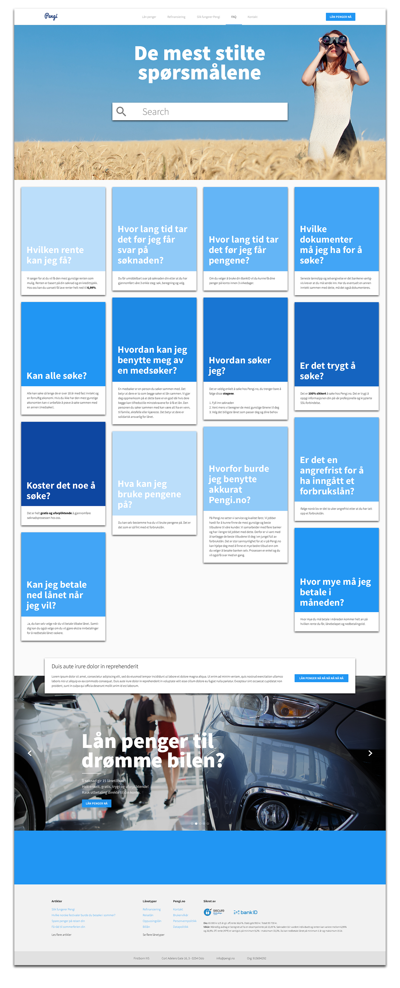
I tried to do something different with the FAQ page compared to how I generally would do. In the hero section the user will would be able to search their question, and depending on the search different or the answer would appear. If the search function is not in use, then all the FAQ answers would appear as visualized below. Right after the FAQ answers I have placed a floating promotional box. The meaning behind this is that I am imagining, that on scroll it will be 50 pixel from bottom and float above the loan slider. When it hits the blue area below it stops and remains positioned within it, as I have done on the other pages before the footer.
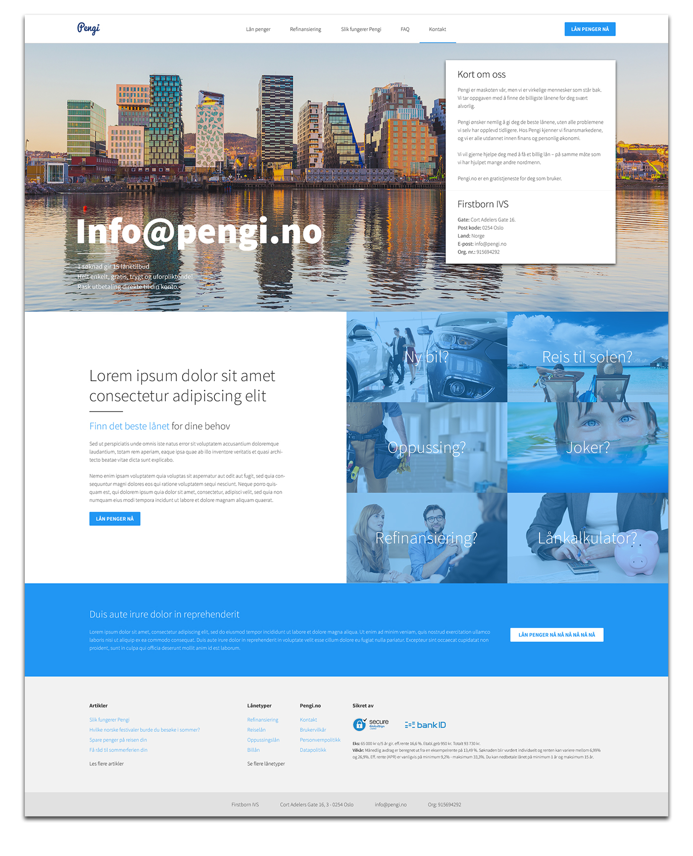
Contact
Contact pages are in general quite boring, therefore, I decided to try to spice it up a bit. What I have done here is to have the normal contact information within the hero section and the extra spice I have given it, is adding the section that promotes their different loan types - stolen from the homepage.
Loan options
The hero on this page is a slider with the different loan options or the ones they want to promote the most. Below it each loan type is visualized with its own image. This page is to give the user a picture of what Pengi offers.
Articles
Single article
The article below is one that currently is on their page, but it lagged structure and did not engage the user to read it, but rather click away from it. Within the article they use many sub-headlers there my thought is to use that to their advantage and give their content some room to breath, but most importantly to improve the user experience on their single article pages.


