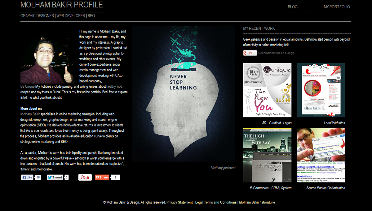
First online portfolio optimized for Mobile & Tablets
The main idea is of how the world of HTML5 tech has changed and become as a pro with non faults, as there's no worrying re/ if your website width will fit all your users screen or not. in this design whether you have a giant screen or very small tiny one you will have the same font size and images. this optimization tech has been implement without setting up the width and high for images, iframe, videos,etc...
on of the biggest challenges facing web designers today is the explosing of different devise size and screen sizes. Designing for multiple screens can be a difficult and time-consuming task. to make this process easier many designers start using a fluid grid layouts and that's now avaible on Adobe Dreamweaver cs6 gives designers a value way to control page layout for multible screen sizes.It also automatically integrates cross-browser consistency through the use of HTML5 boilerplate and the respond.js library. - Produced By lynda.com and written by james Williamson


