
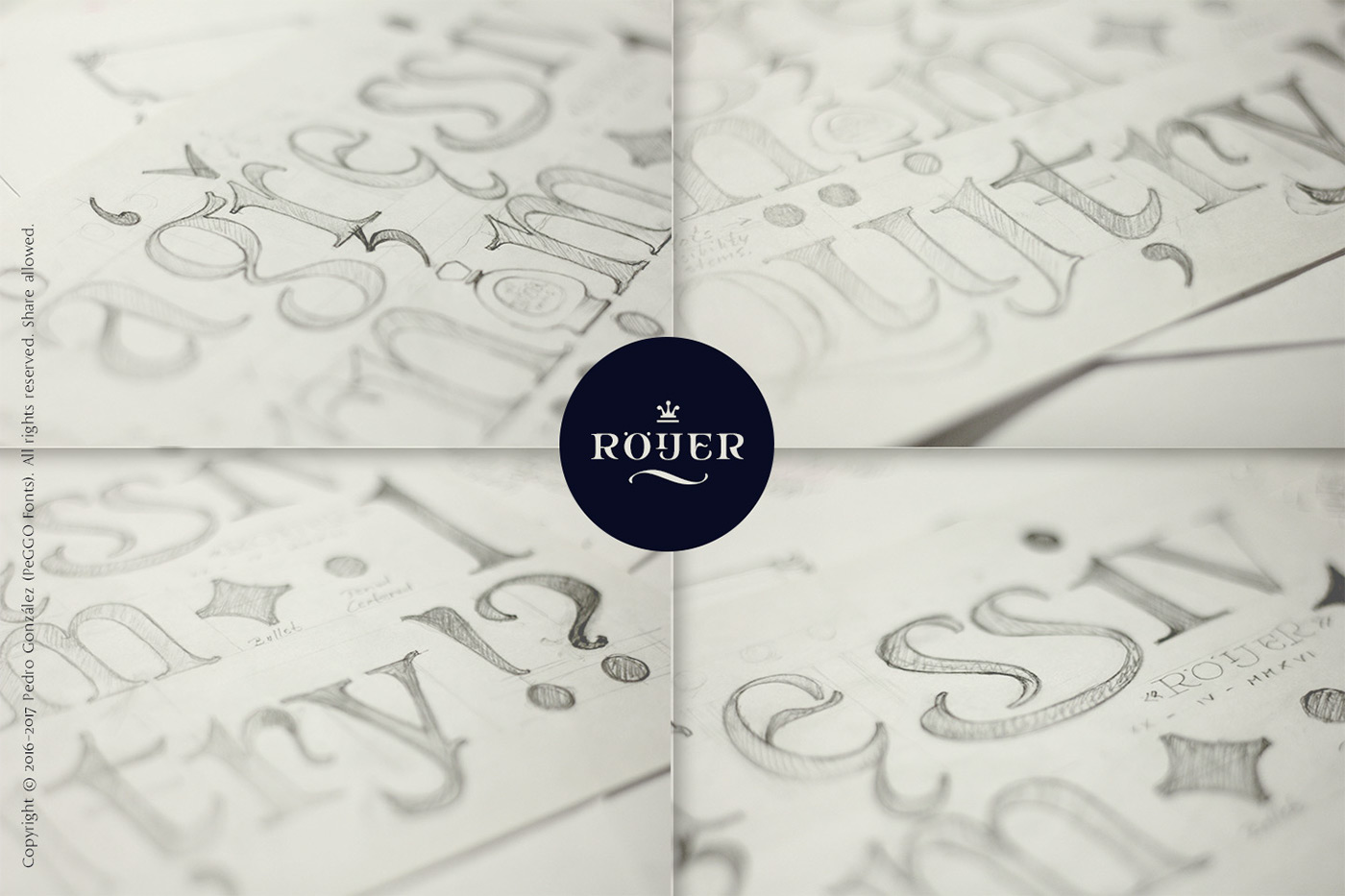
“Röijer” was born from a branding exercise done with “high care”, graphically developed thanks to the valuable help of designers Marcela Aguilera & Pedro Gonzalez, each letterform and every type design process was worked as a typographic jewel, as a strong bond between classical and fresh concepts (with a Lombardic and Art Nouveau touch).
Röijer puts a dual capital model in your hands; a classic Roman and a fresh contemporary alternative, on each letter: the first located in a lowercase box looks formal and sober, while the uppercase box shows a glamorous and more daring look, ideal to being use at specific moments only. Röijer combine elegance and audacity in a very magistral way.
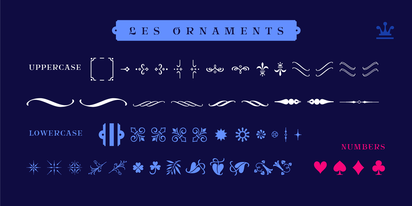
It has 2 variants with 541 glyphs each one; a normal and a volumetric one, all with an ornaments set and a decorative objects set. Ideas that be useful not only for branding design but also for titling, headline composition, label design, fashion and luxury stuff.

First branding sketch excercise, from where the main idea starts.


The next idea is to make "Röijer" grow into a bigger family font, including lowercases on the next realease.

And even with more than one size, as here's projected in a lighter version too.


Photography: Marcela Aguilera
Graphics and Art Direction: Marcela Aguilera & Pedro González
Type Design: PeGGO Fonts
"Röijer" is available at:
PeGGO Fonts website: http://peggofonts.com/
MyFonts: http://myfonts.us/3nc0mG
Creative Market: http://creativemarket.com/peggo
Thank you for watching and support, enjoy it!


