


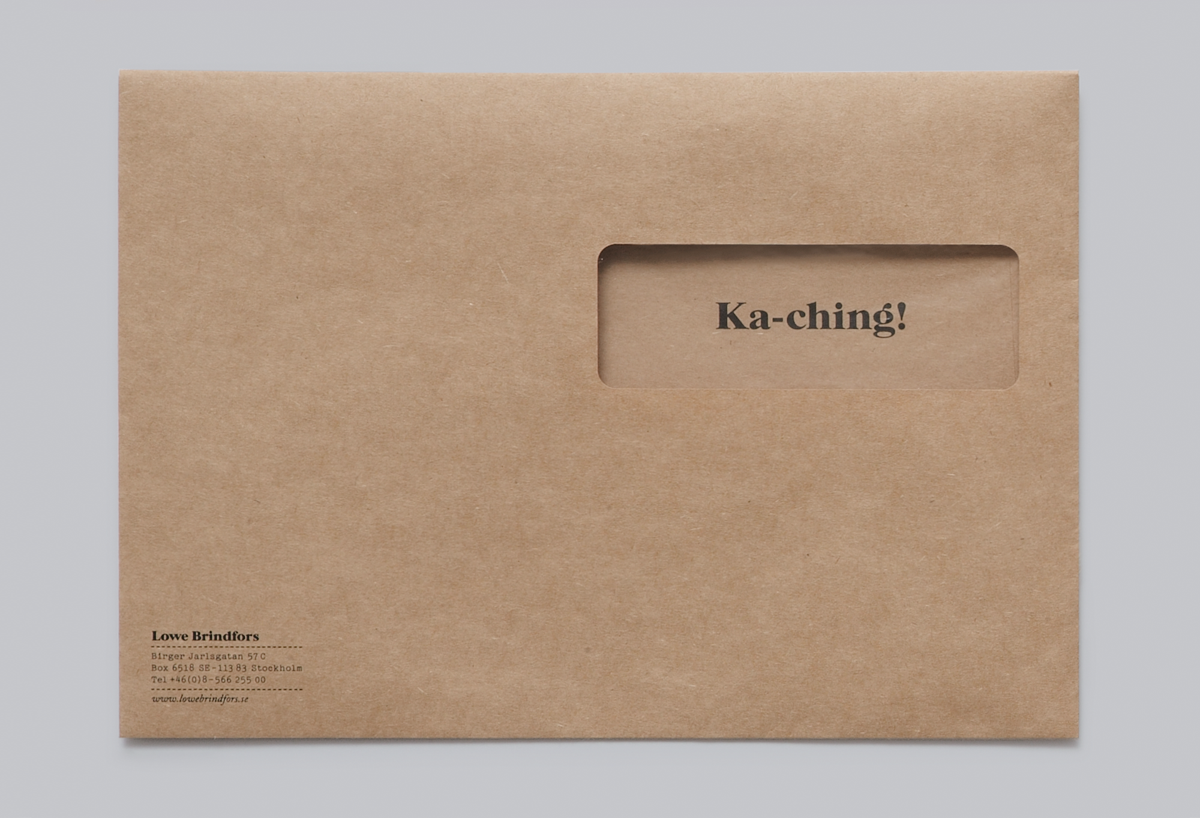


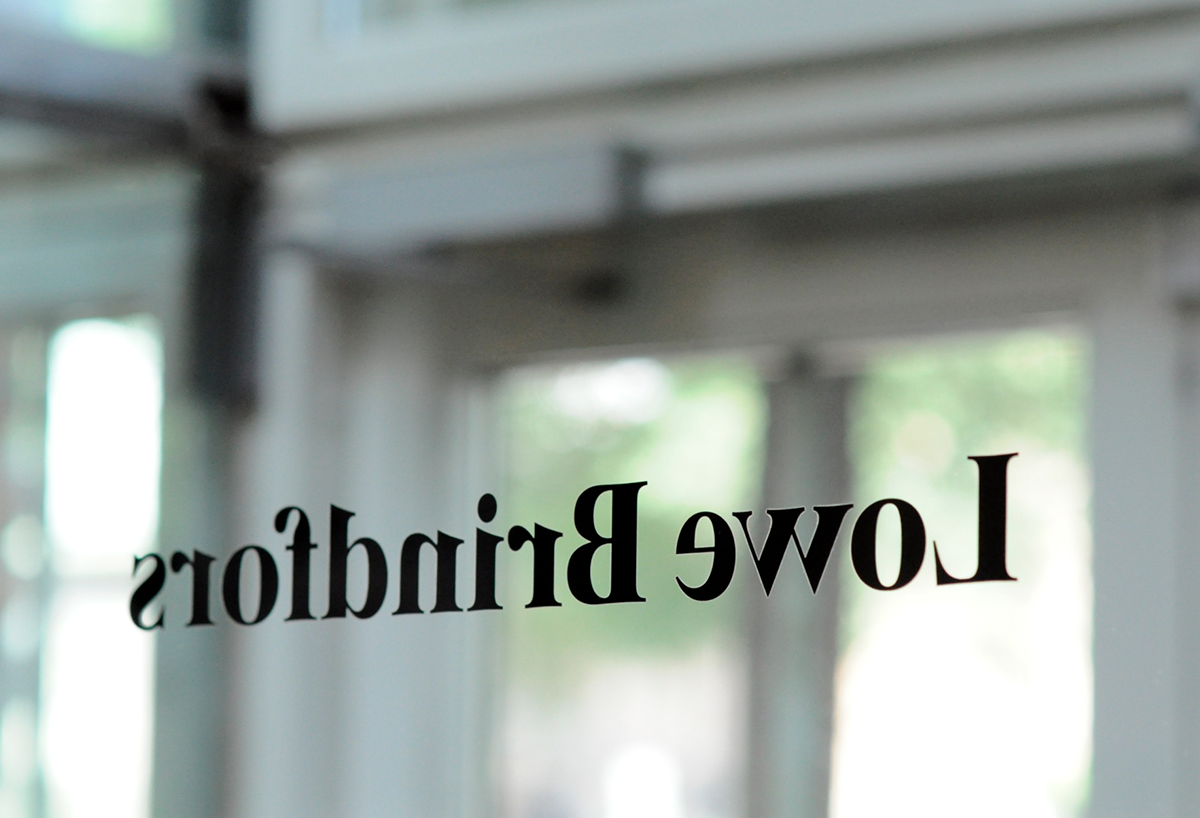
When Lowe Brindfors, Sweden's largest and oldest advertising agency turned 30, a new design identity was introduced. It’s aim was to visualise their belief in the importance of idea-driven communication. Each piece of stationary has a message or visual relevance to it's context, explaining or adding a different perspective to the item in question. A crafted, sober expression was introduced but with a relaxed, witty tone of voice. The typefaces and aesthetic inspiration was taken from the late 70's (when they were founded) and the colour palette was inspired by their office building (a former garage for trams). Formal yet personal.


