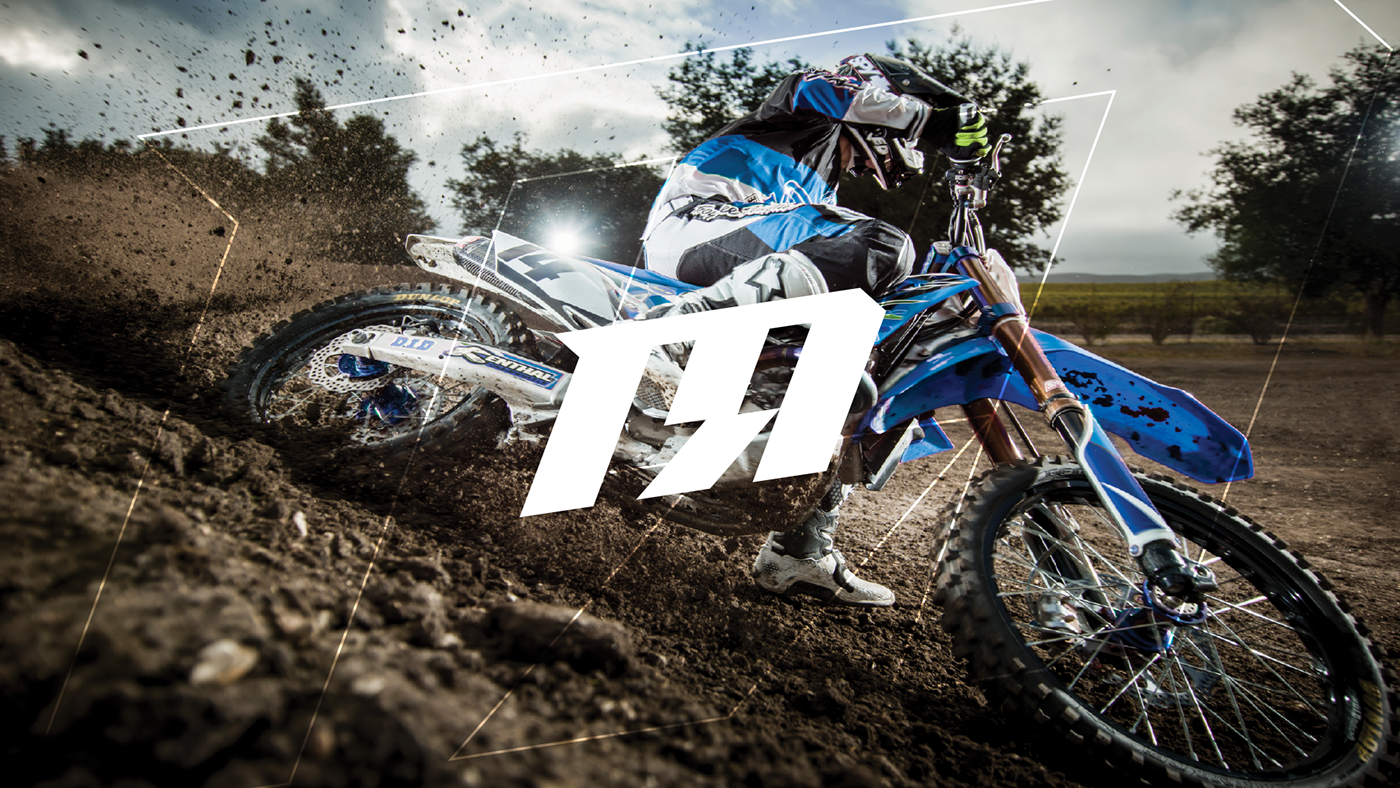
Shelby with MOTOROOST started sponsoring riders in 2012 helping each one of them achieve their goals in competitive racing.
As the brand started to expand, she felt the previous identity didn’t convey the aggressive sharpness that her riders showcase when they race. She also wanted help with her apparel line in creating impactful shirts that would help market her company.
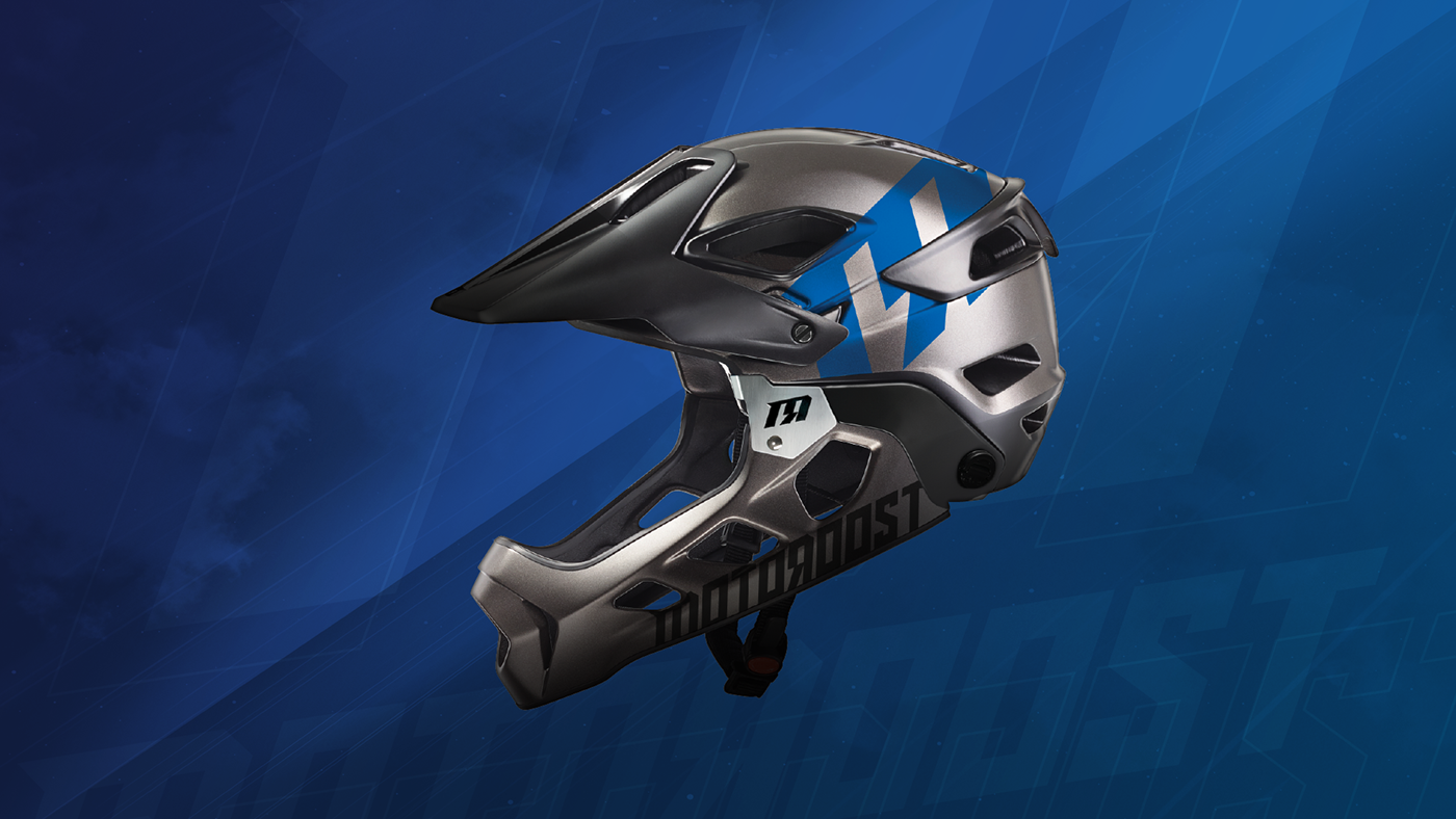
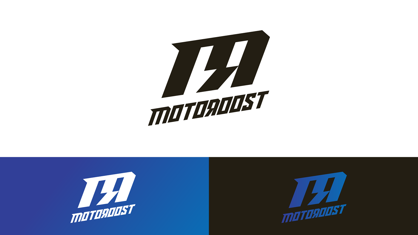
By dissecting the rigid ‘M’ character in the middle stem, the effect gives the viewer a sense of electricity with an abstract lightning bolt, simultaneously creating the backwards letter ‘R’

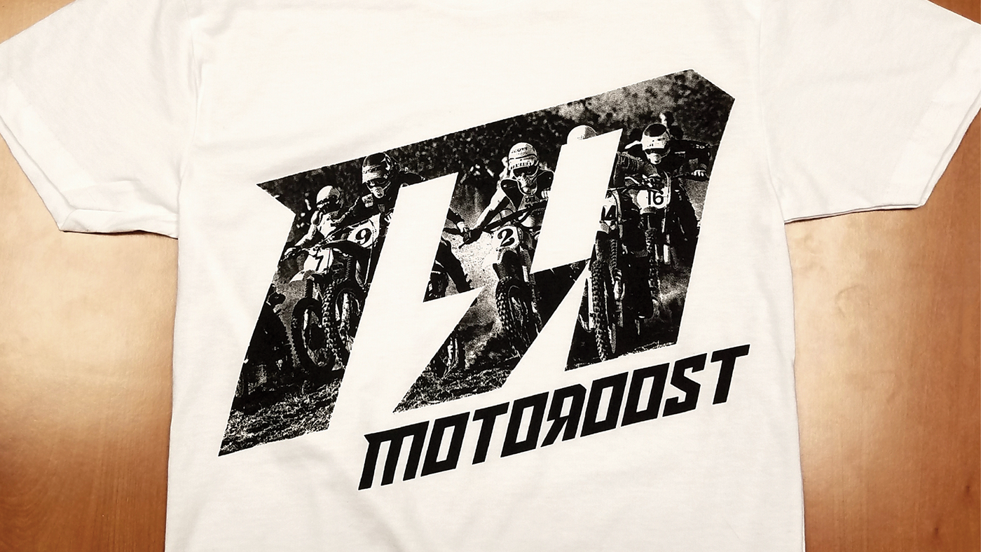
To help keep costs down on production, we decided to use process black ink on Gildan's solid white tee's. Using halftones, the printer was able to get remarkable detail for the hand-out shirts.